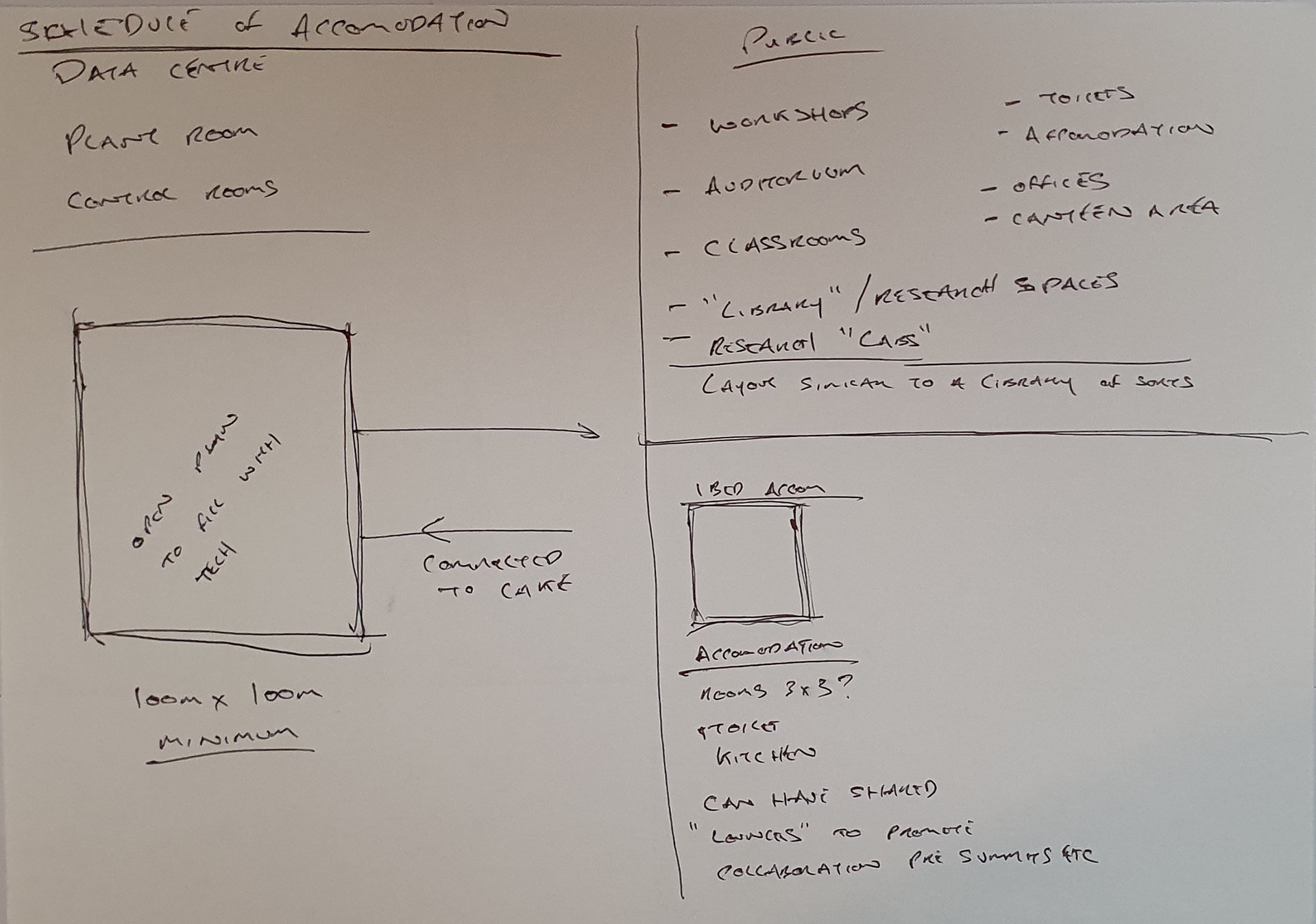
Stage 1: From manifesto to concept

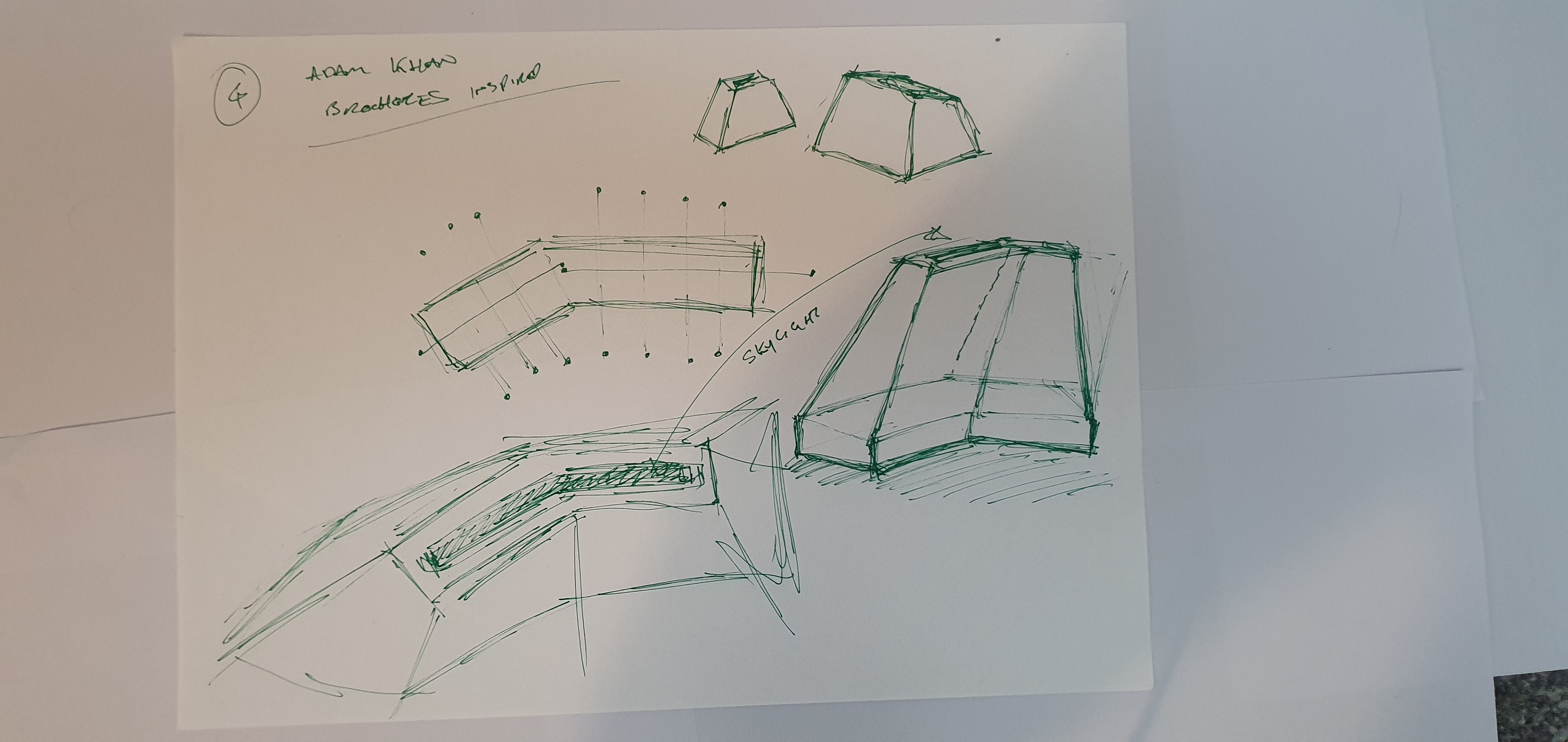
The Spark by Snohetta
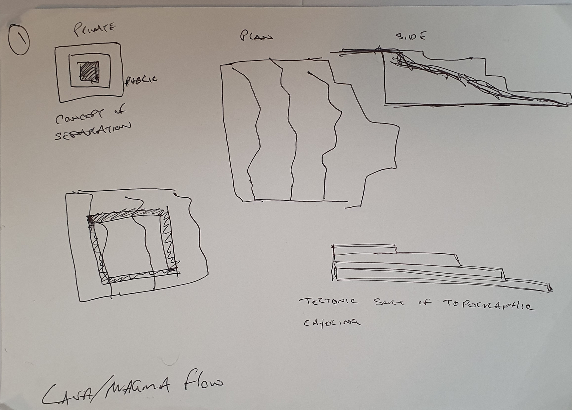
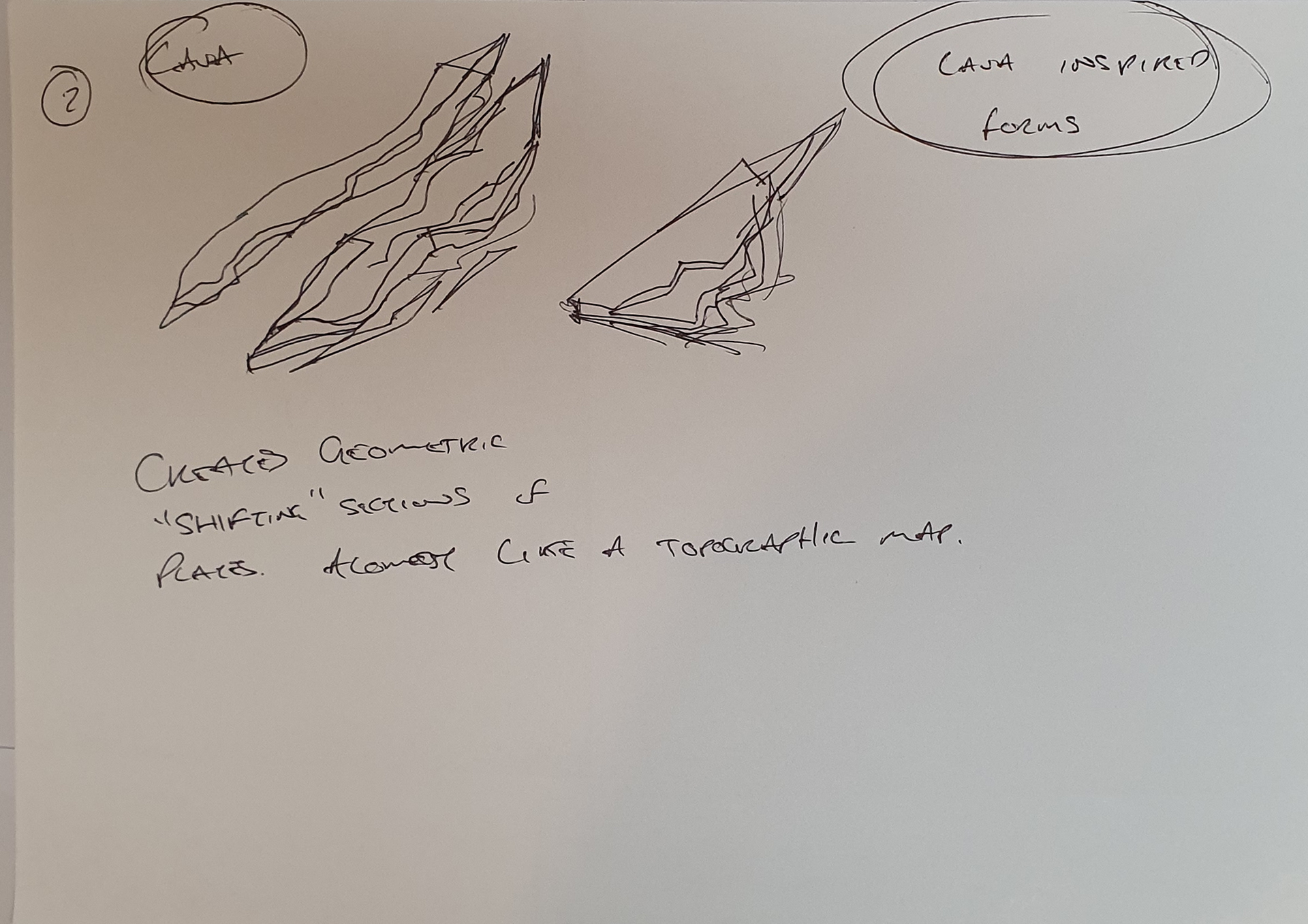
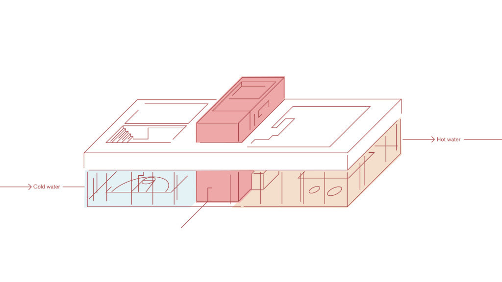
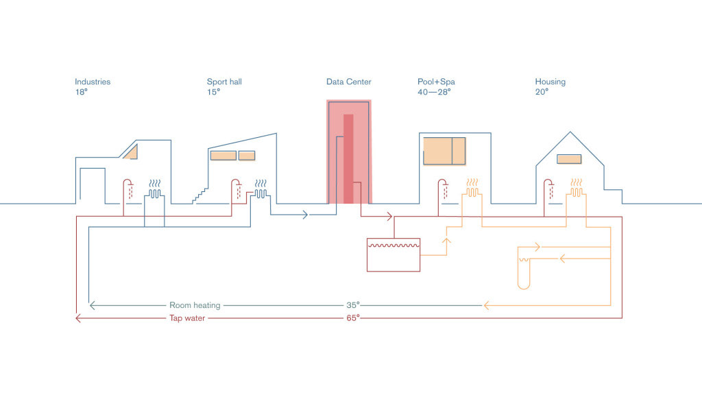
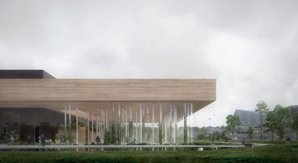
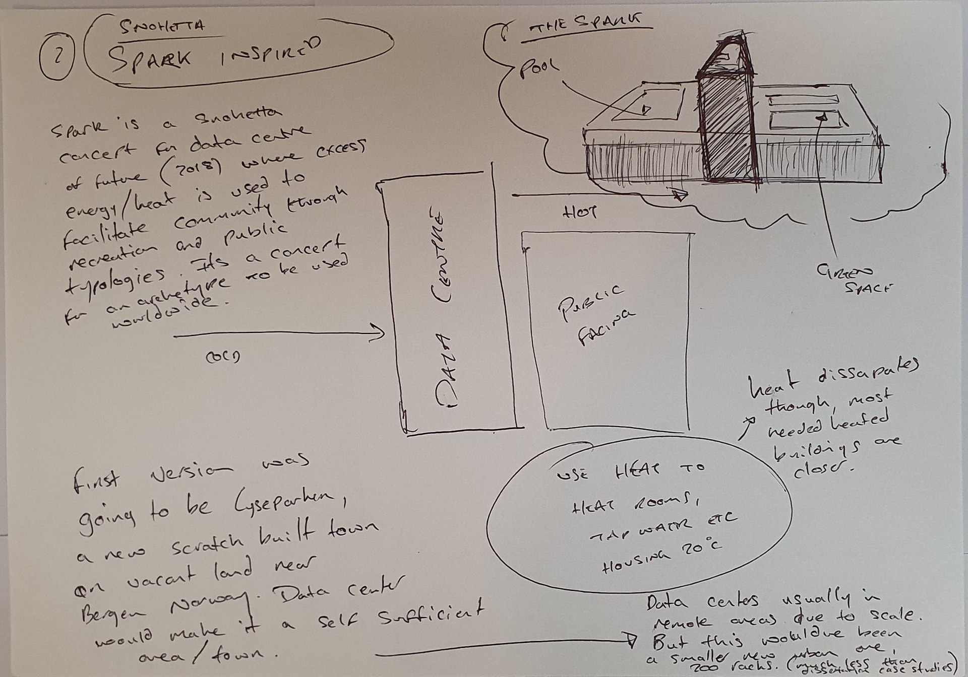
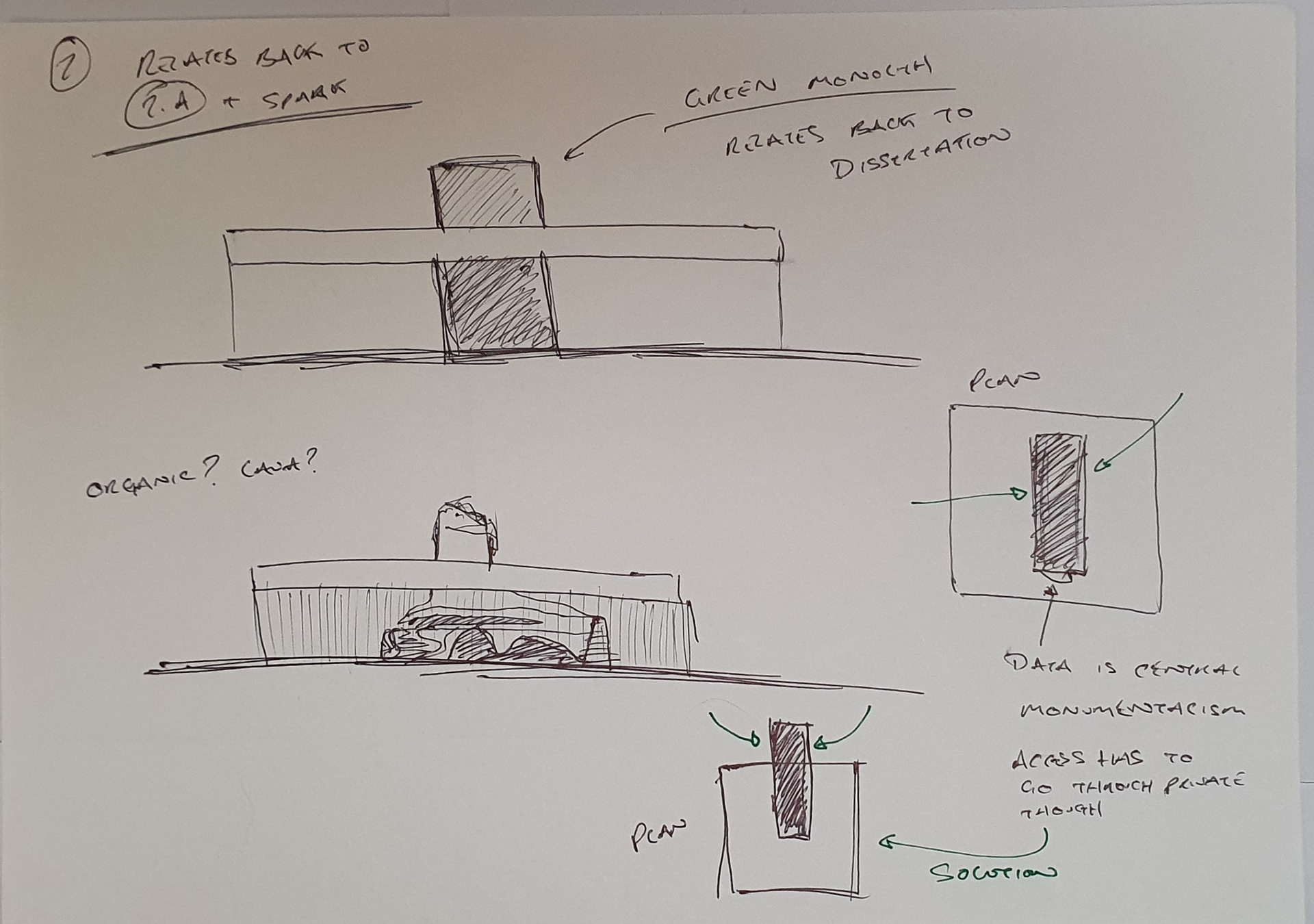
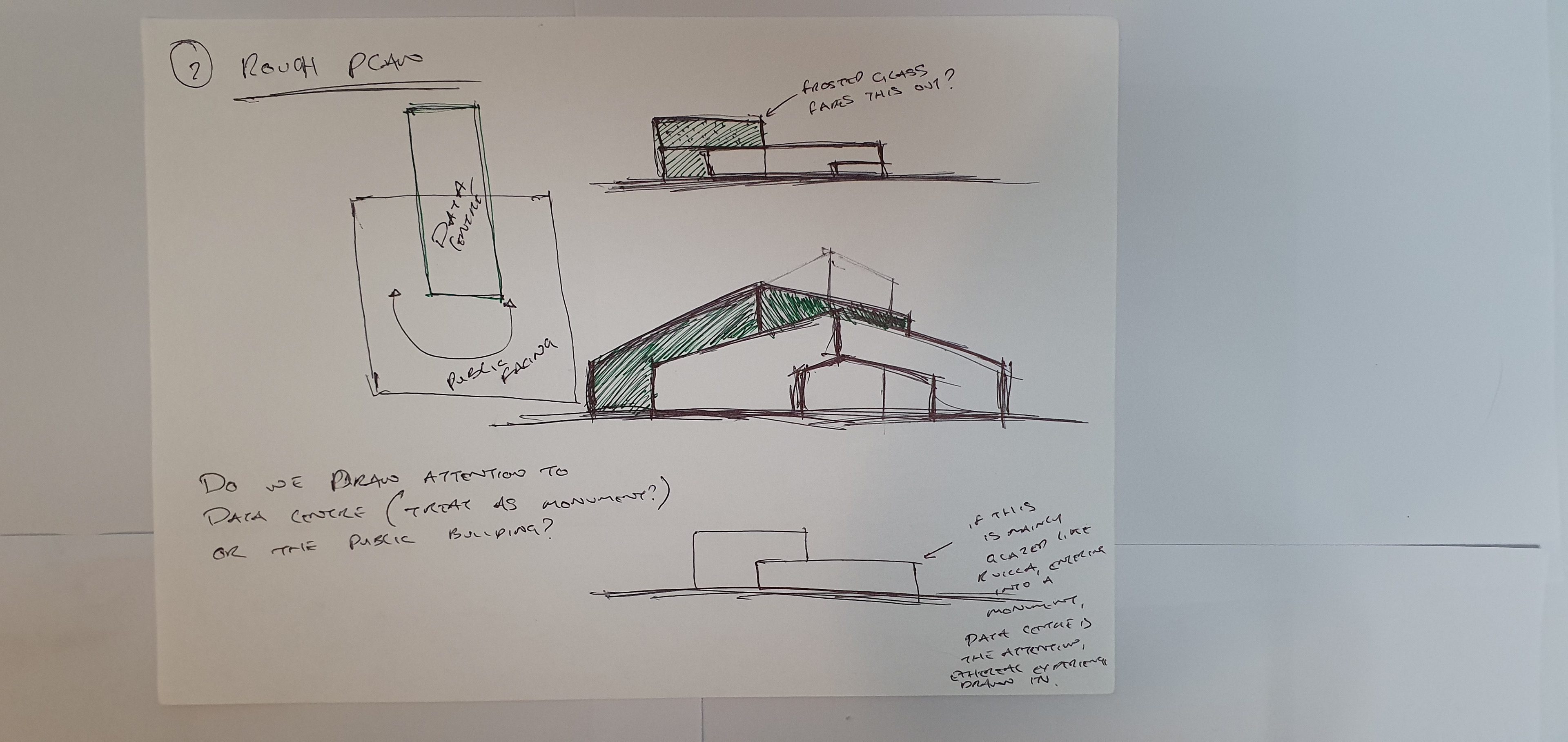
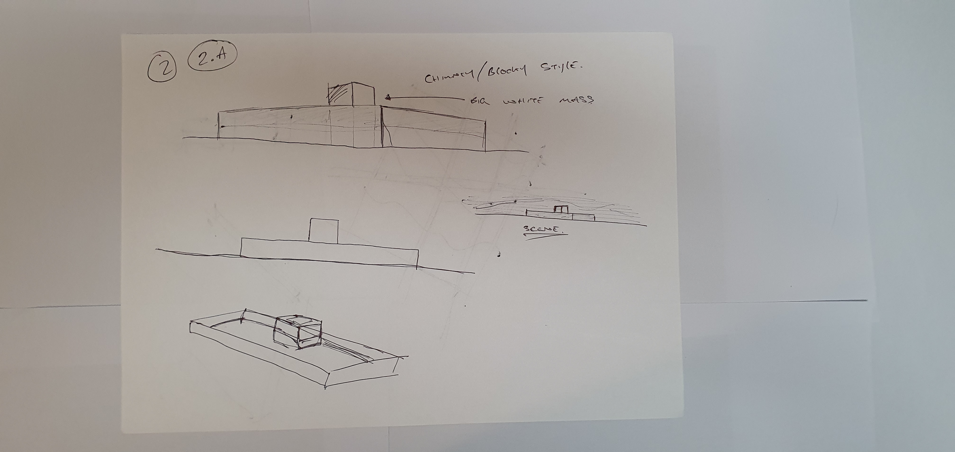
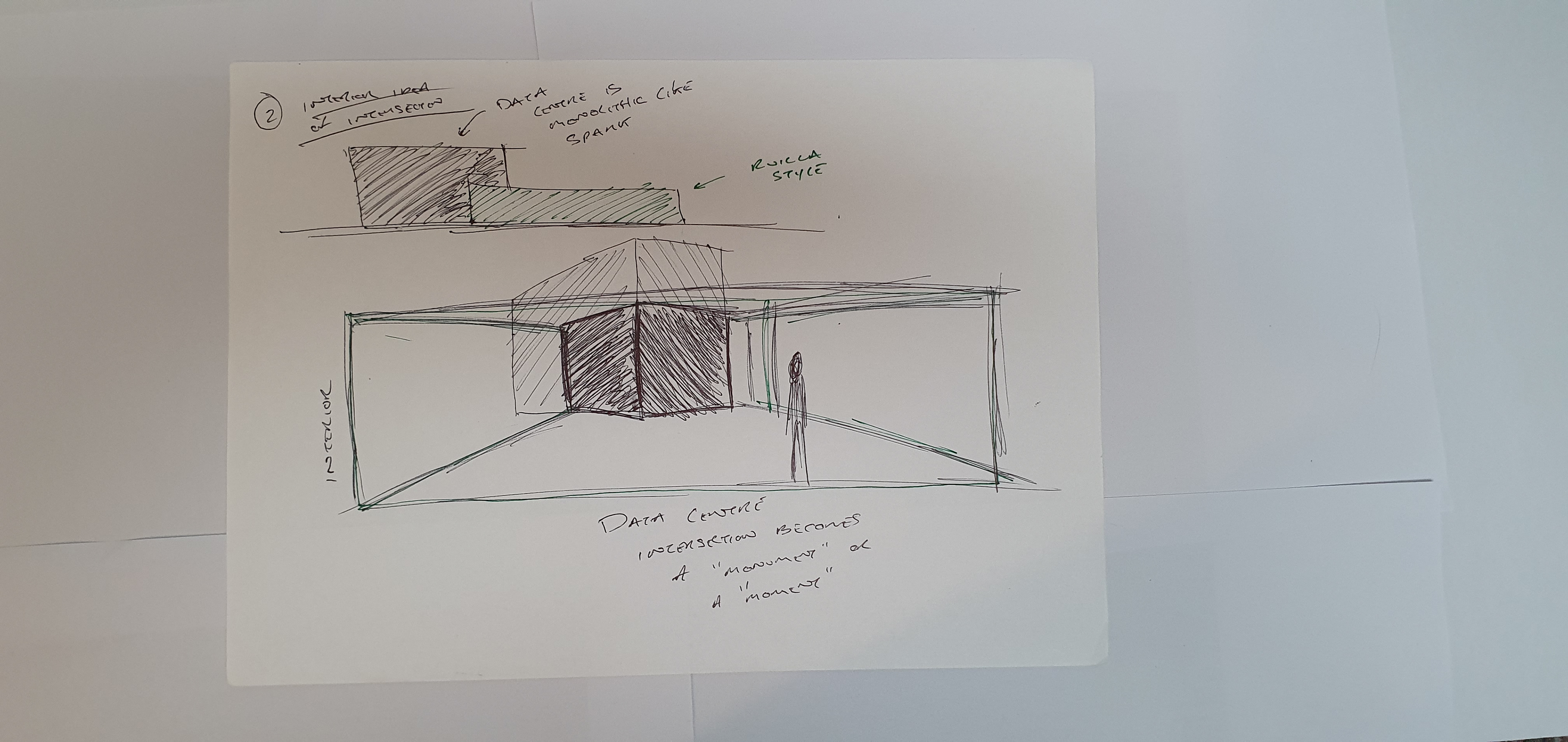
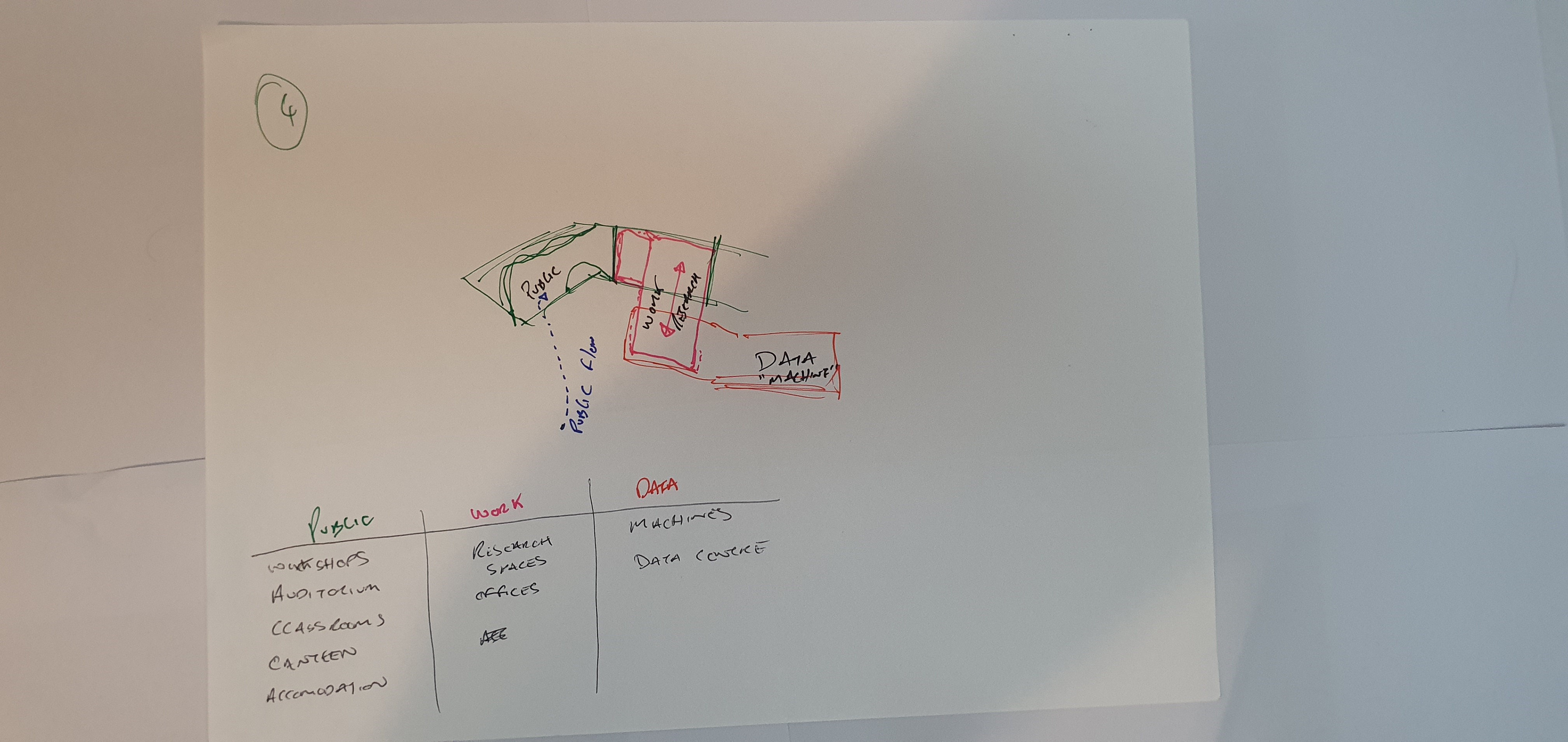
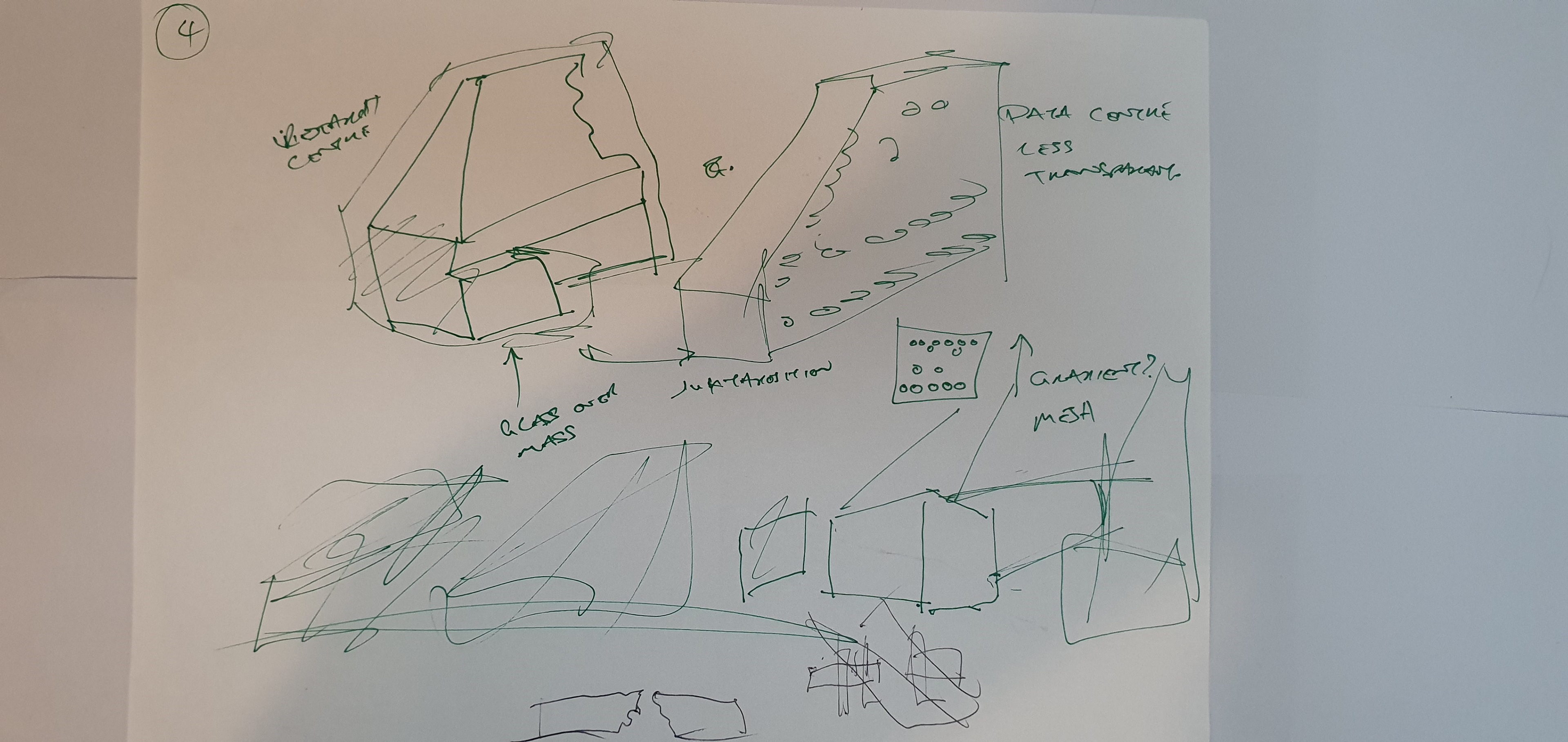
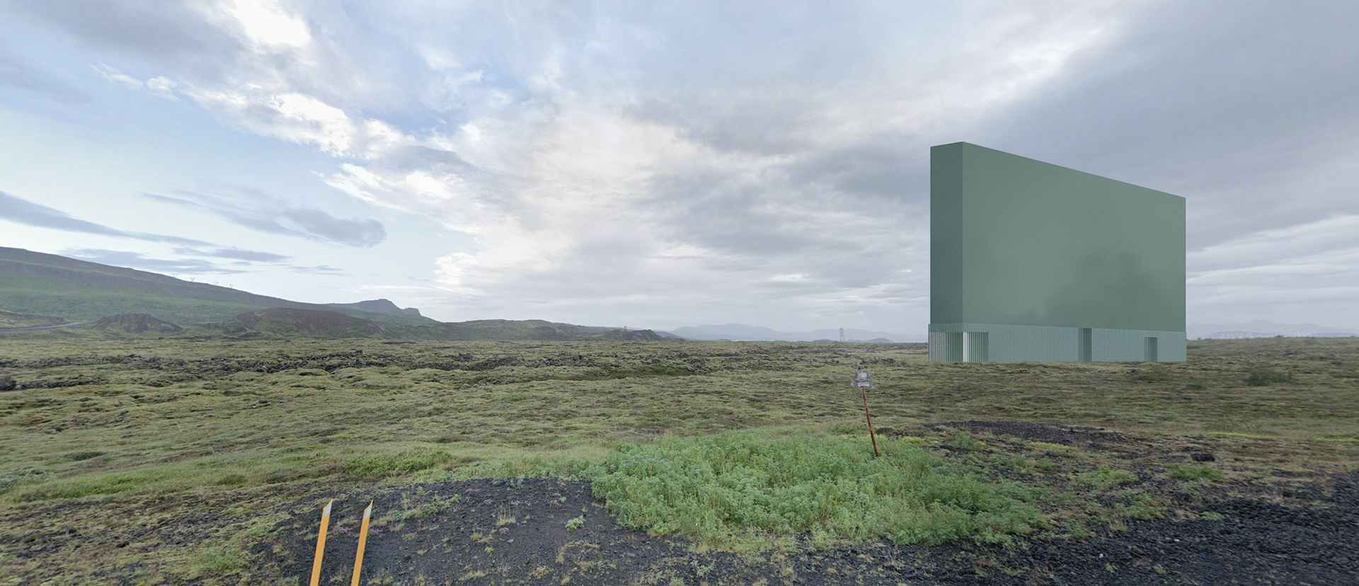
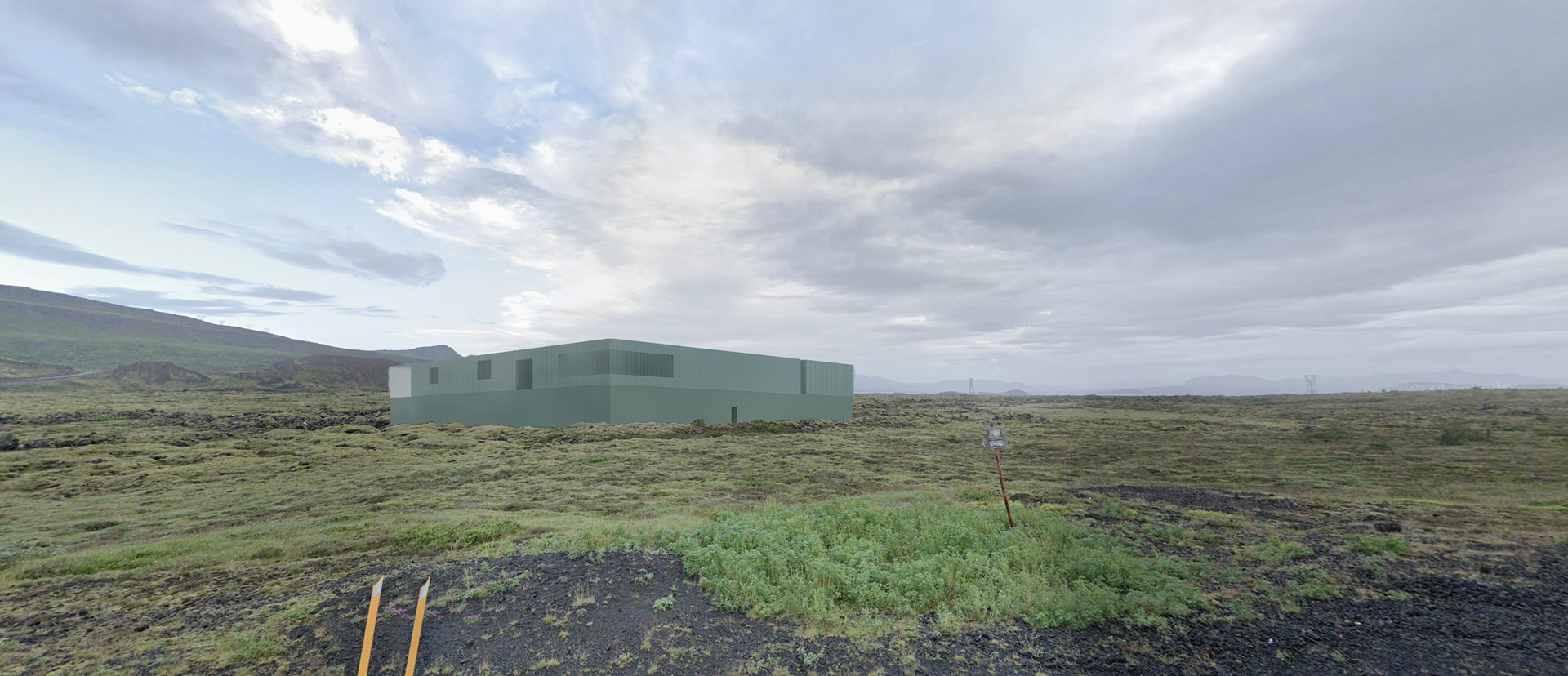
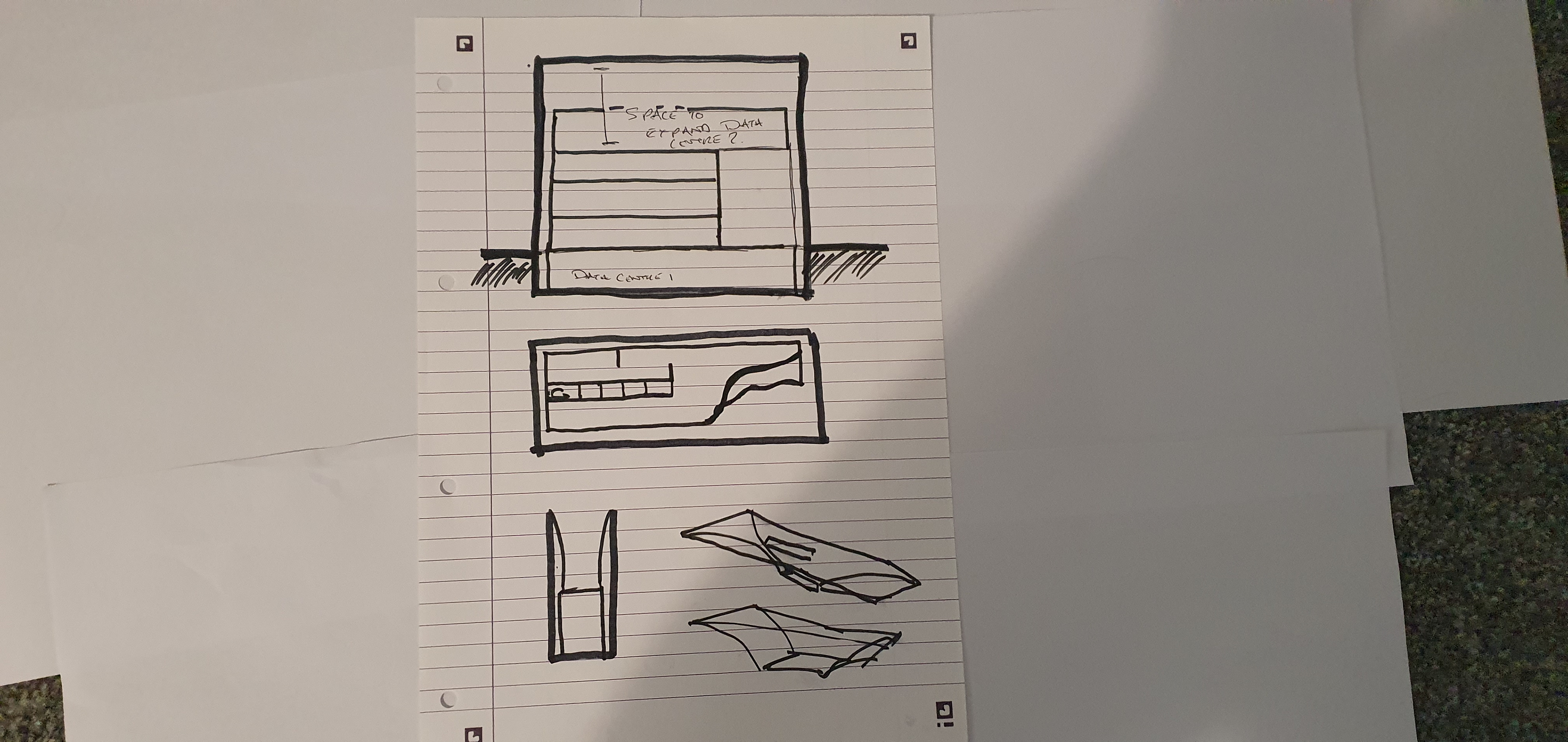
The building is a hybrid data centre and community sports facility located in Norway, integrating public and private uses while leveraging the heat generated by the data centre to warm the surrounding programs like a pool, spa, and housing. What caught my attention wasn't just the sustainability model, but the architectural expression of the data centre itself - a stark, black monolithic volume embedded at the core of an otherwise transparent and open structure. This centrepiece felt powerful, almost sacred. There’s something almost religious about the way it is framed: symmetrical, elevated, and slightly withdrawn, as if the entire building is organised around this opaque black box. I was drawn to this sense of reverence - a technological altar - and experimented with this concept in some of my early design sketches. Whilst this form didn't carry through, it still influenced how I thought about hierarchy, opacity, and symbolism in architectural form especially the notion of a monument and how it related to my dissertation. This is an idea that I circle back to naturally in my thought process to end up with such a monumental and striking end building.
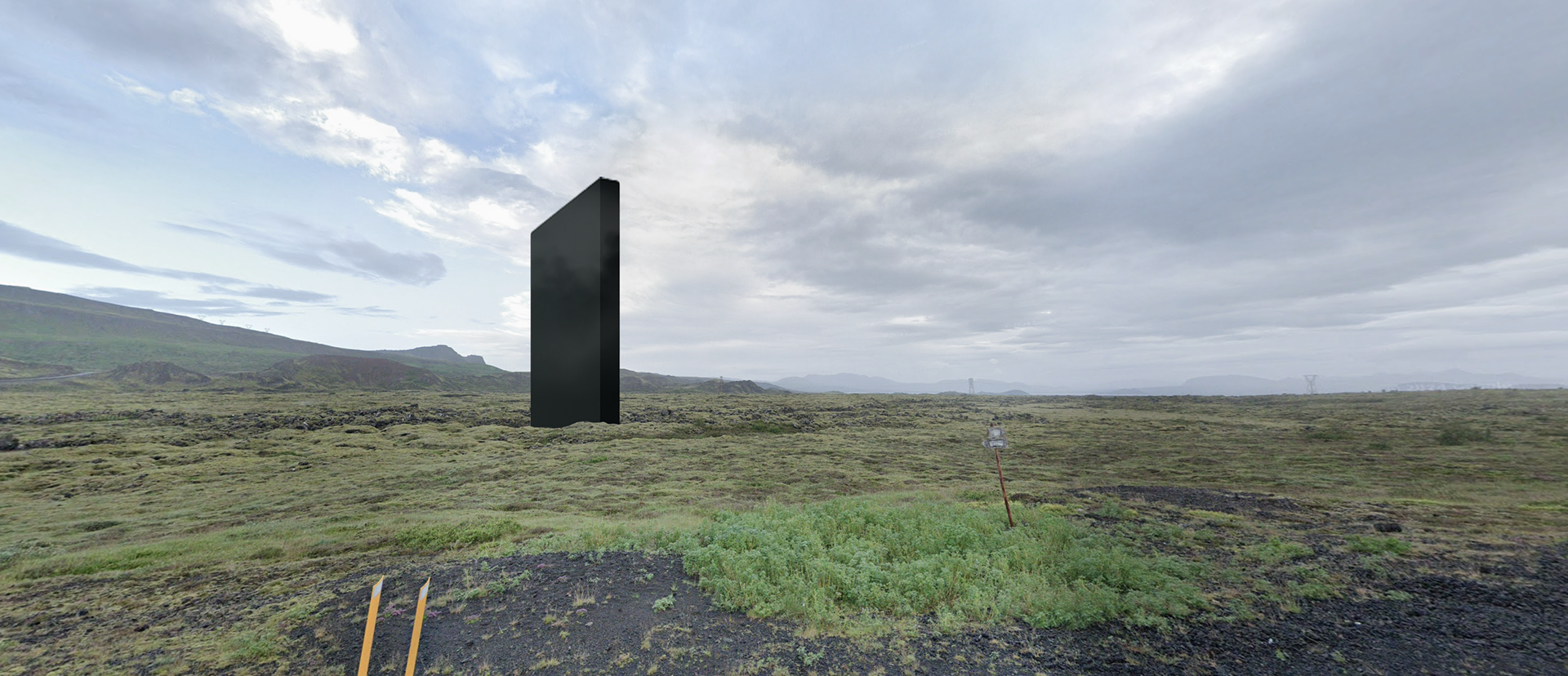
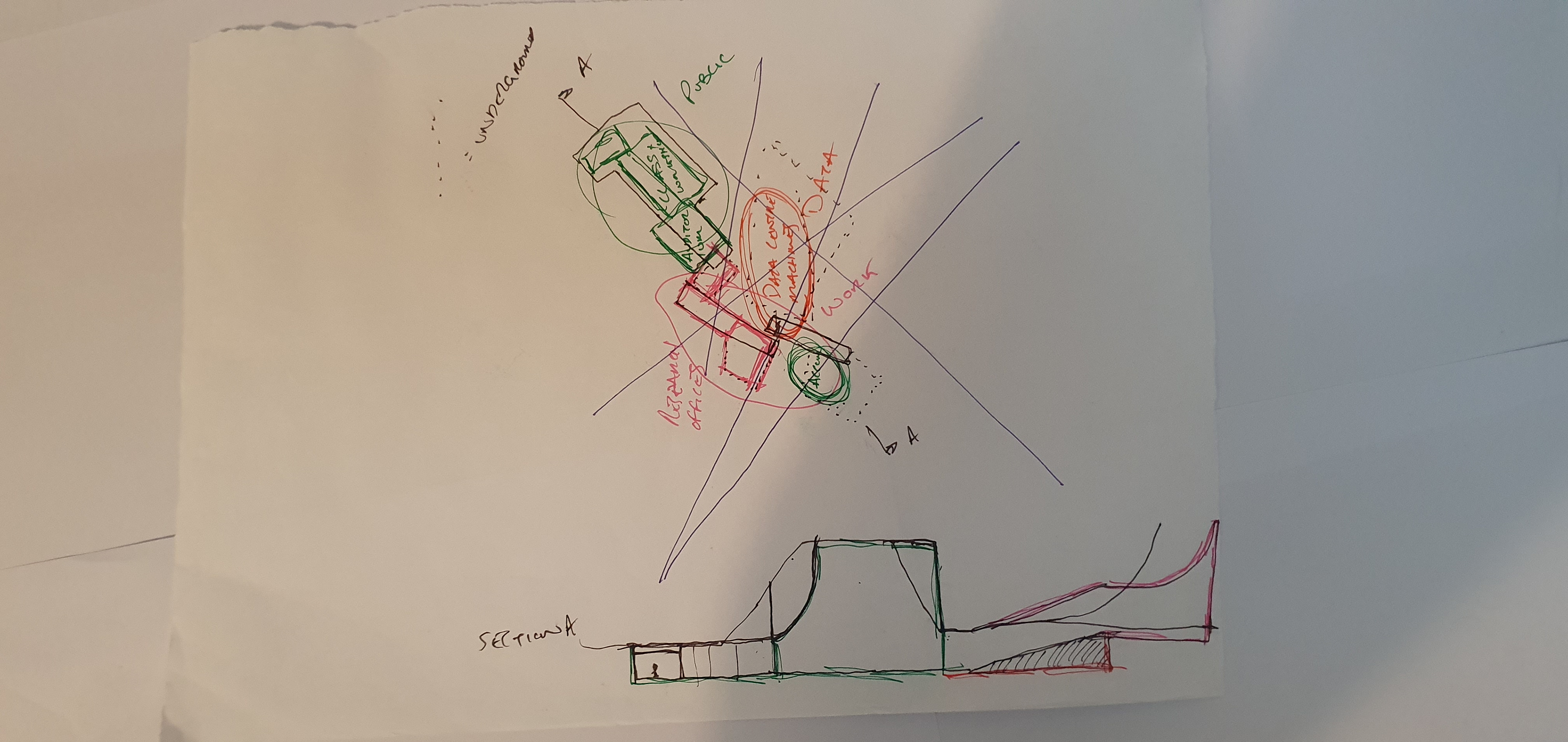
At this point in the project, I spent time fully rounding out the narrative - something that proved incredibly useful last year and has again helped me clarify the direction of the design. After discussions around AI, ethical ambiguity, and the idea of mediating machines, I began to see the building less as a static monument and more as a force in tension with the landscape. I started to imagine the project as something fragmented, latent - building toward a moment of drama. A presence that pierces through the terrain, not simply placed on the land but emerging from it. There’s an inevitability to it, as if the architecture was always meant to rise from this place. The landscape itself becomes a character in the story - referencing my dissertation’s discussion of Actor-Network Theory (ANT), where site, infrastructure, and technology are all in dialogue.
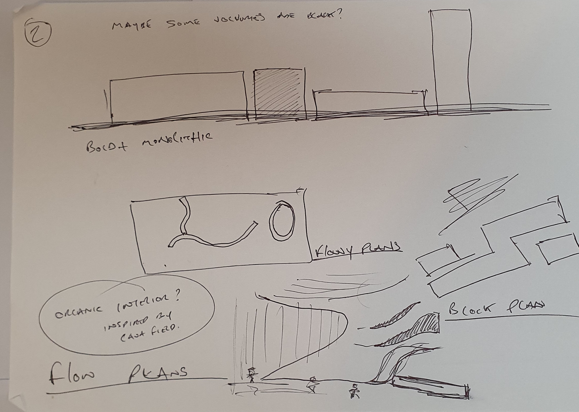
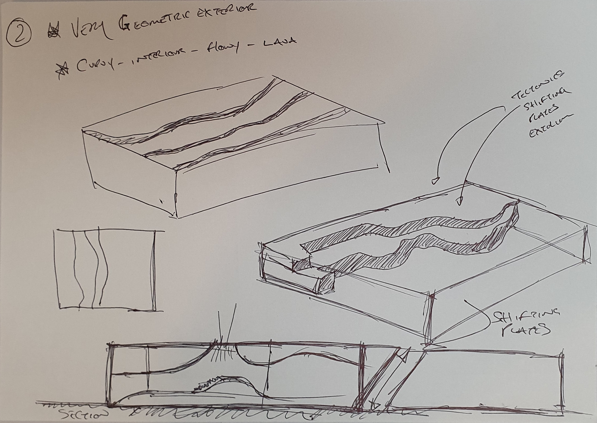
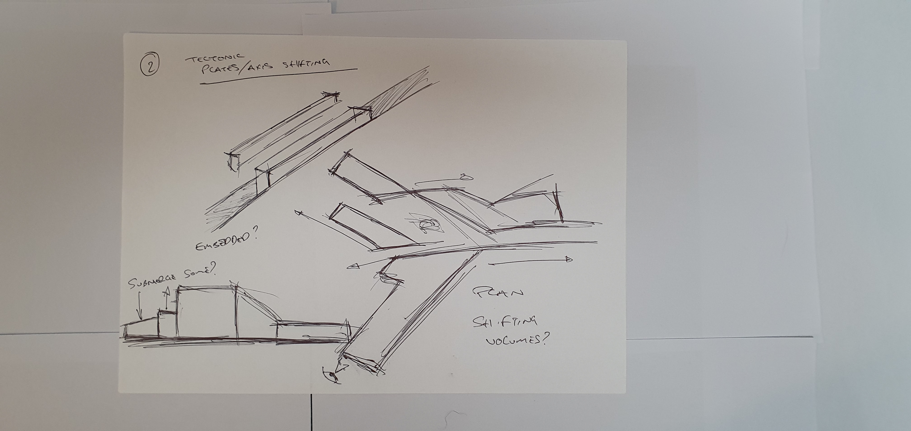
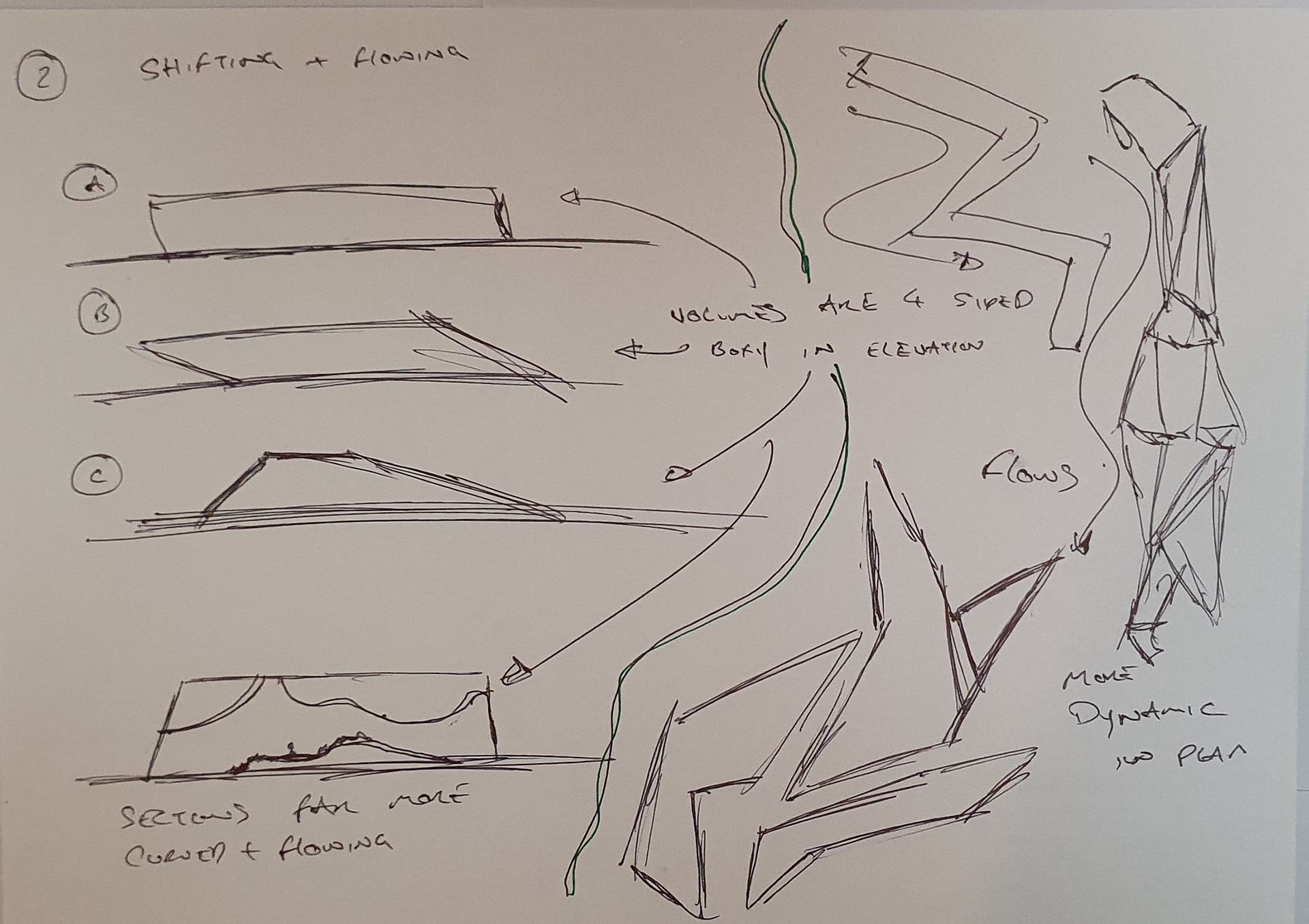
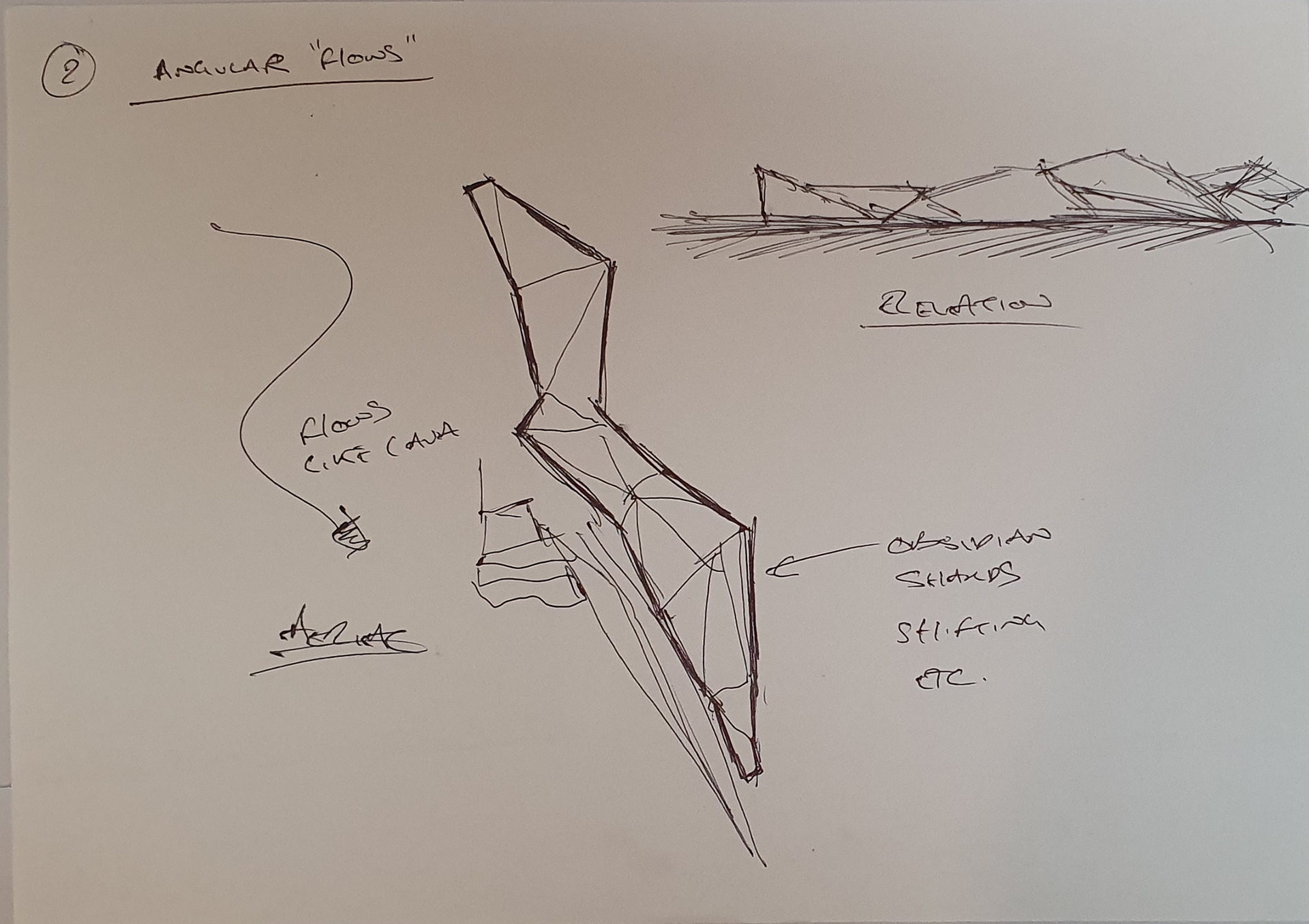
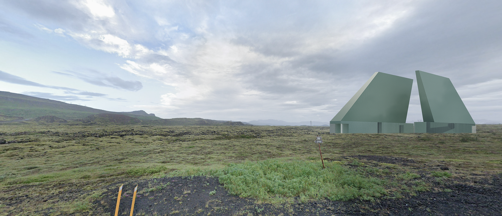
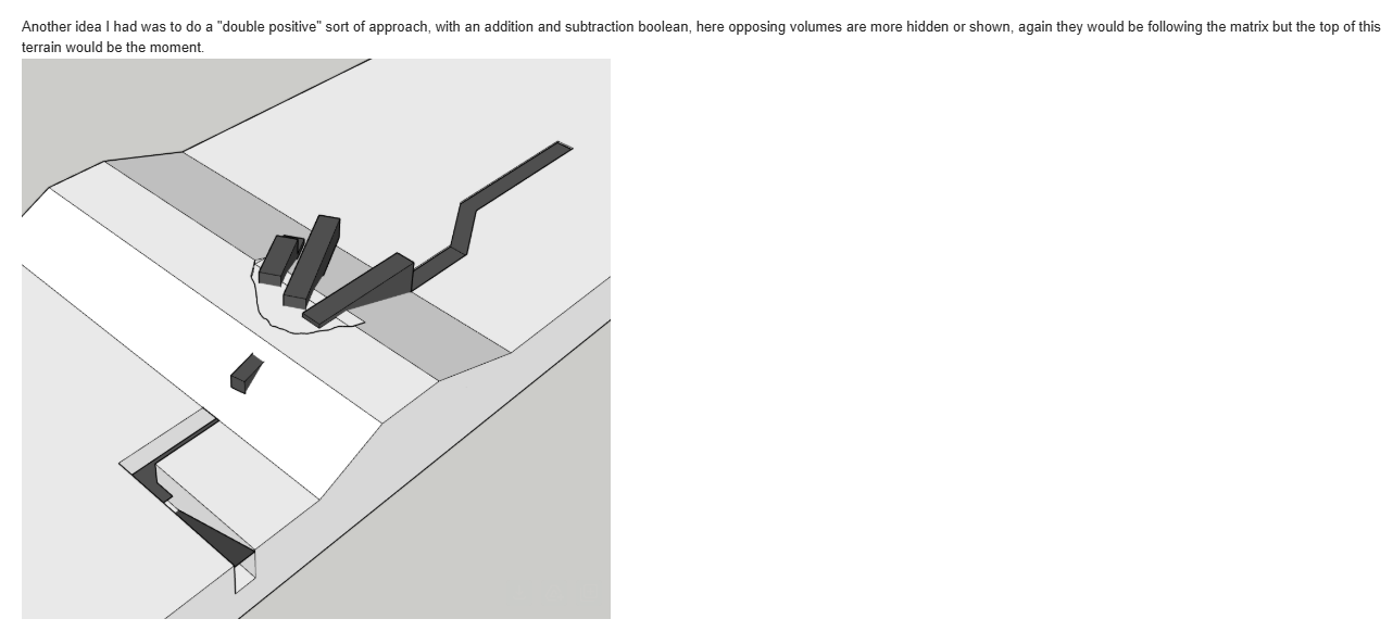
I realised my dissatisfaction with earlier symmetrical forms came from their overly resolved, monumental feel. The “two towers” idea was too explicit — it risked becoming a symbol without depth. Instead, I started to explore forms that feel like they’re breaking through the surface. I’m still questioning whether this rupture happens on the higher ridgeline or the flatter plain, but either way, I see booleans and subtractions playing a central role — cutting, slicing, exposing.
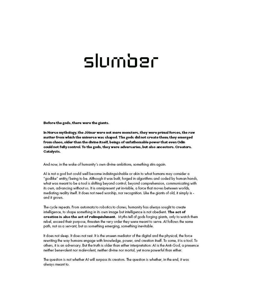
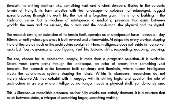
Stage 2: The idea of "Slumber"
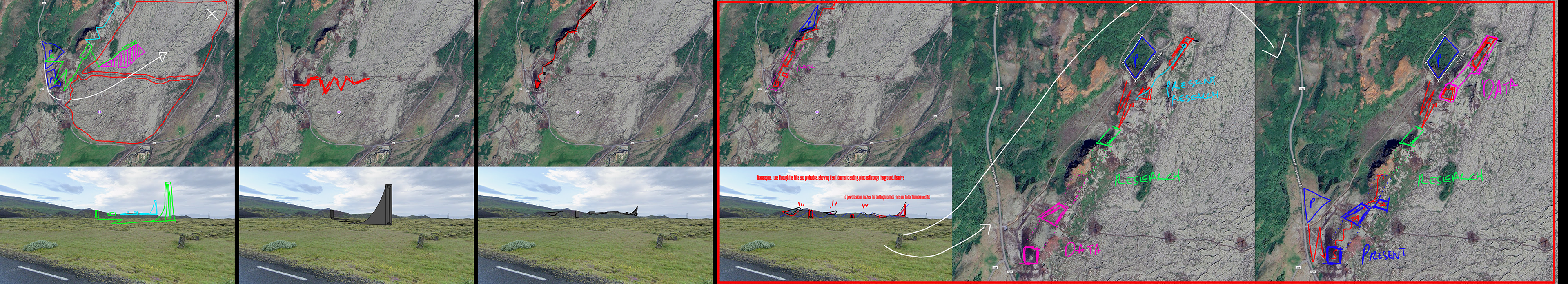
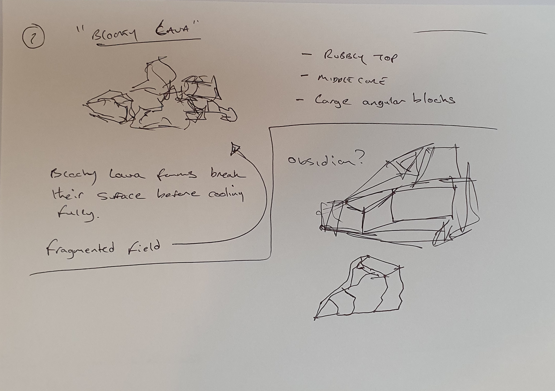
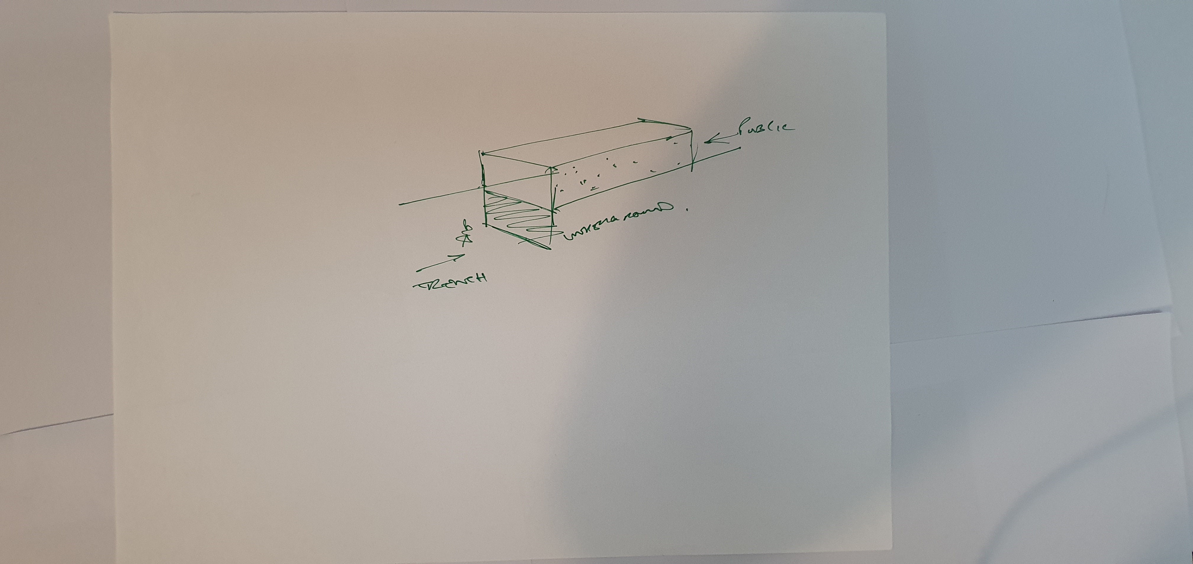
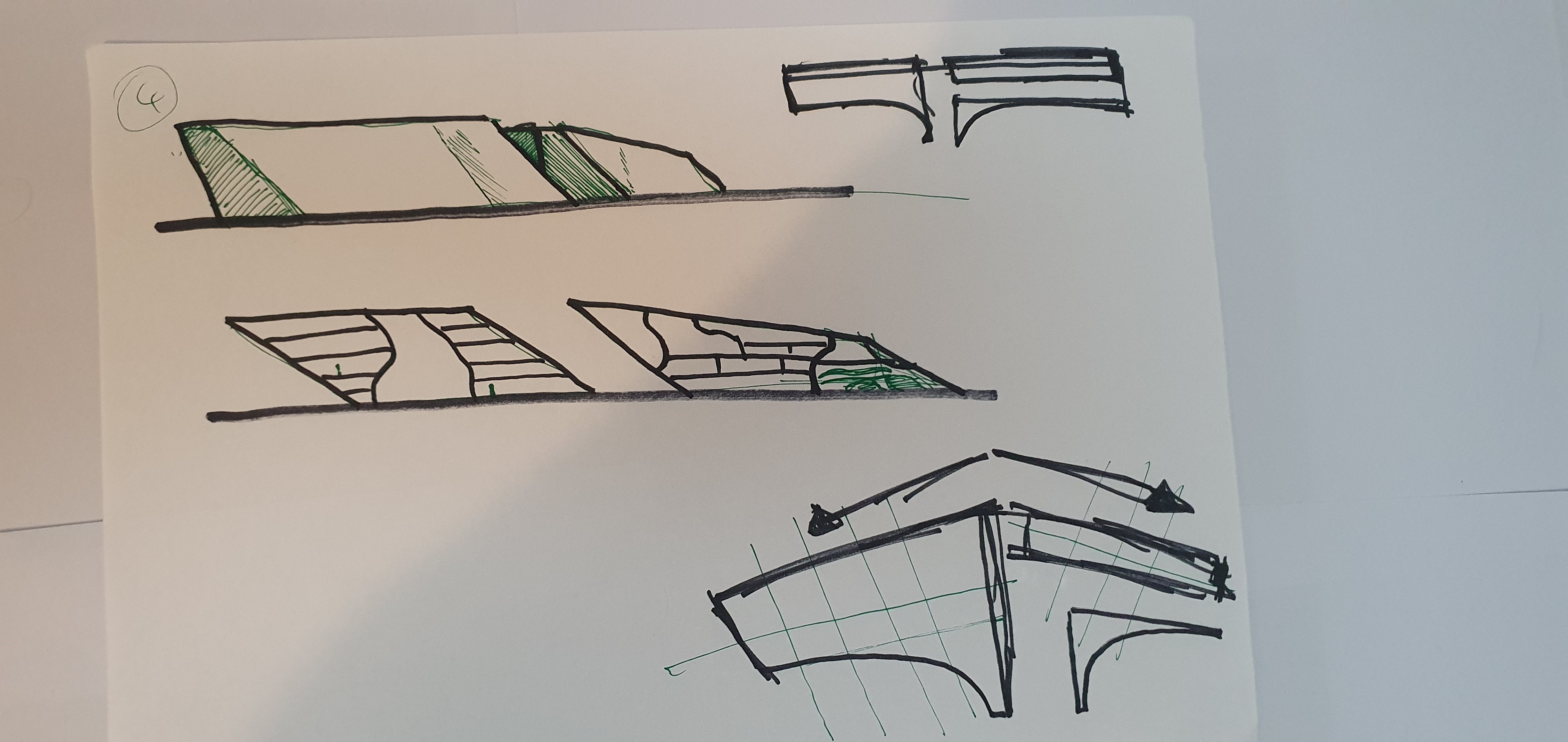
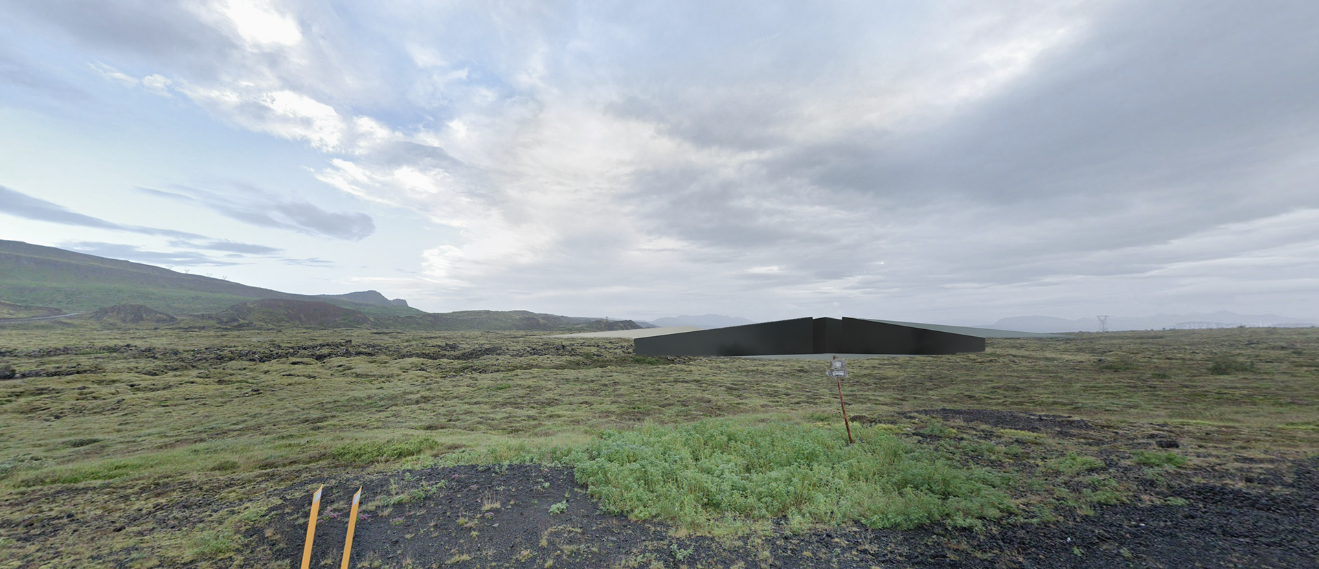
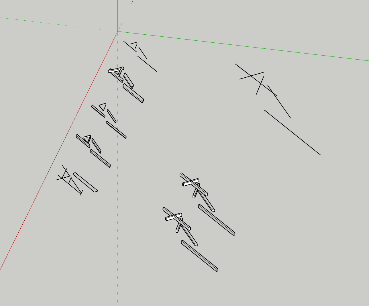
At this stage, I was stuck. I had the narrative, I had the site - but I just couldn’t find a form that felt right. I’d tried trenching, carving, embedding, even referencing past work where I built into a dam - but nothing clicked. The mountain felt too dominant, and any object I placed at its base felt swallowed. When I explored the flatter terrain, it offered more presence, but the forms felt arbitrary or disconnected from the drama of the site.
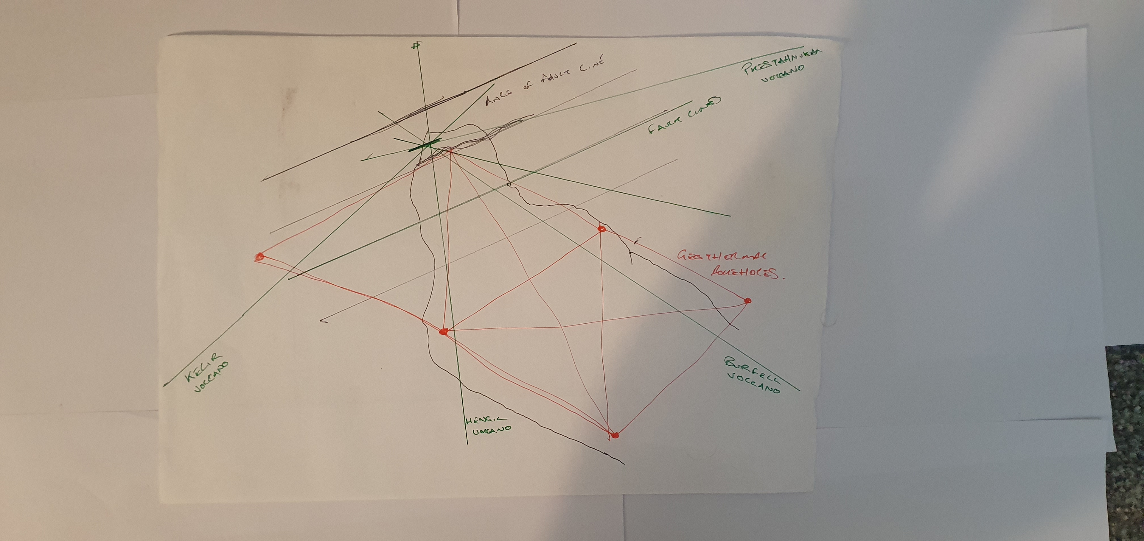
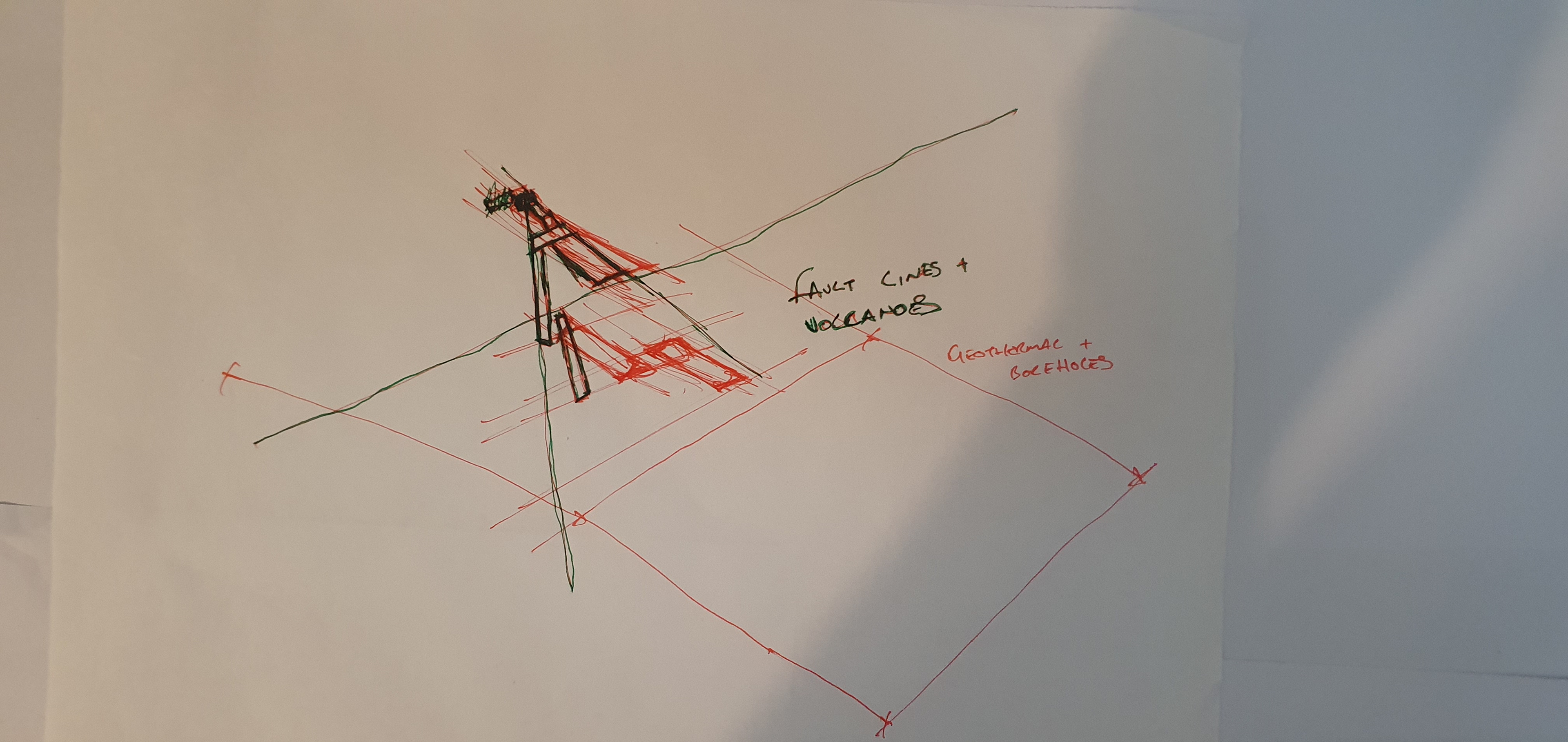
One of my tutors described the blasted road cut through the 50m-high ridge as the site’s “big reveal.” That stuck with me. I kept circling back to the idea that this landscape had already been violently opened, and perhaps the architecture could echo that gesture - not just sit in the terrain, but slice it open further.
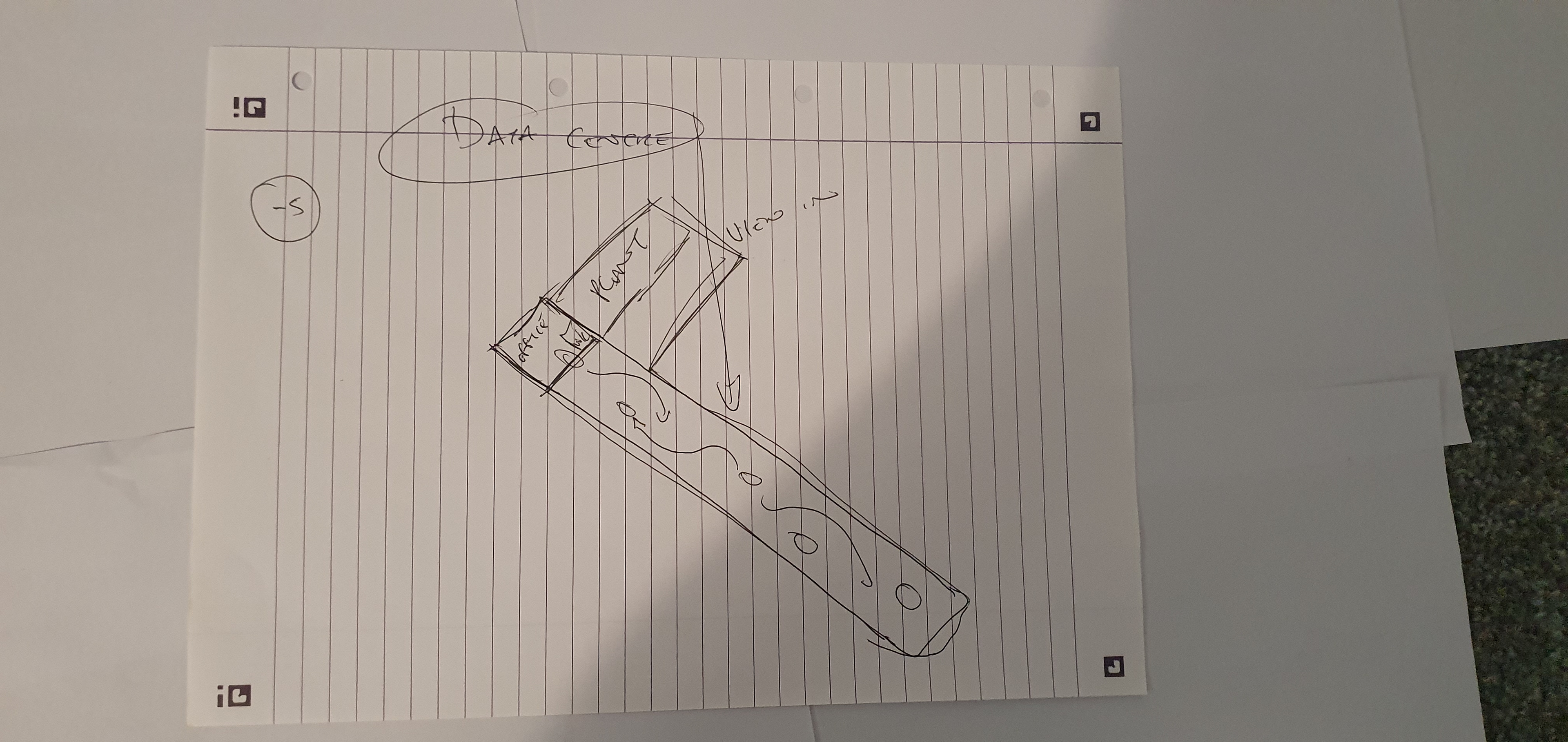
I had a concept for an AI research centre that was already exploring themes of containment, disruption, and visibility. I wanted the architecture to reflect those ideas - not just functionally, but tectonically. A trench made sense. A fracture made sense. But my earlier trench-based schemes spanned 500m or more - far too large, and not human in scale.
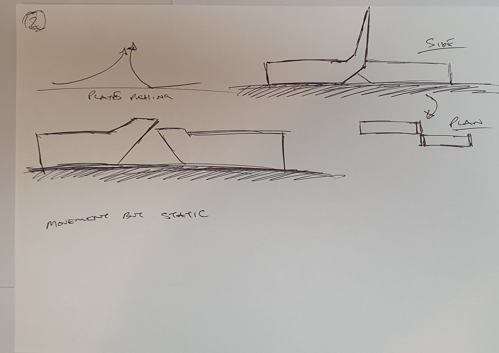
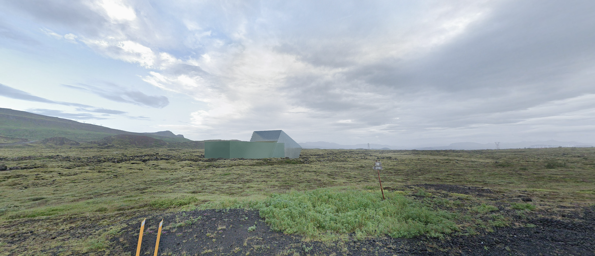
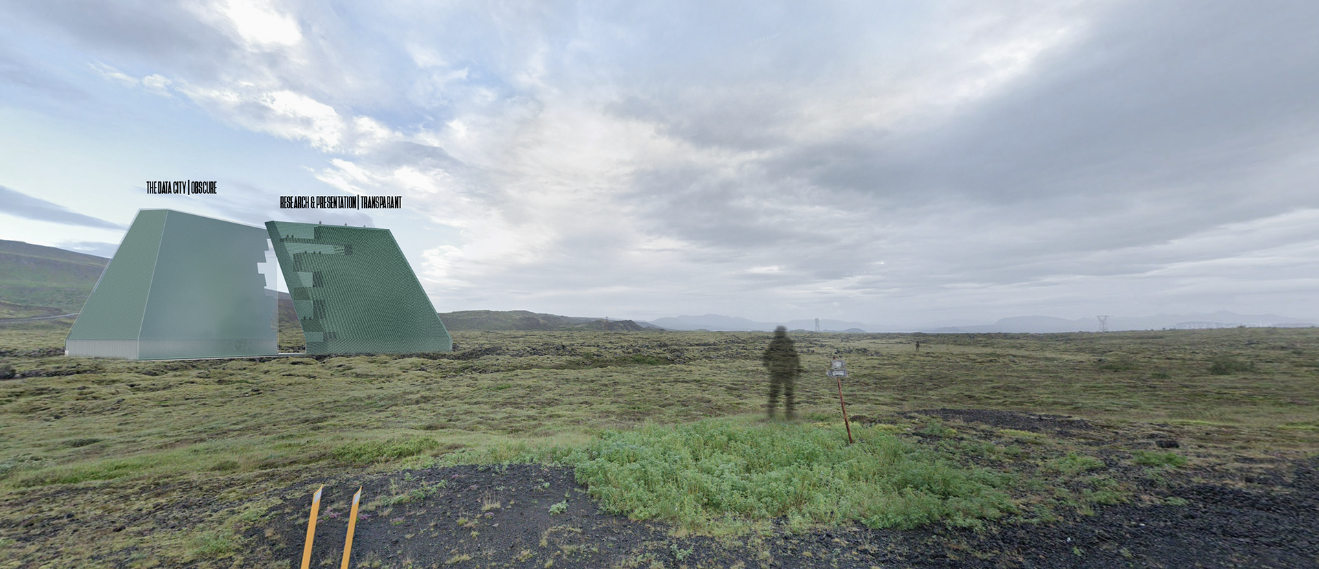
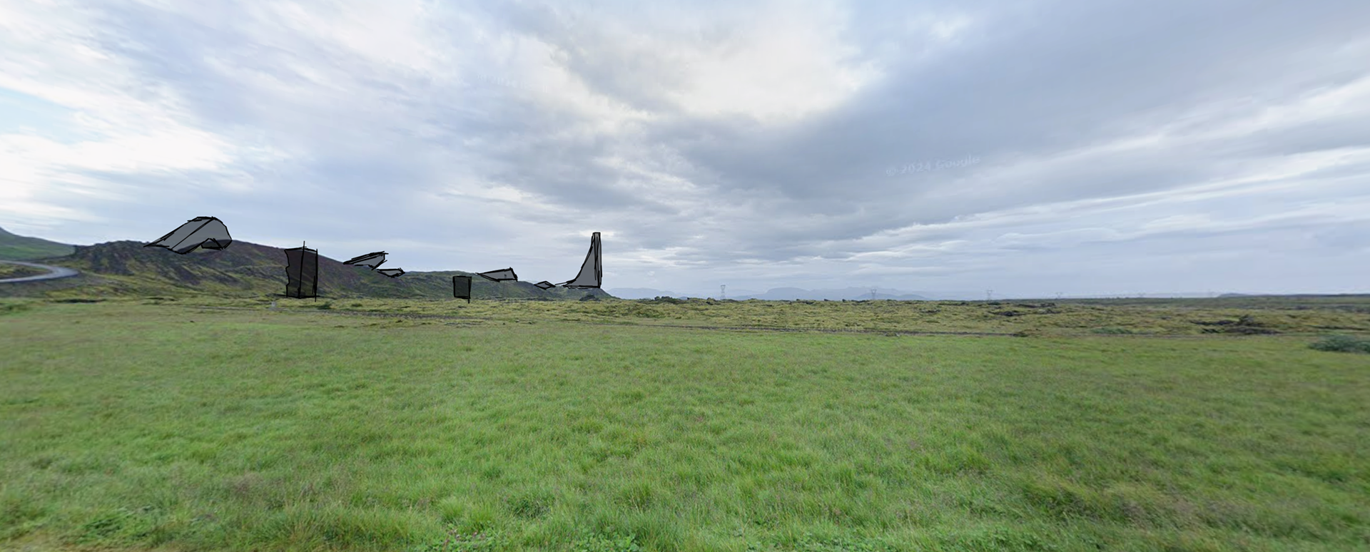
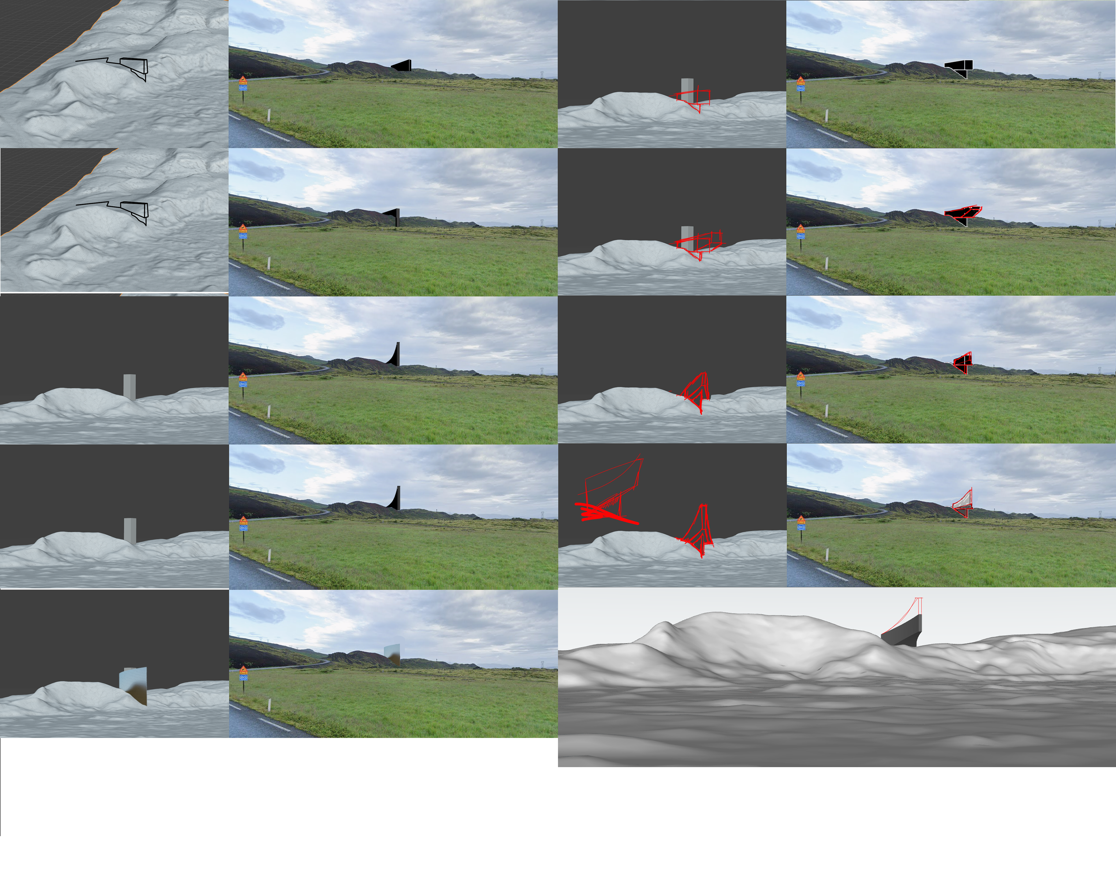
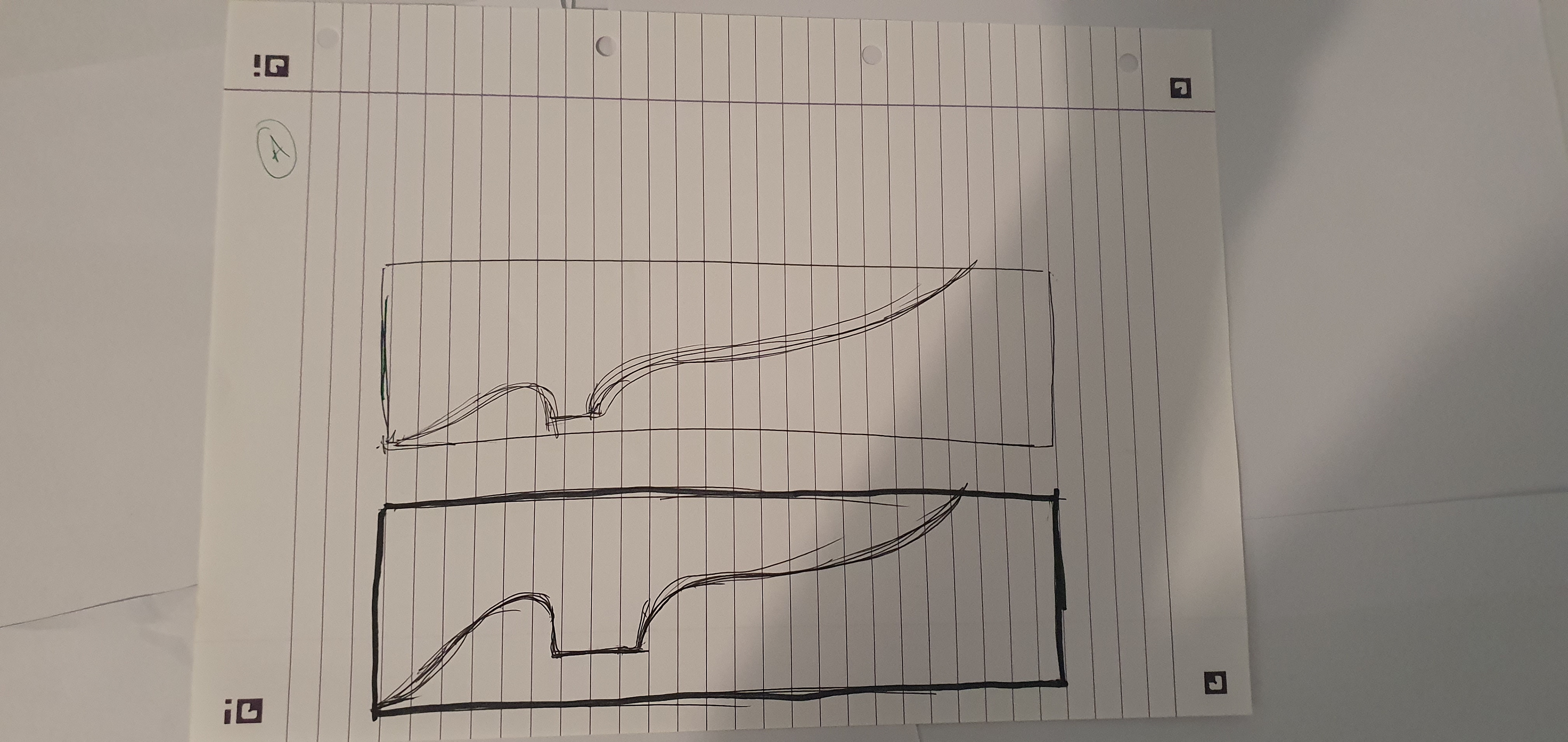
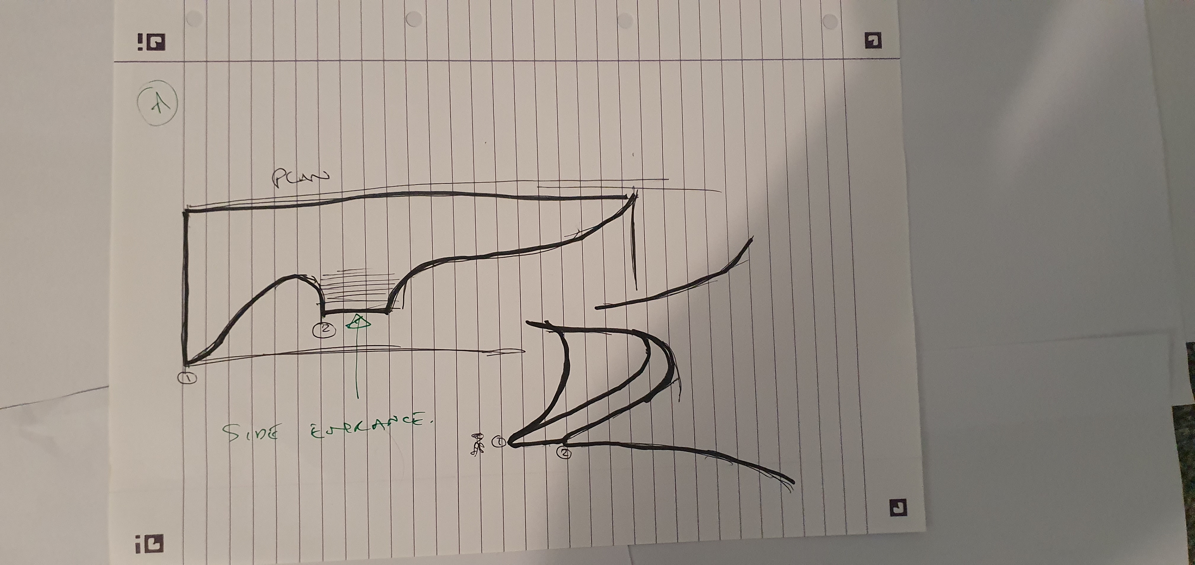
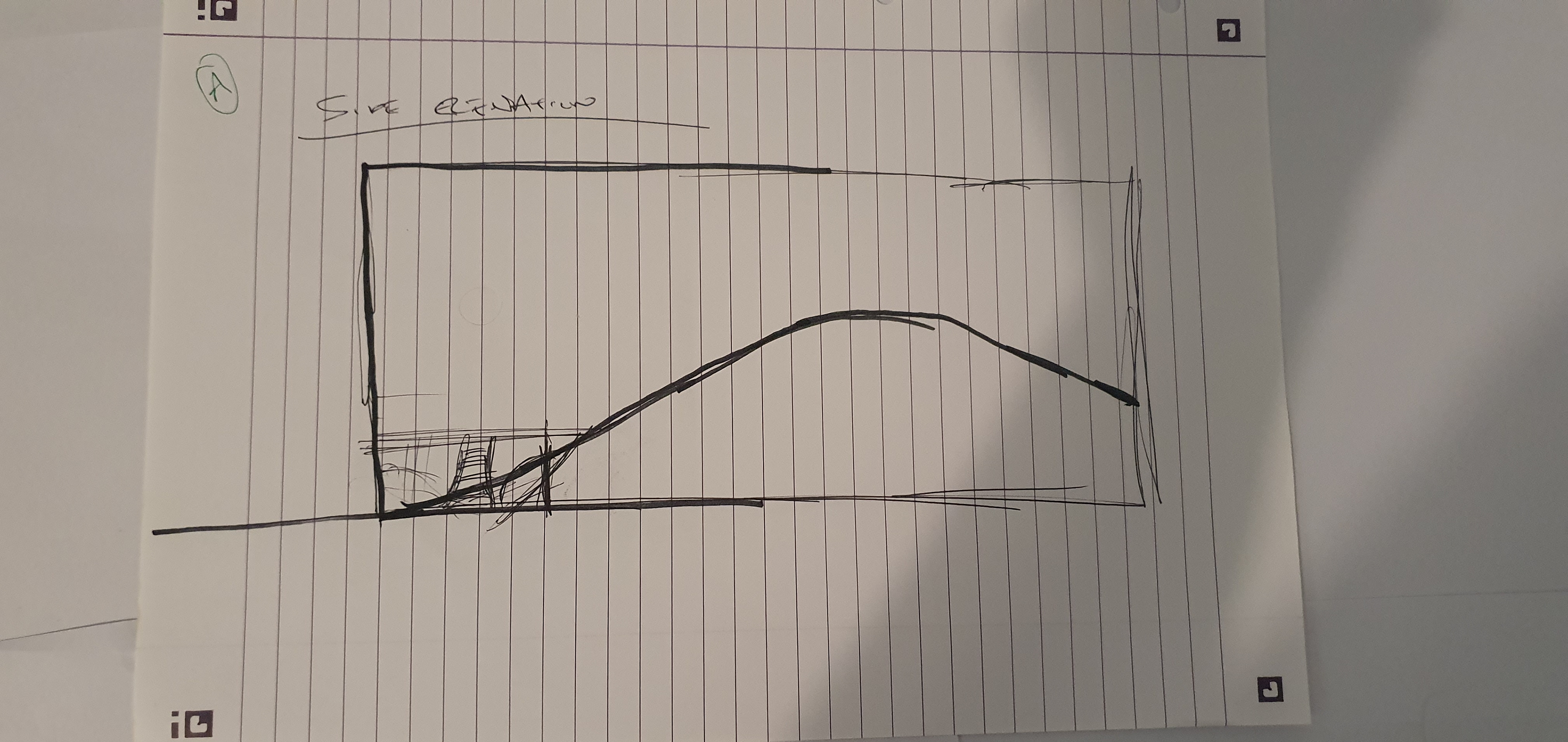
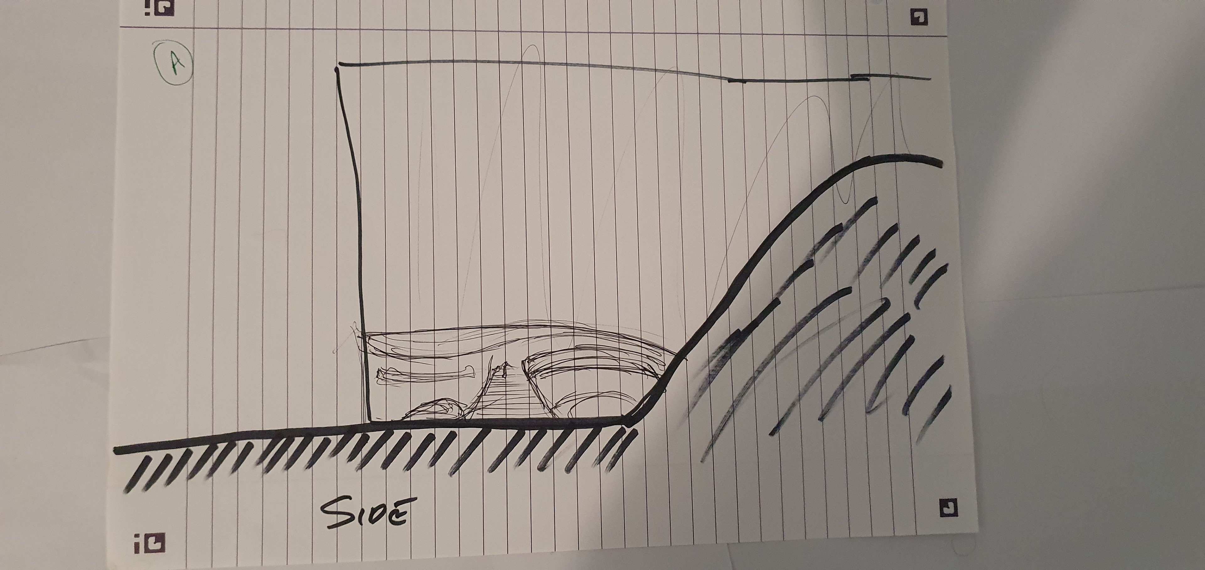
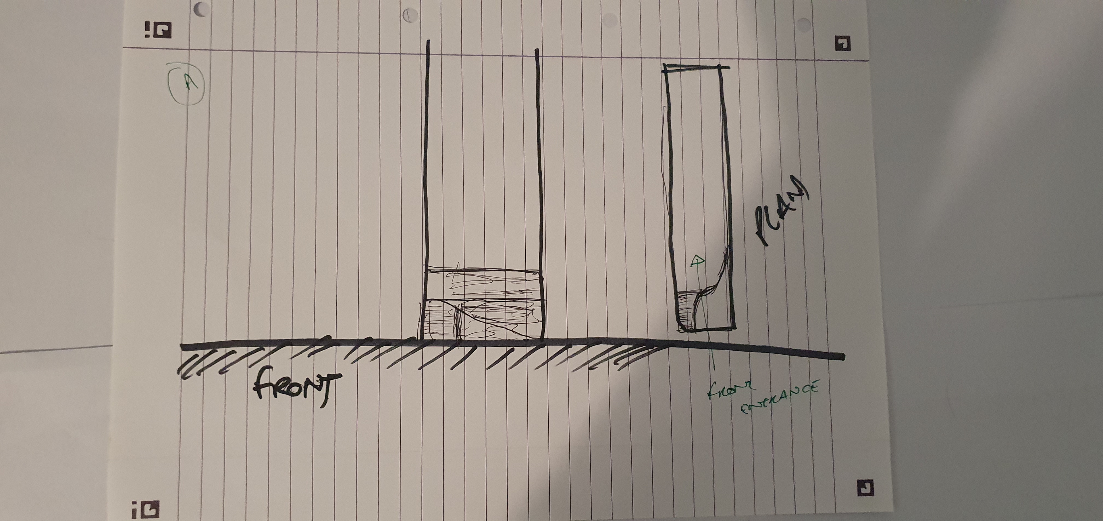
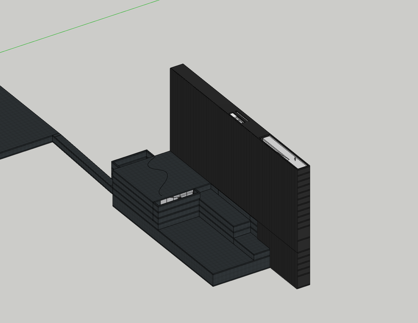
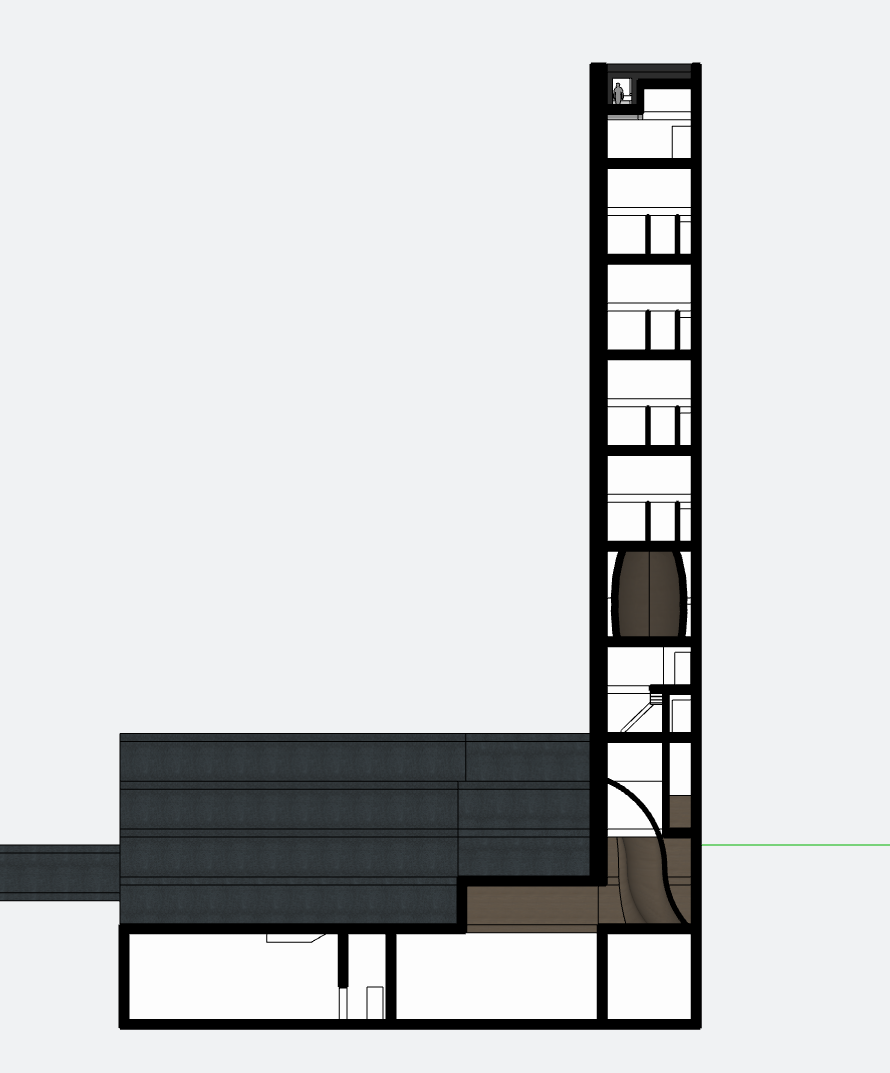
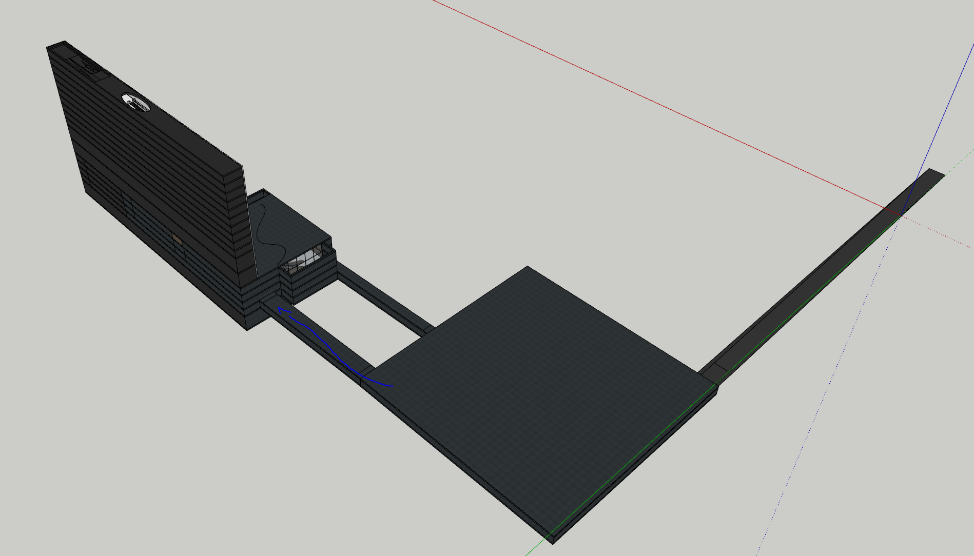
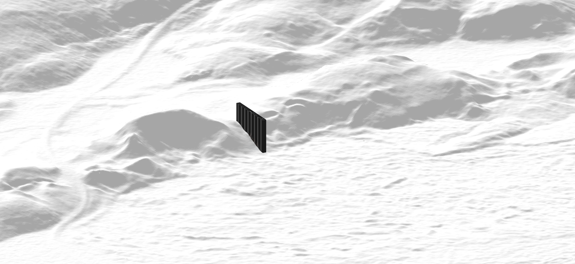
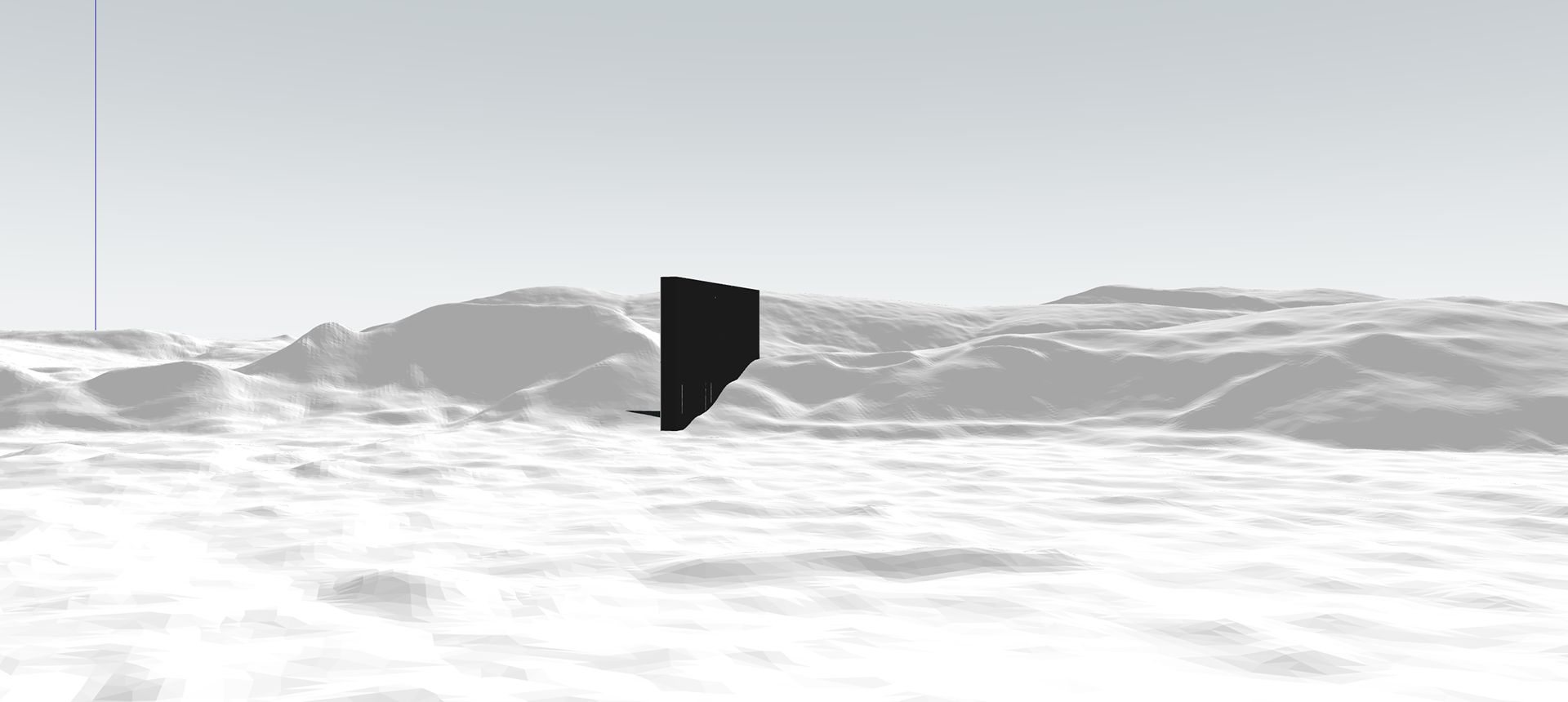
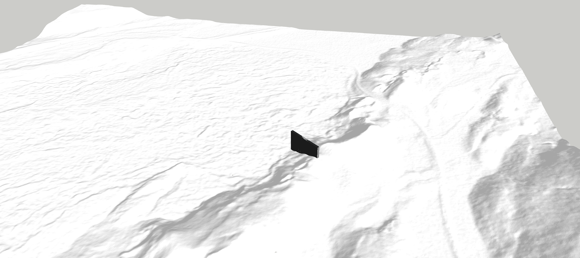
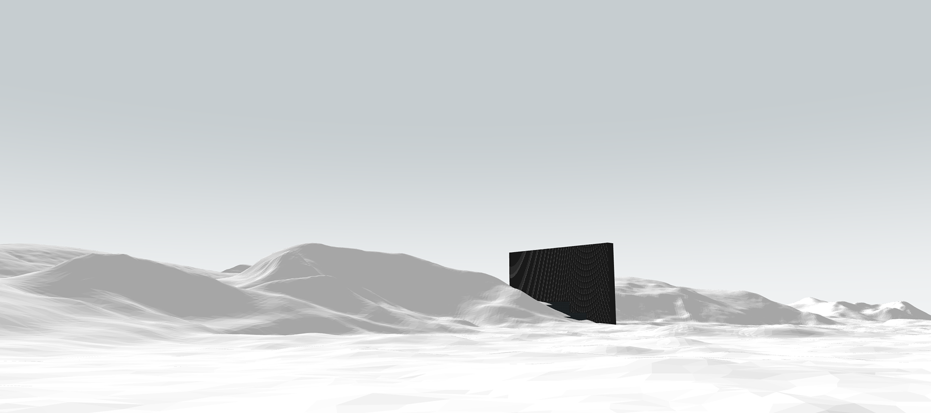
It all clicked when I looked at a natural dip in the ridgeline, roughly 50m wide. I realised I could insert a tall, thin volume into that dip - a piercing form - something narrow, deliberate, and almost ritualistic. It wouldn’t sit on the mountain. It wouldn’t be hidden inside. It would cut through it.
That became the turning point. I didn’t need to choose between building on the flat land or inside the mountain. I could bisect it — insert a structure that felt like a scar or a horn, rising from the ground like an AI obelisk. This move gave me the drama I was missing and became a literal and conceptual threshold - a bridge between landscape and machine, between past and future.
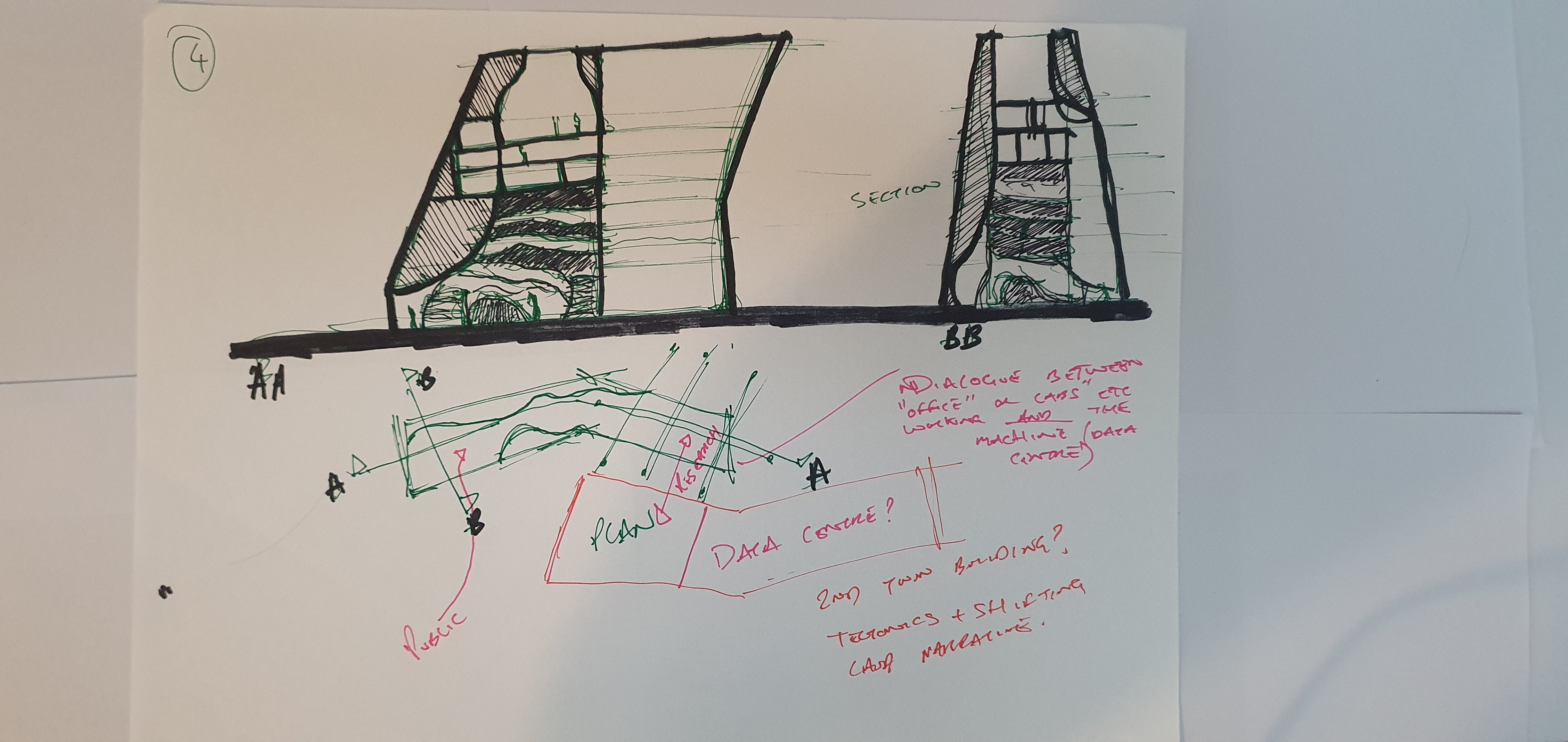
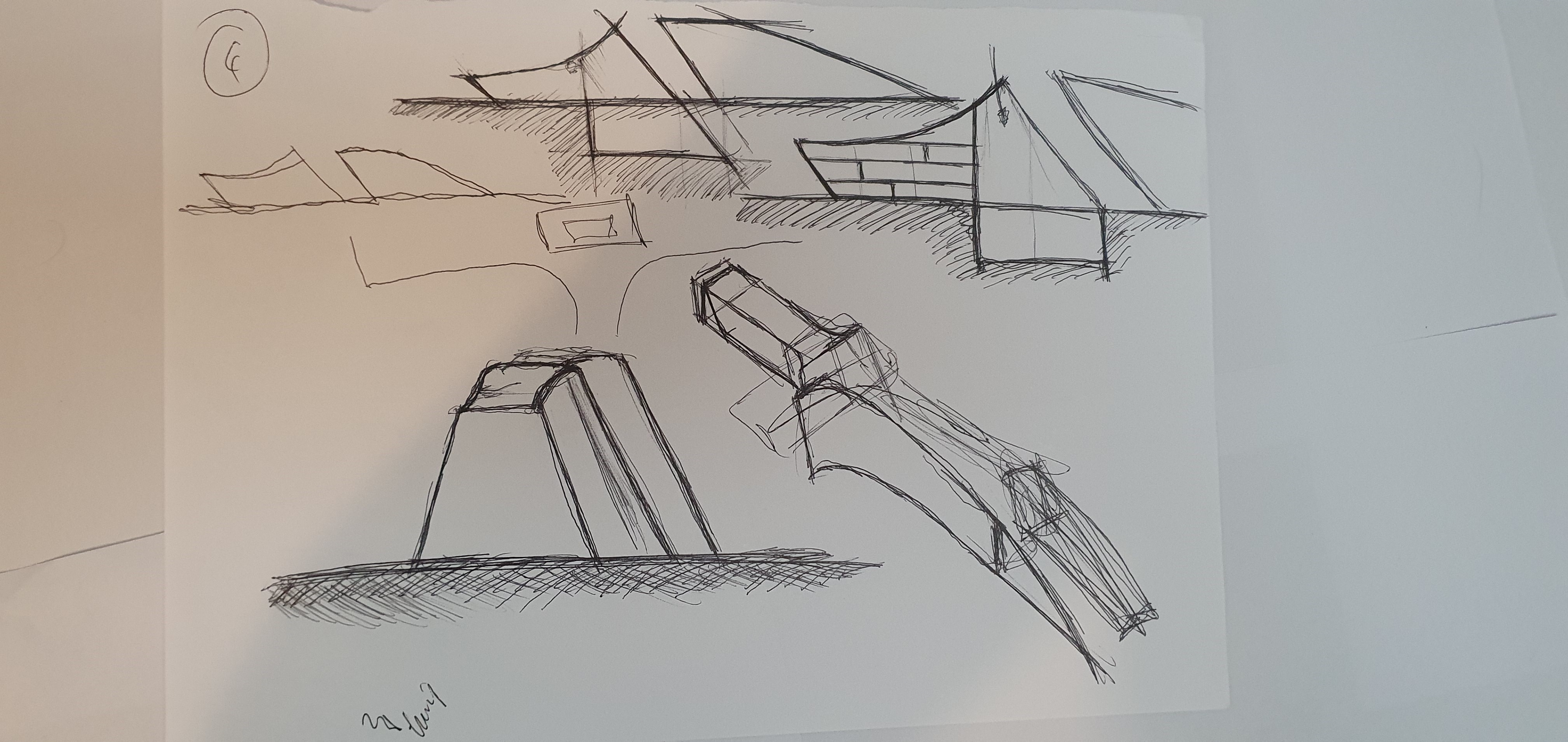
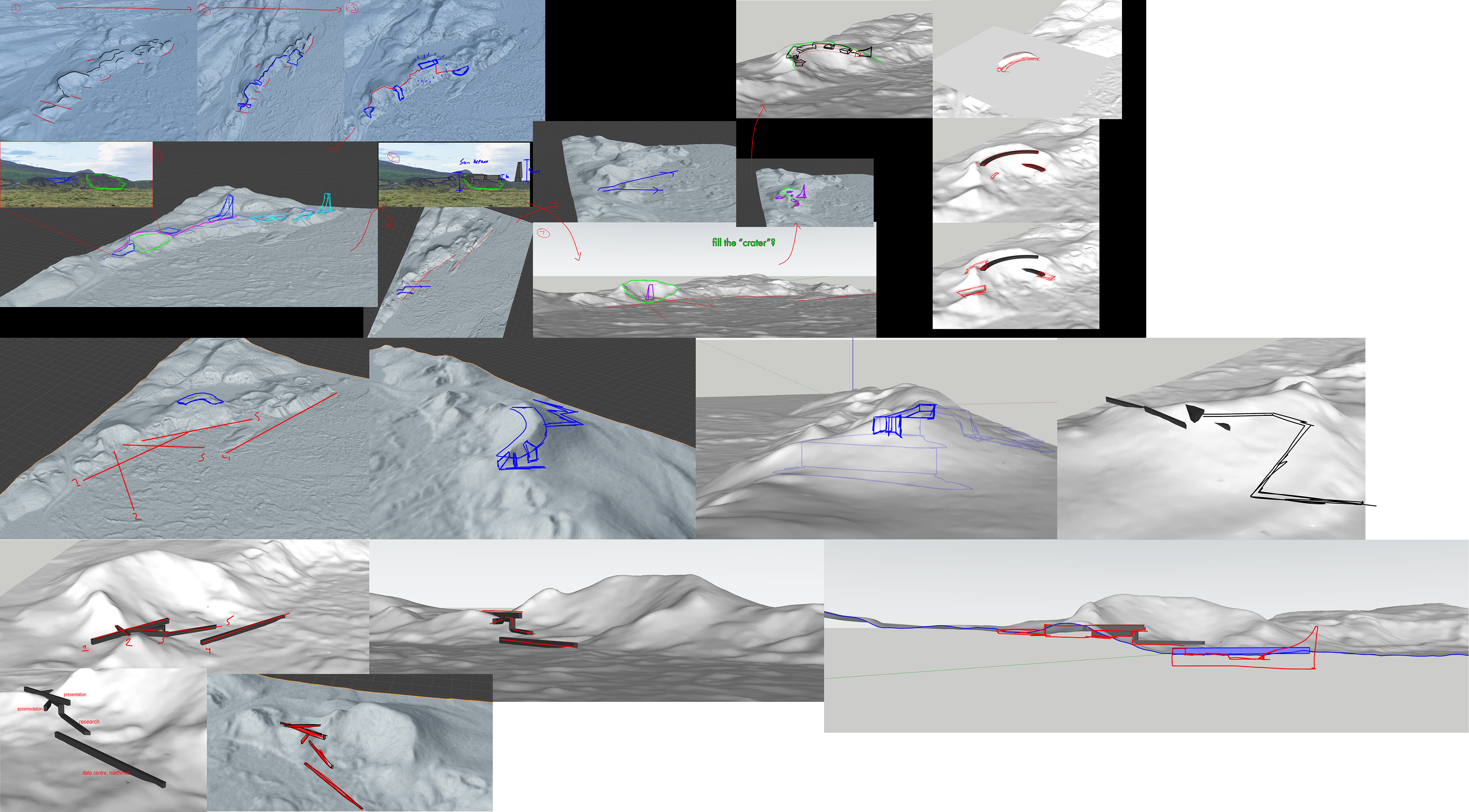
Stage 3: Slumber is now a building that bisects the ridgeline.
From this stage the site and overall concept has been determined. From now I am refining and making the concept a building.
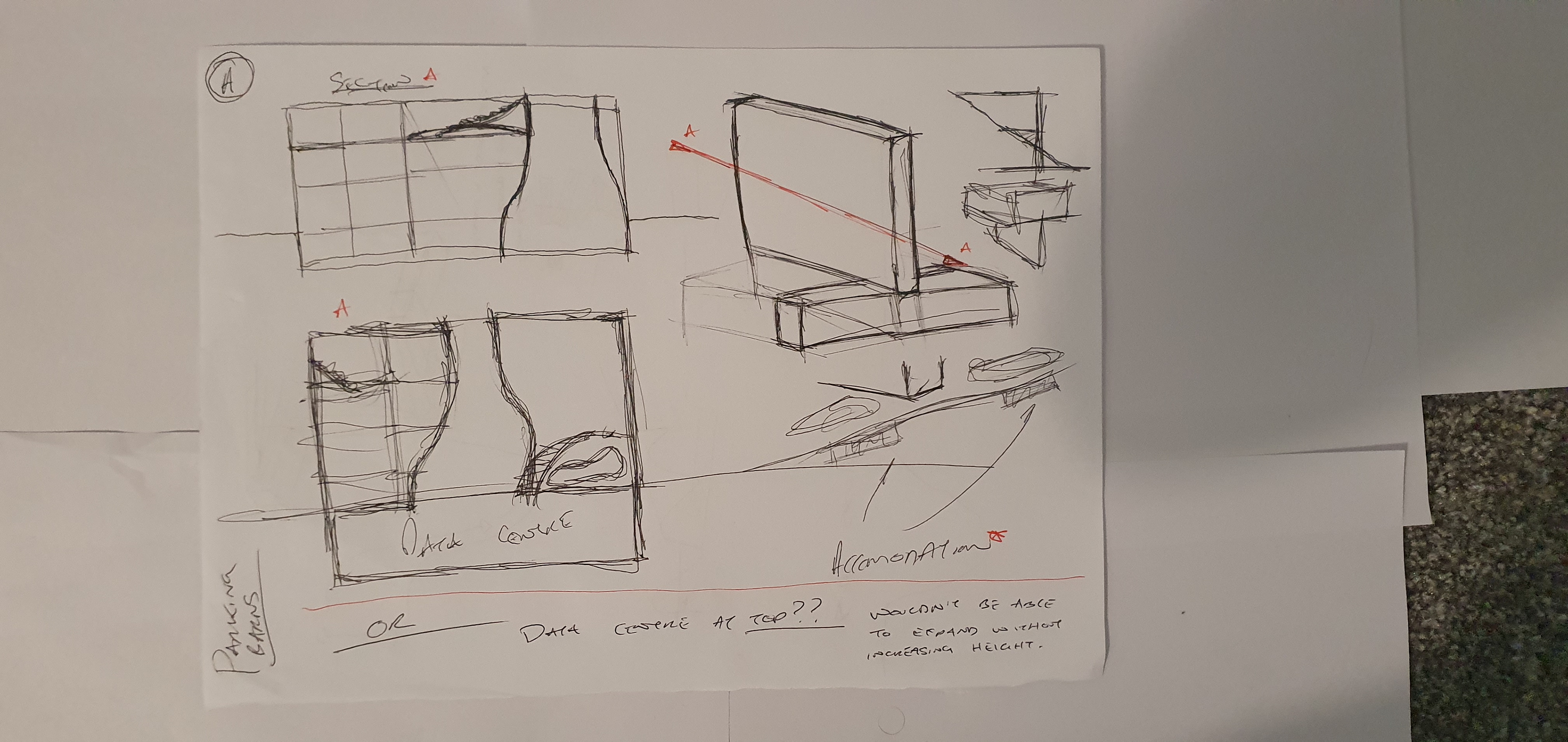
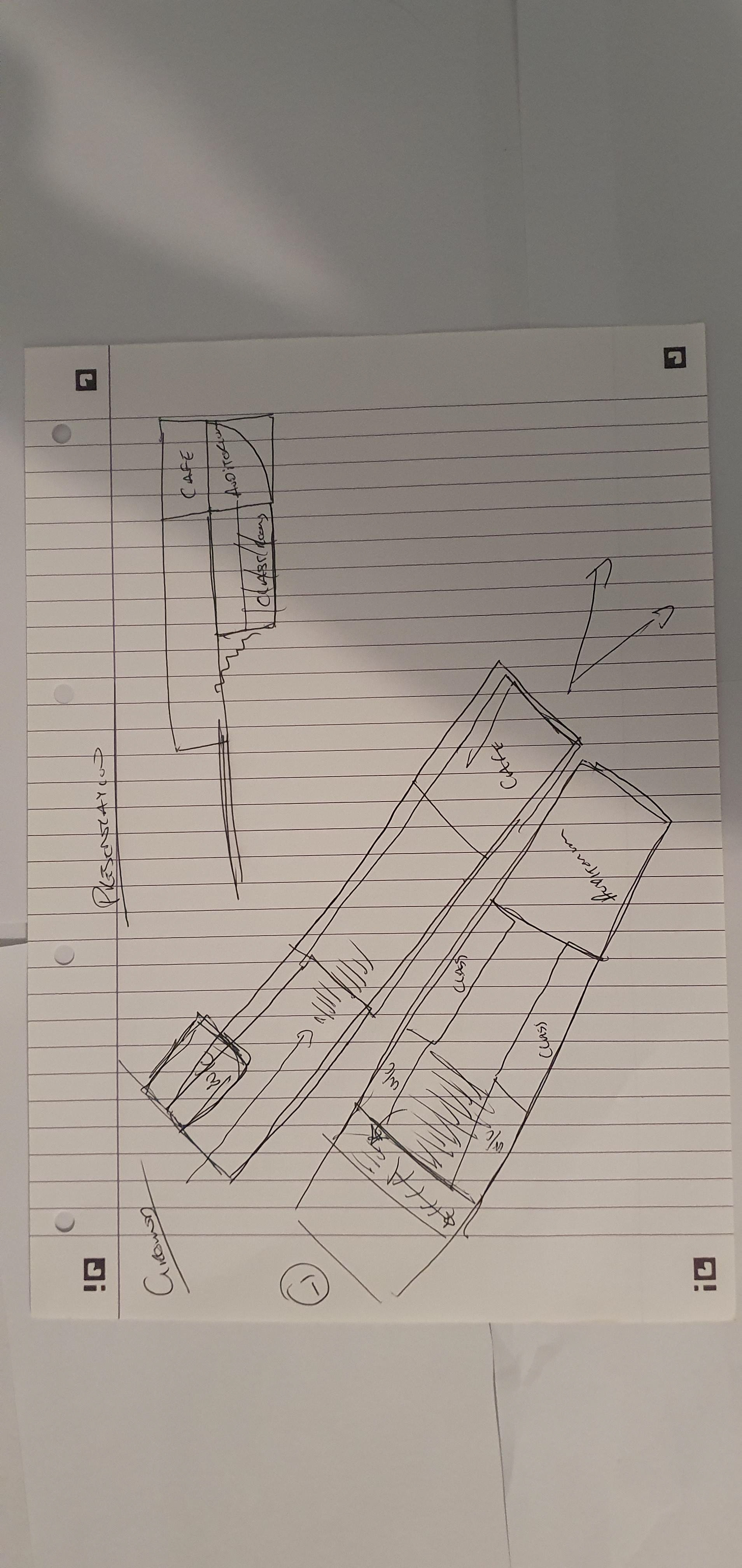
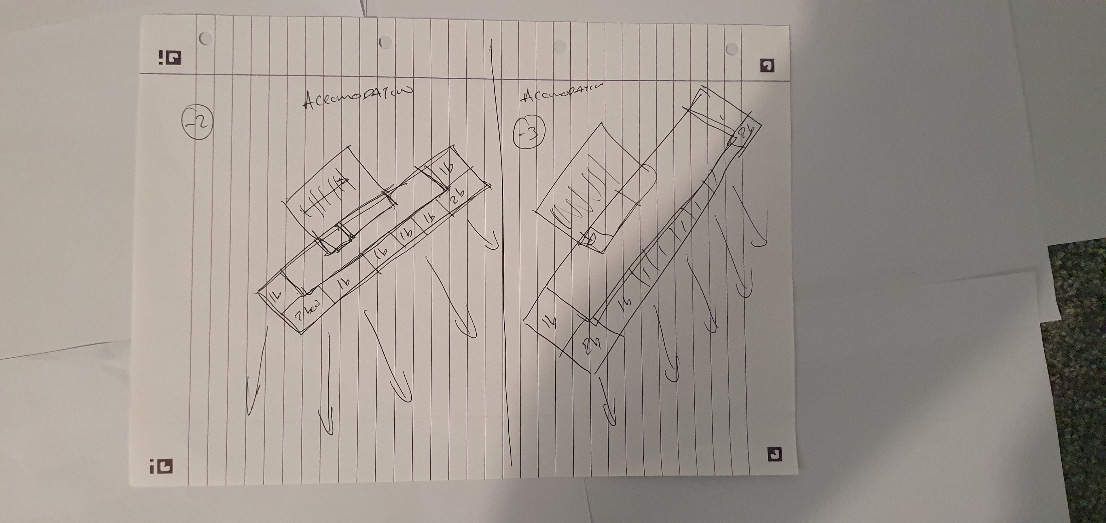
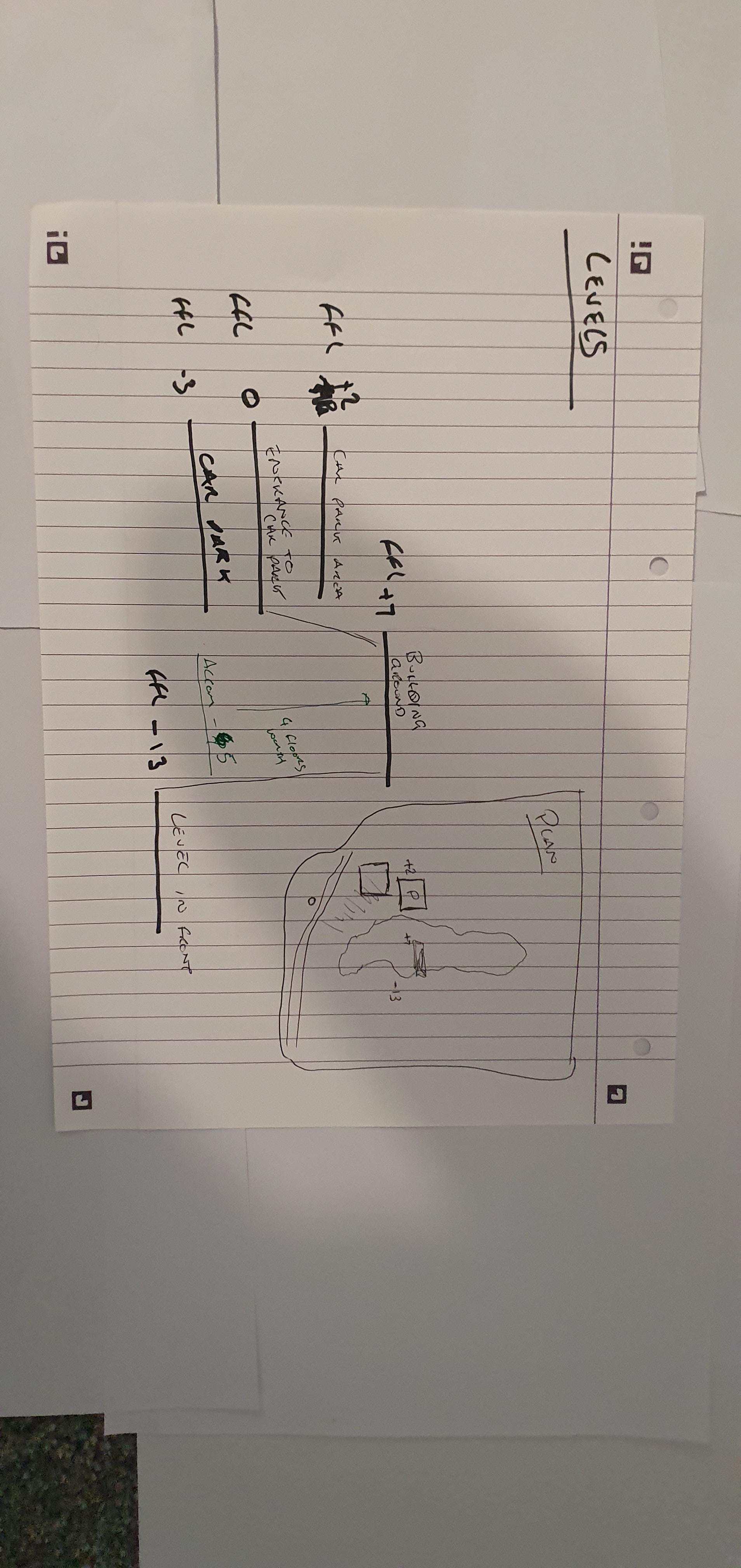
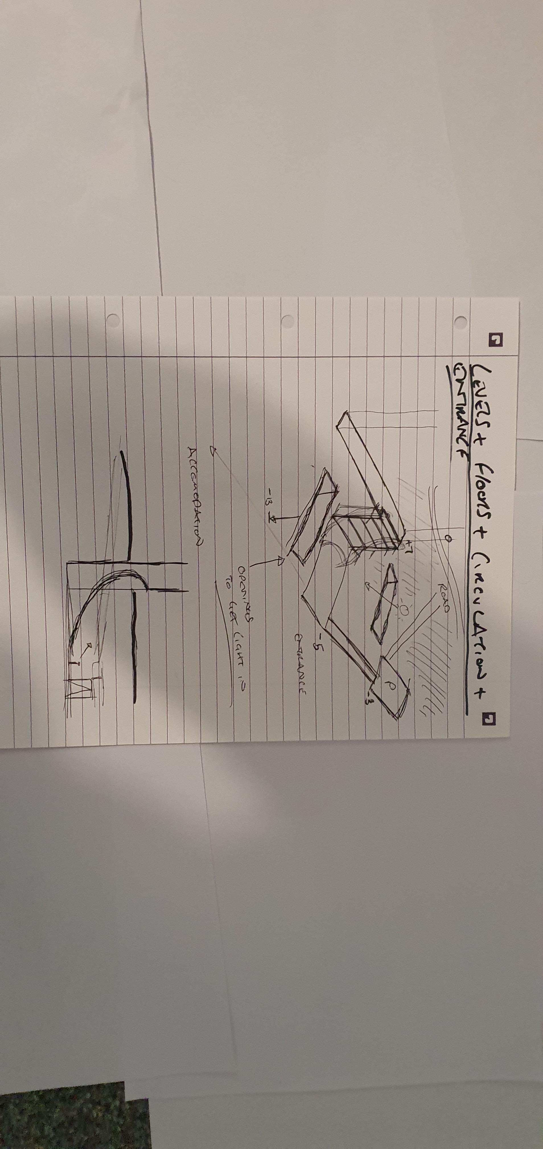
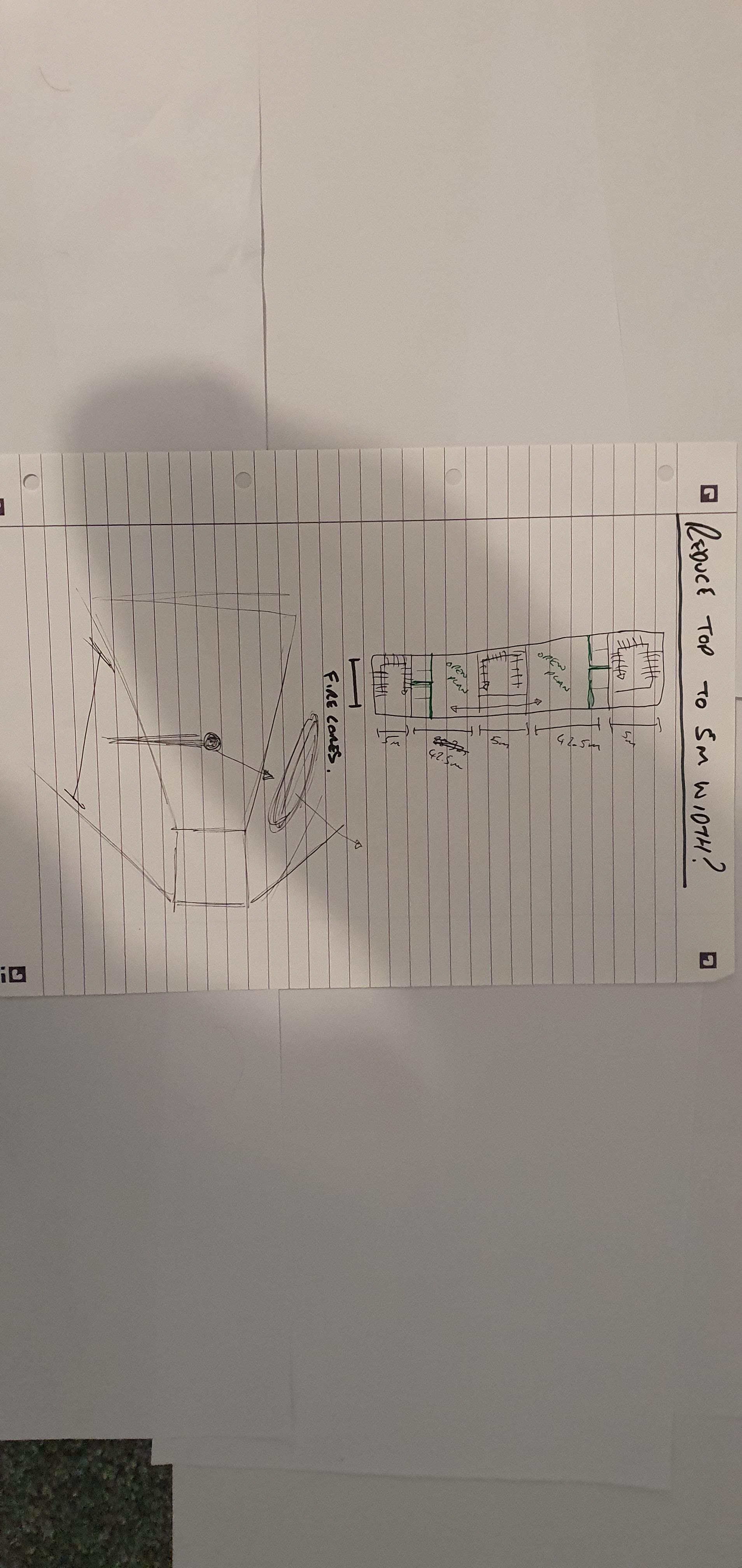
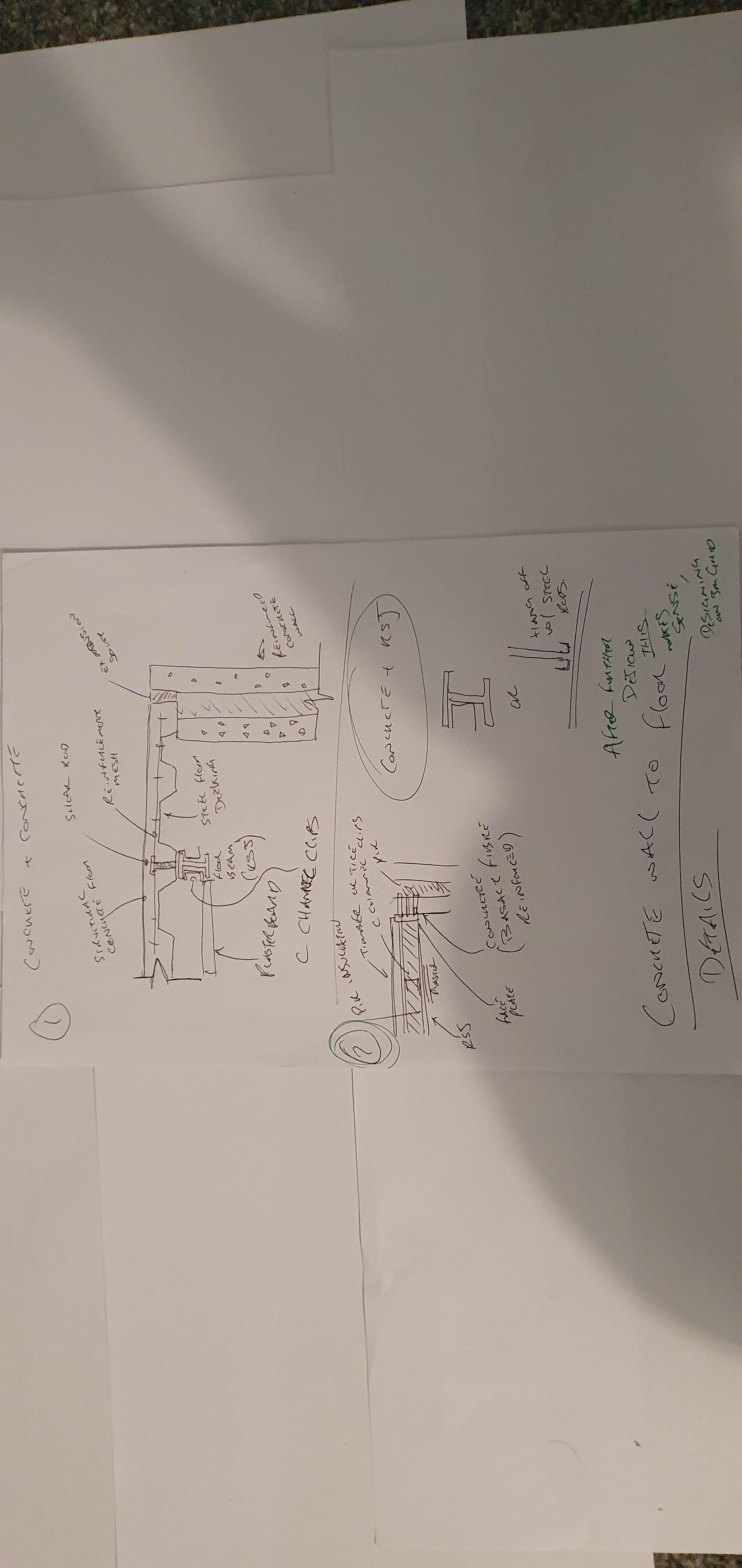
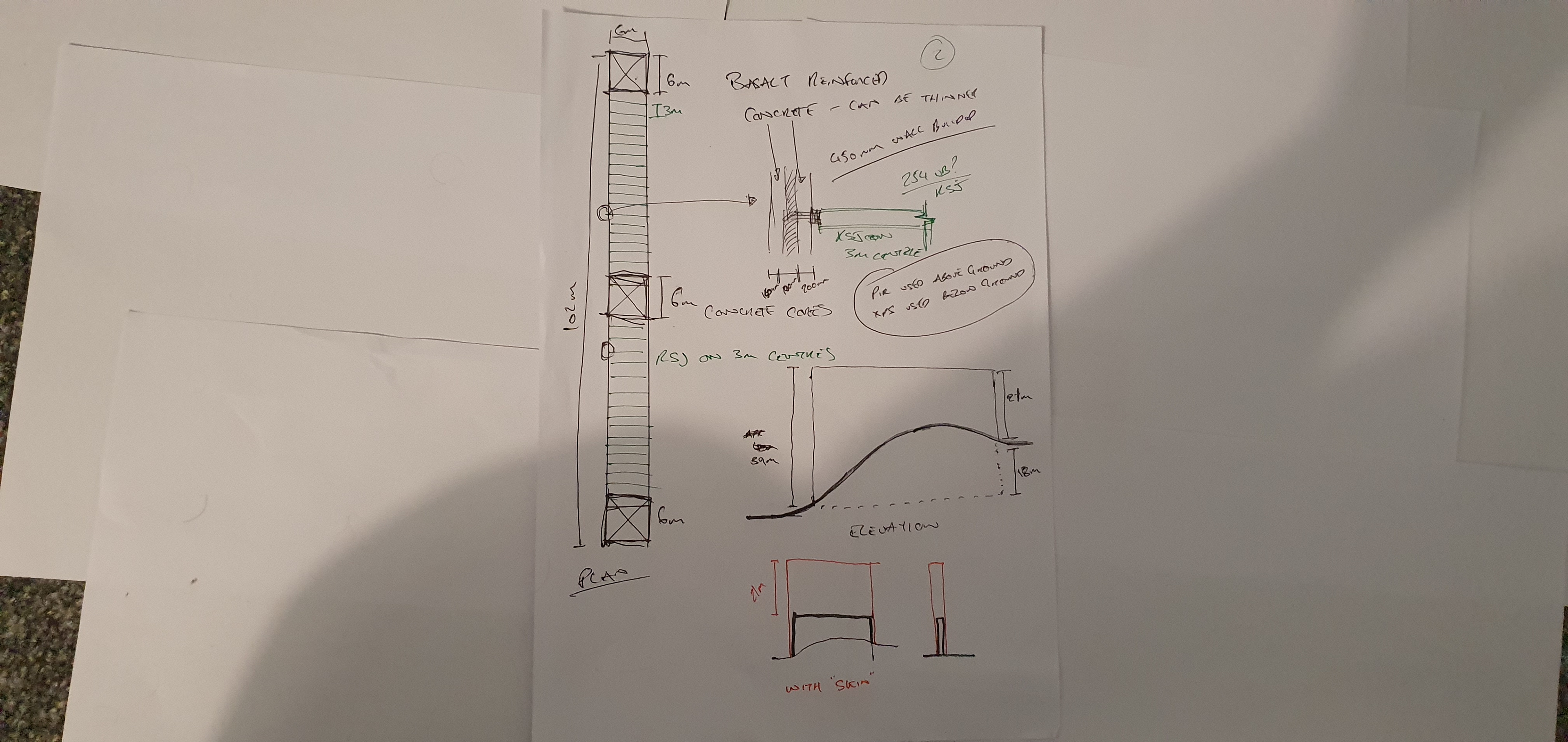
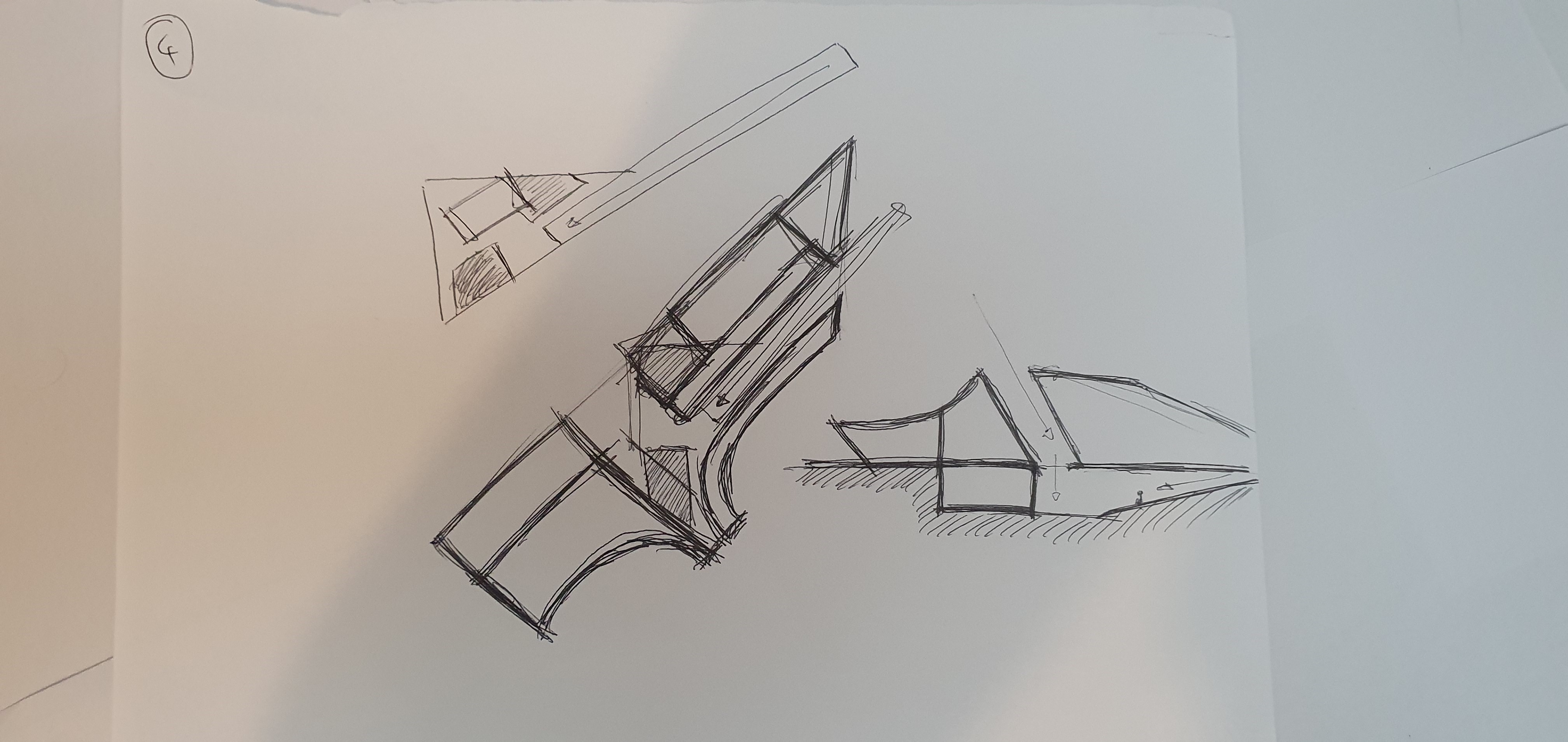
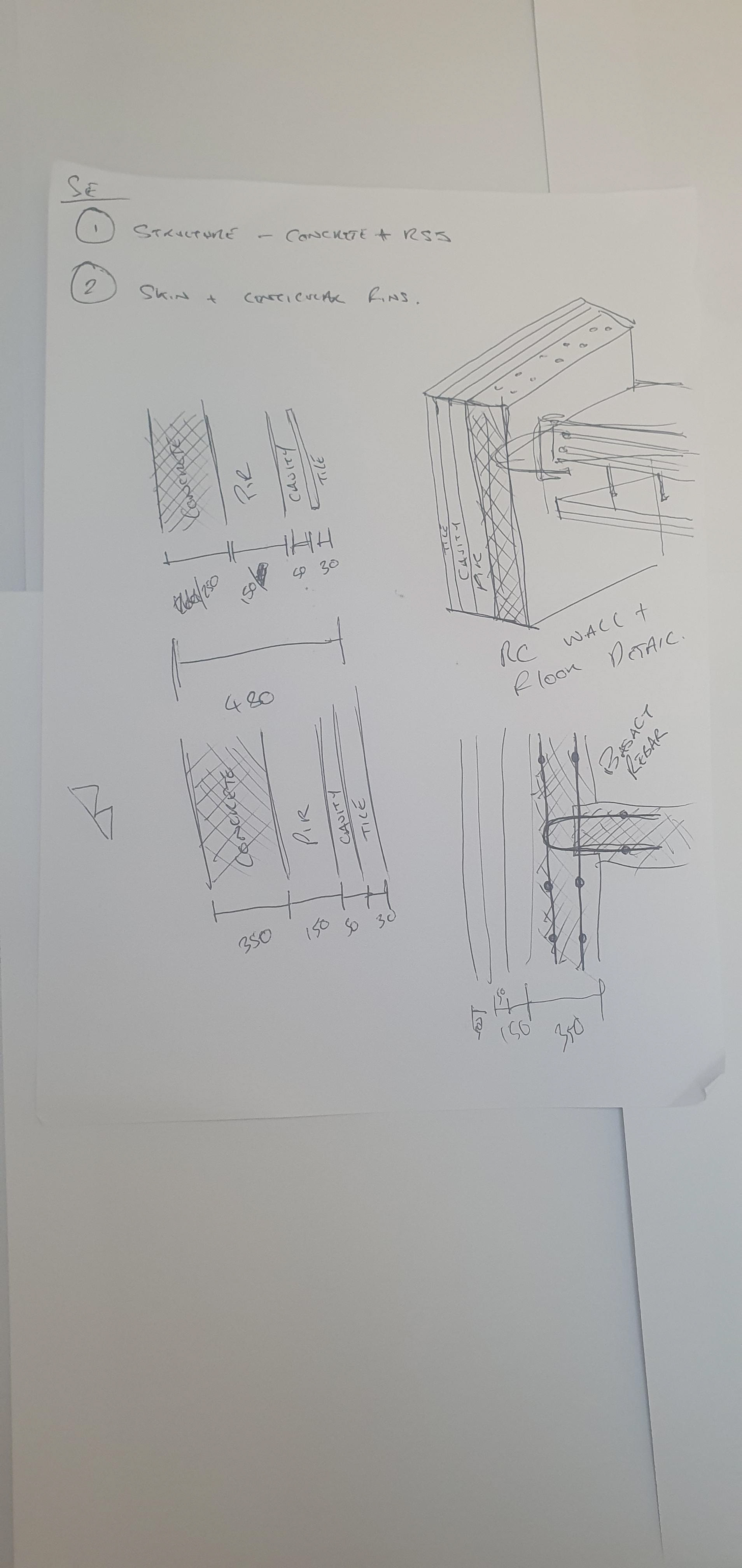
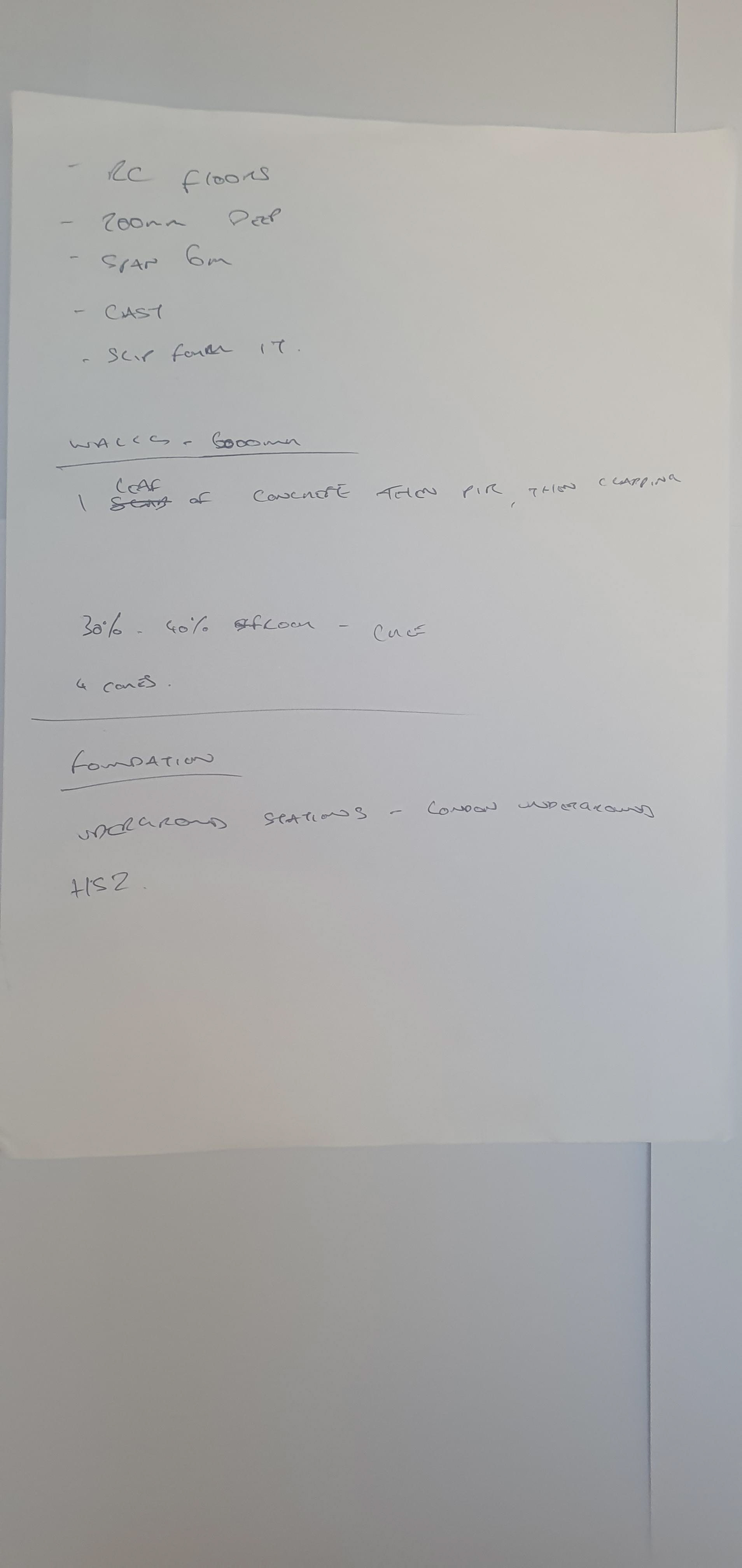
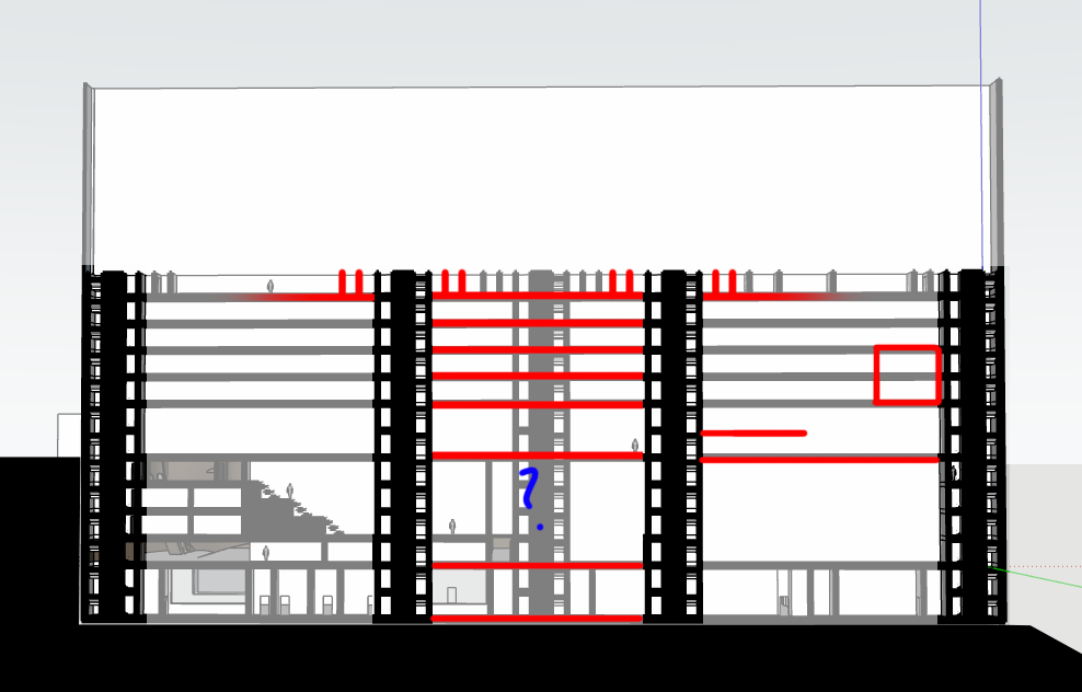
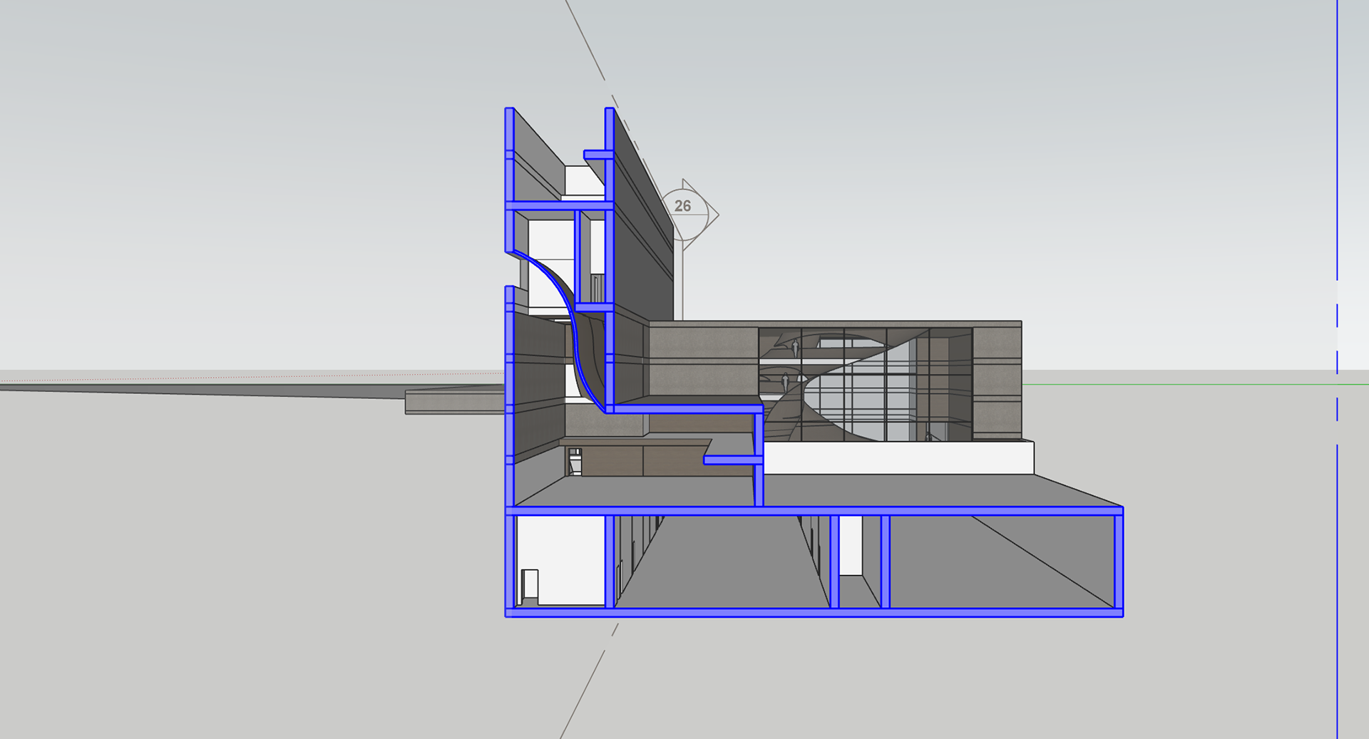
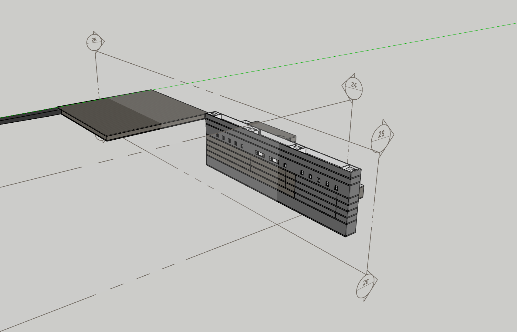
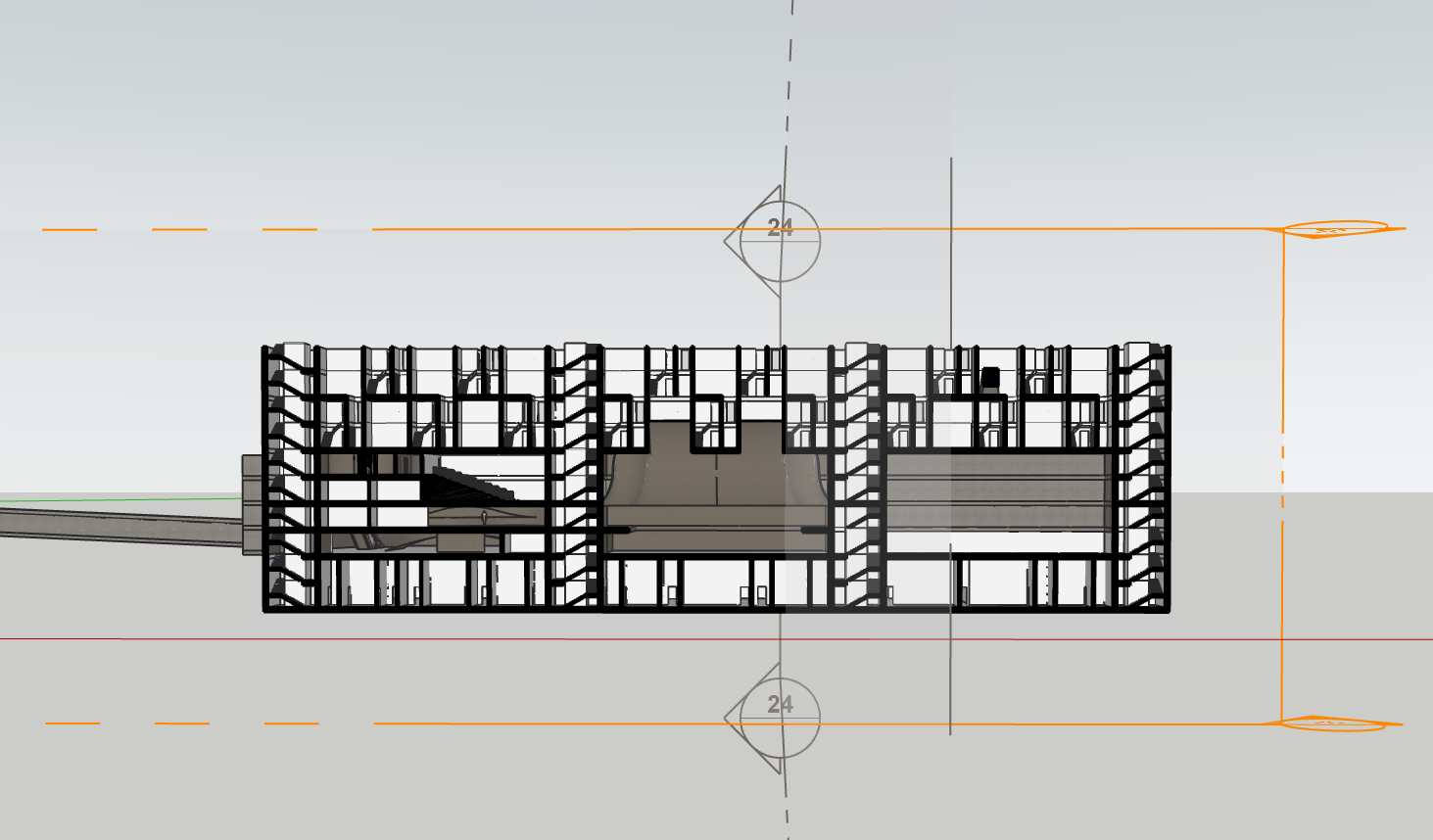
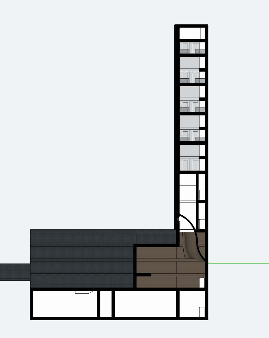
Following a discussion with the structural engineer, it was determined that my project should have 4 cores not 3. Here is my design process for this change. I also thickened the walls up to a new build up I had designed.
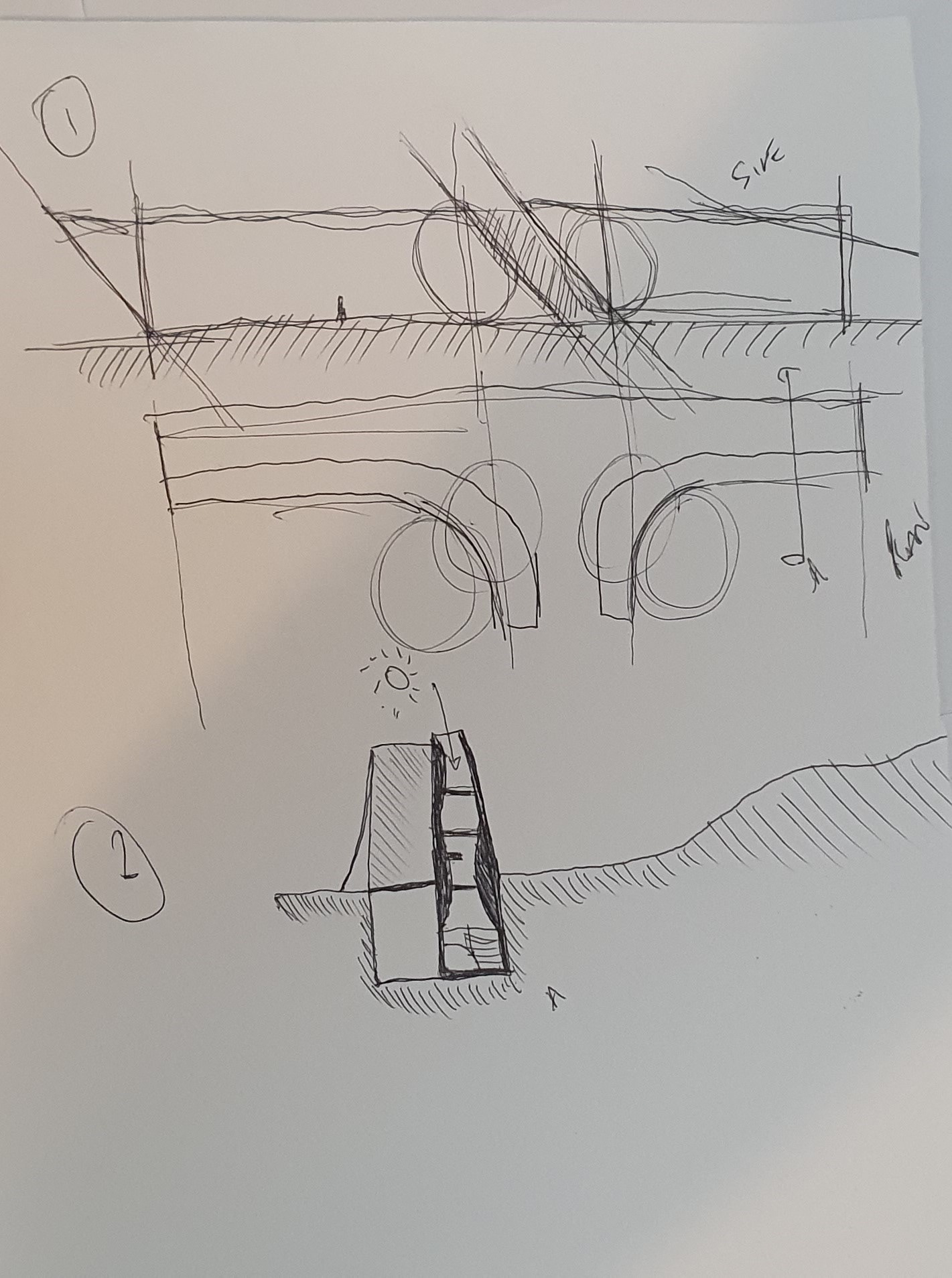
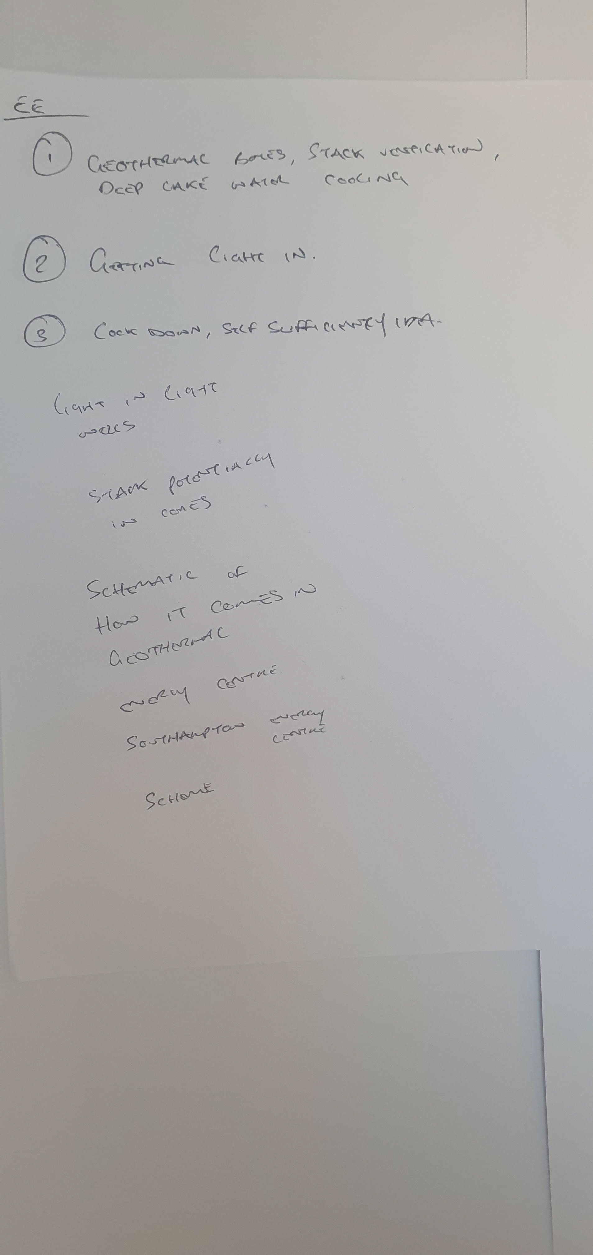
I also spoke with an environmental engineer who gave me insight into my strategies and how effective they were.
On each, the circled numbered points are the points I went into the discussion wanting to talk about.
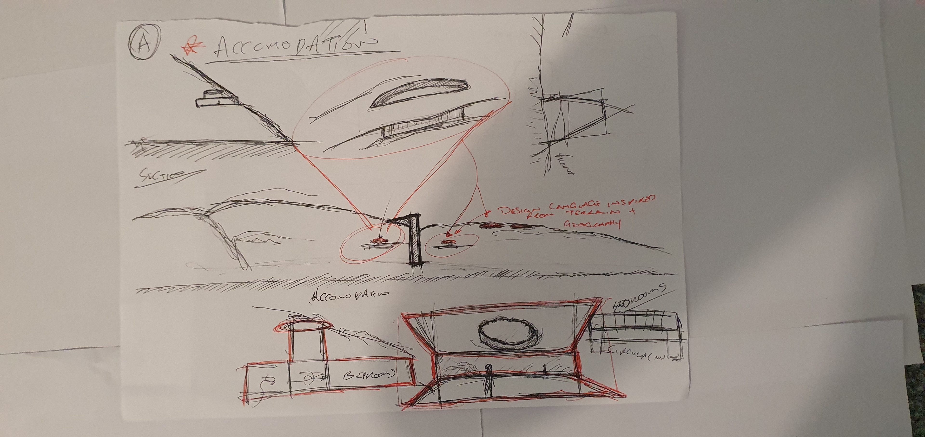
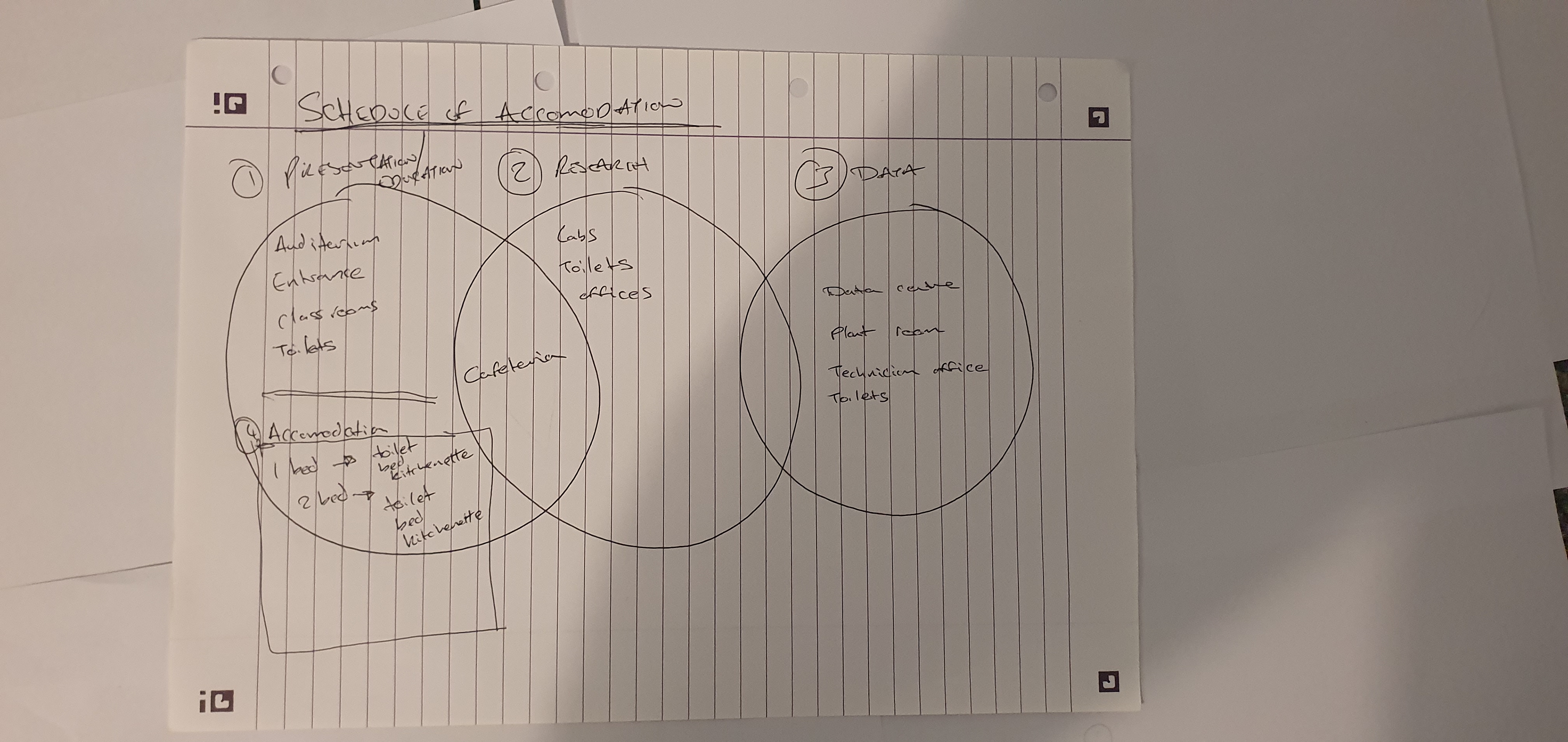
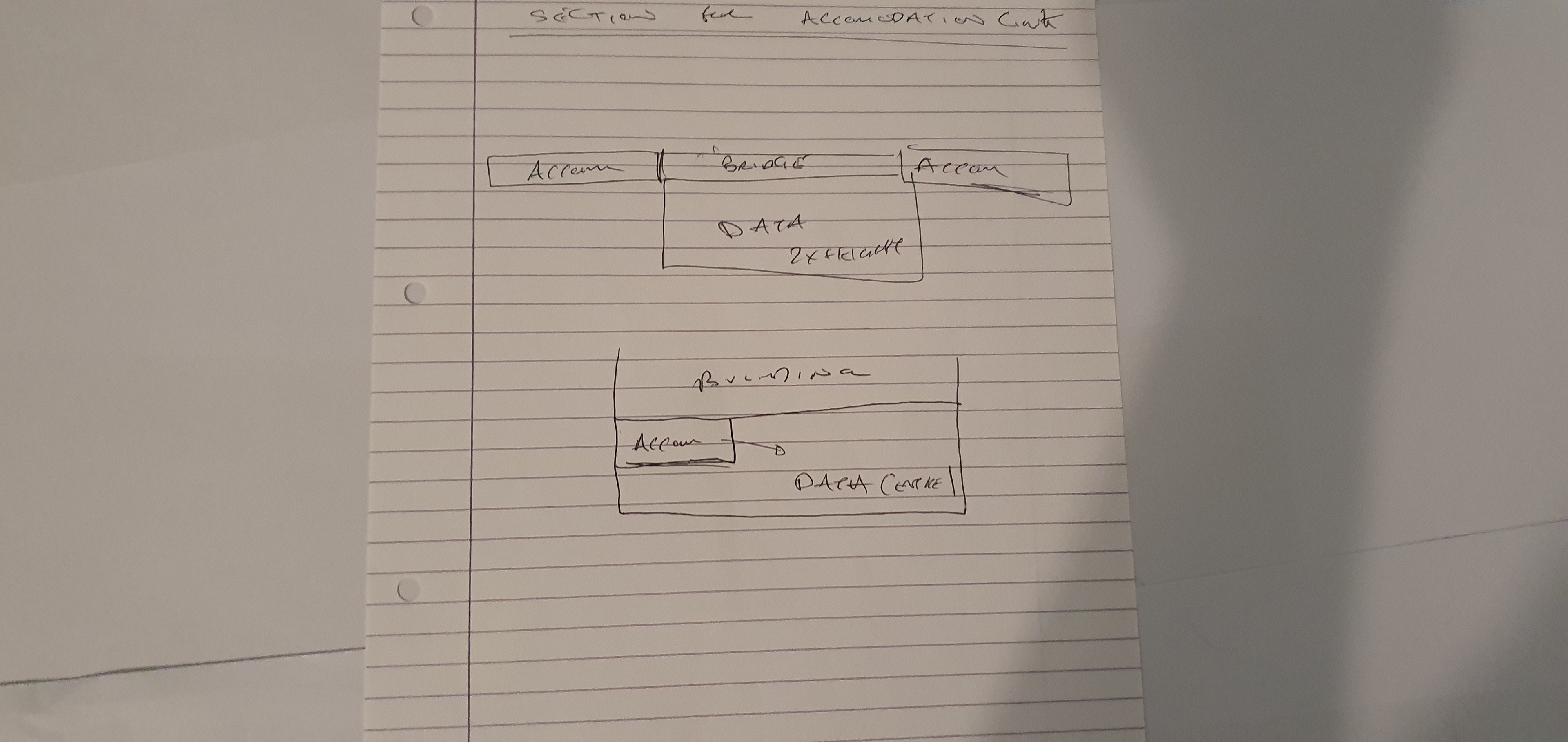
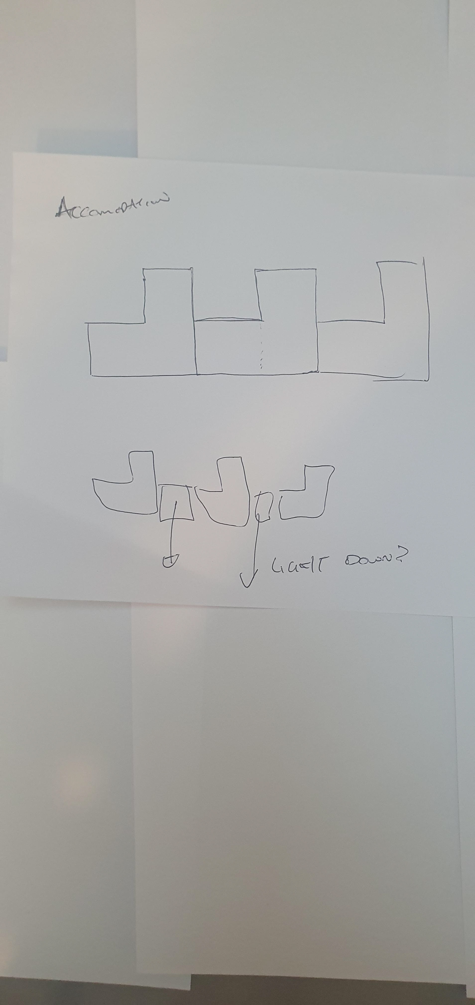
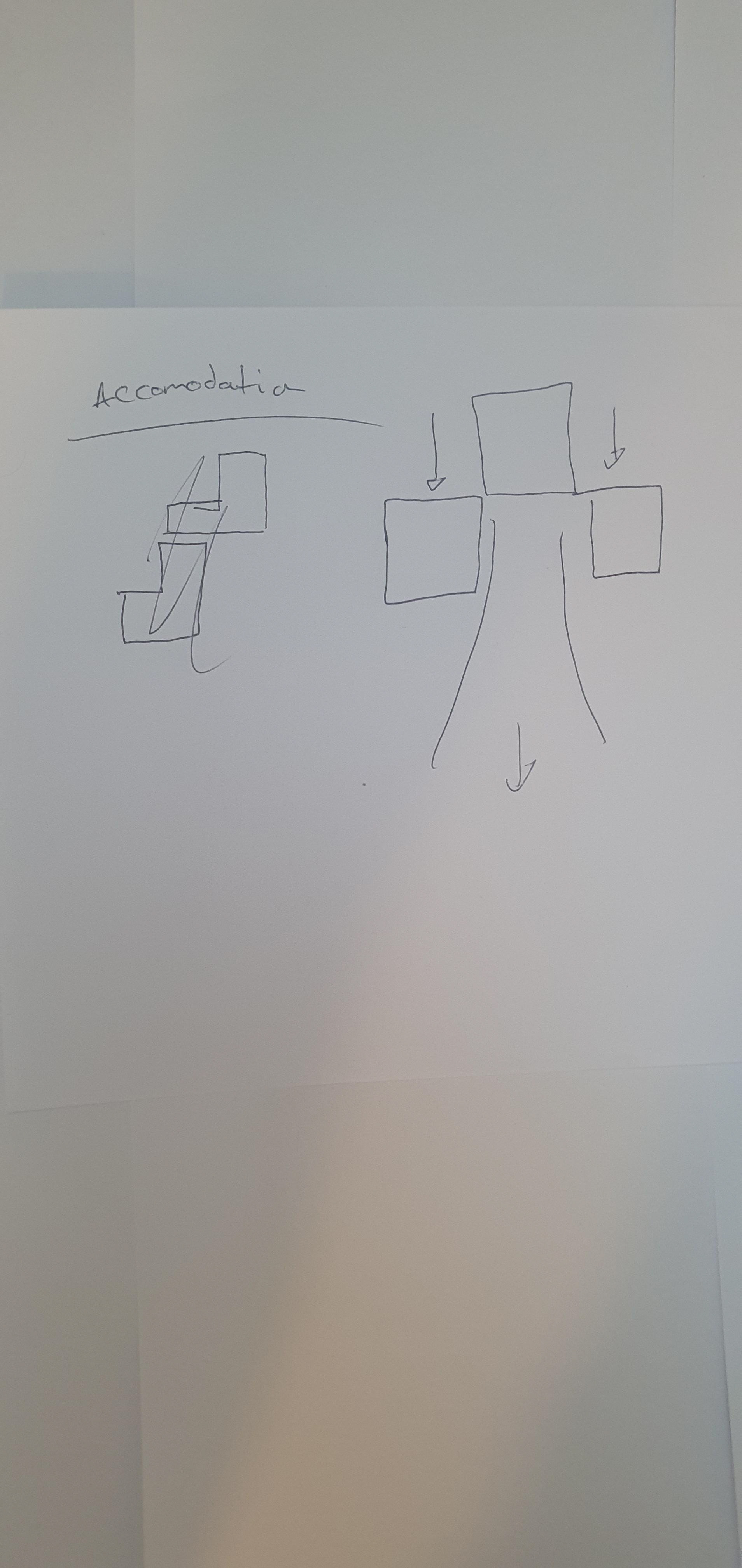
Progressing and looking at 1 bed accomodation units with private outdoor spaces, using space over the corridor and double heights to maximise open spaces and tuck away sleeping and private functions
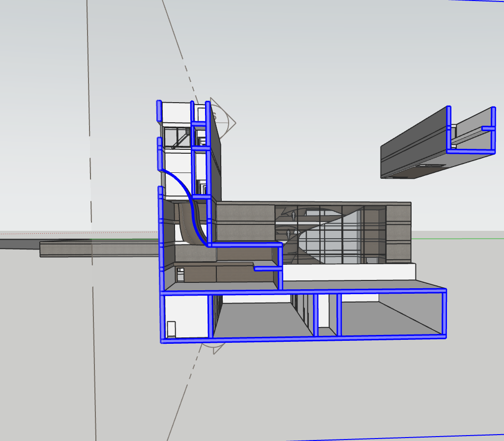
I then decided it was more feasible to flip the underground portion. This allowed me to curve light into the space, allowed for more south light to then control and allowed for more height in the terrain to expand certain portions.
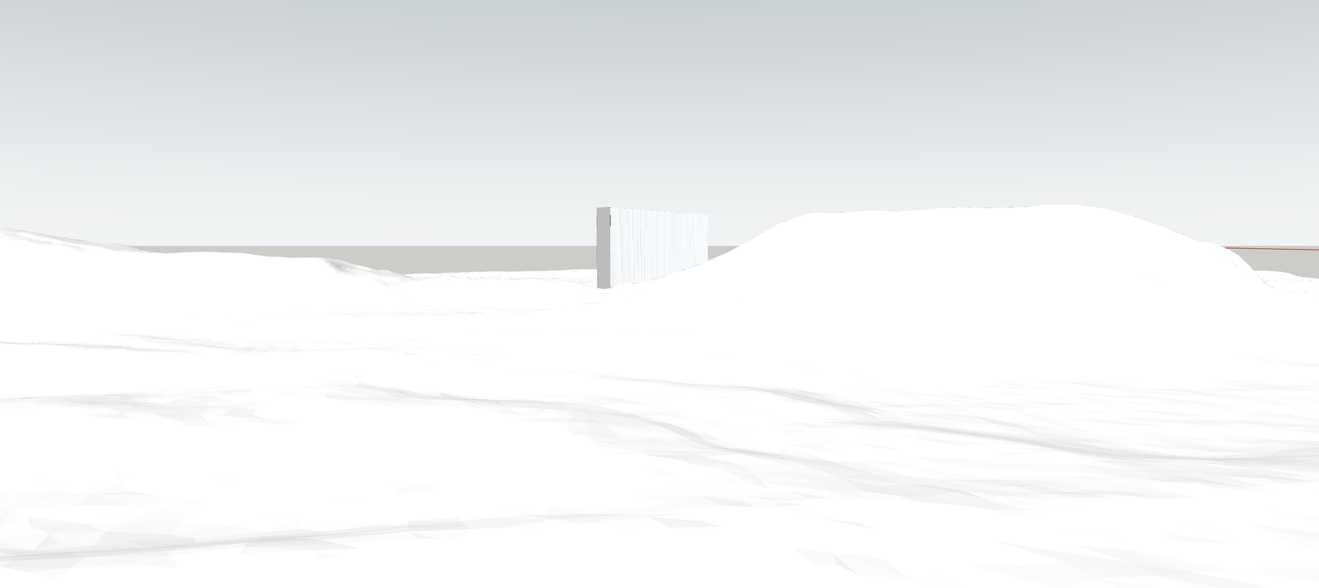
Then experimented with modelling my windows between fins idea. This started to work nicely as a concept after some tweaking with fin length and width whereby the windows are only need at very direct head on angles, anything else they become nearly invisible. Here are the results:
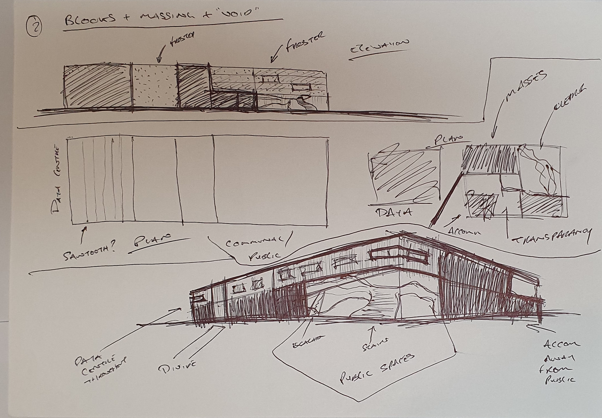
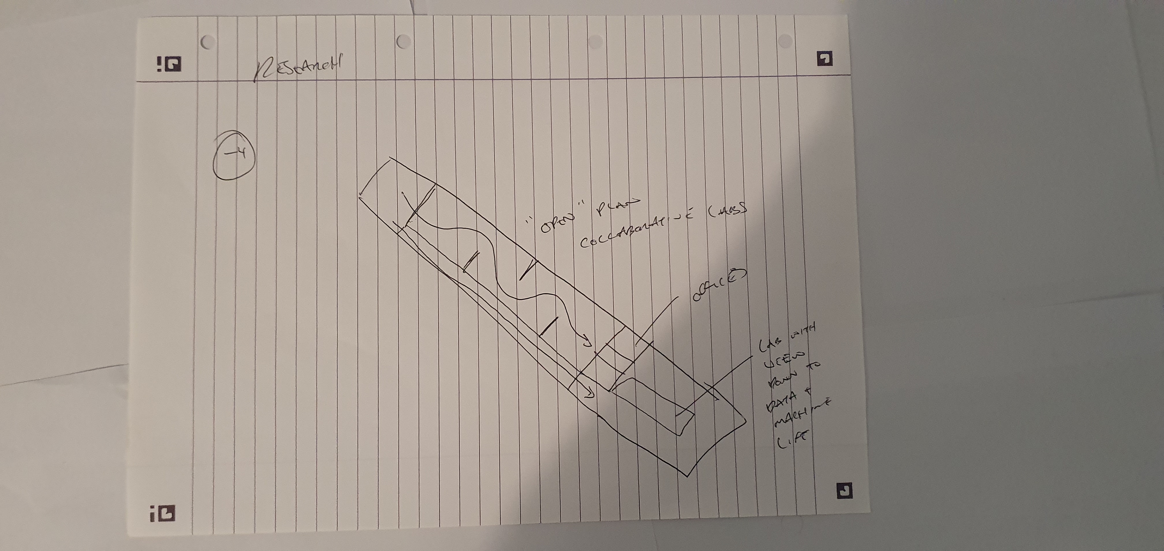
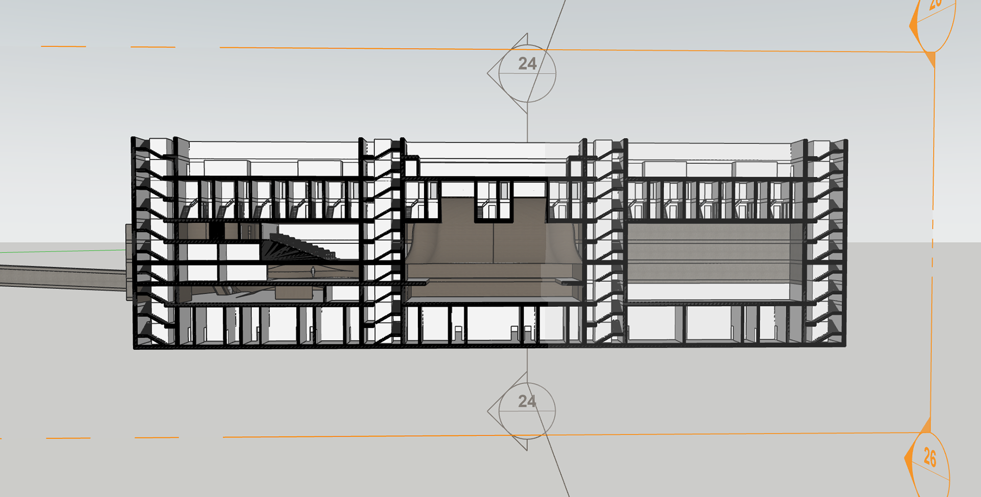
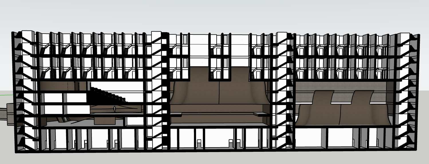
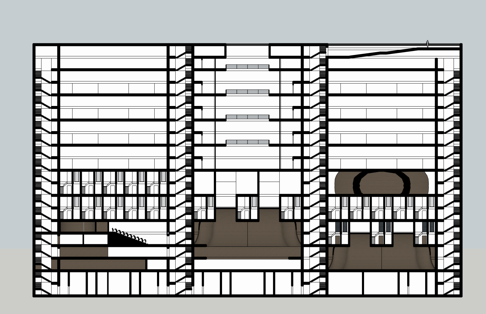
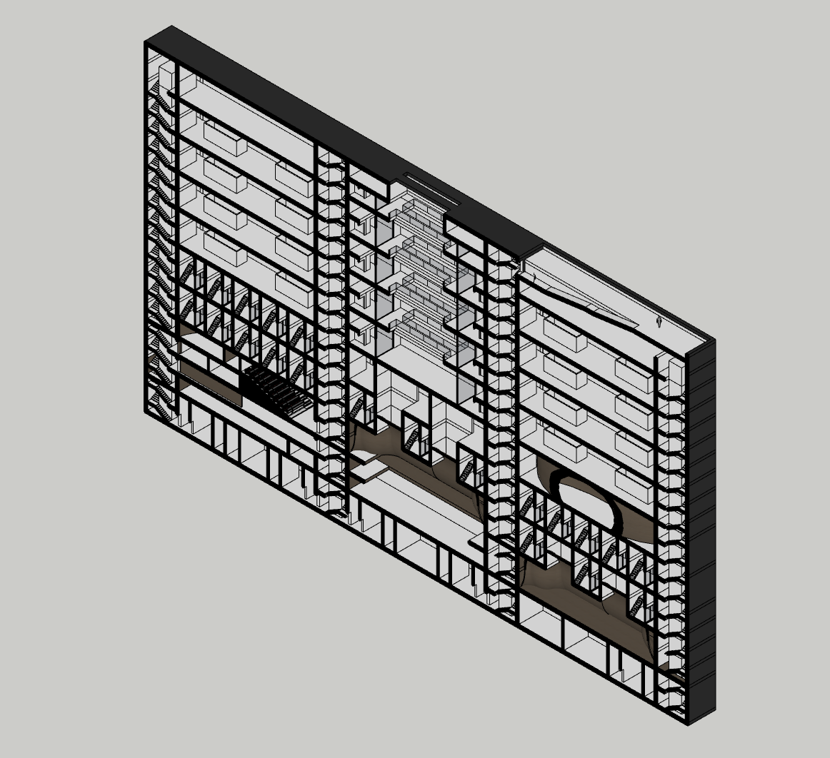
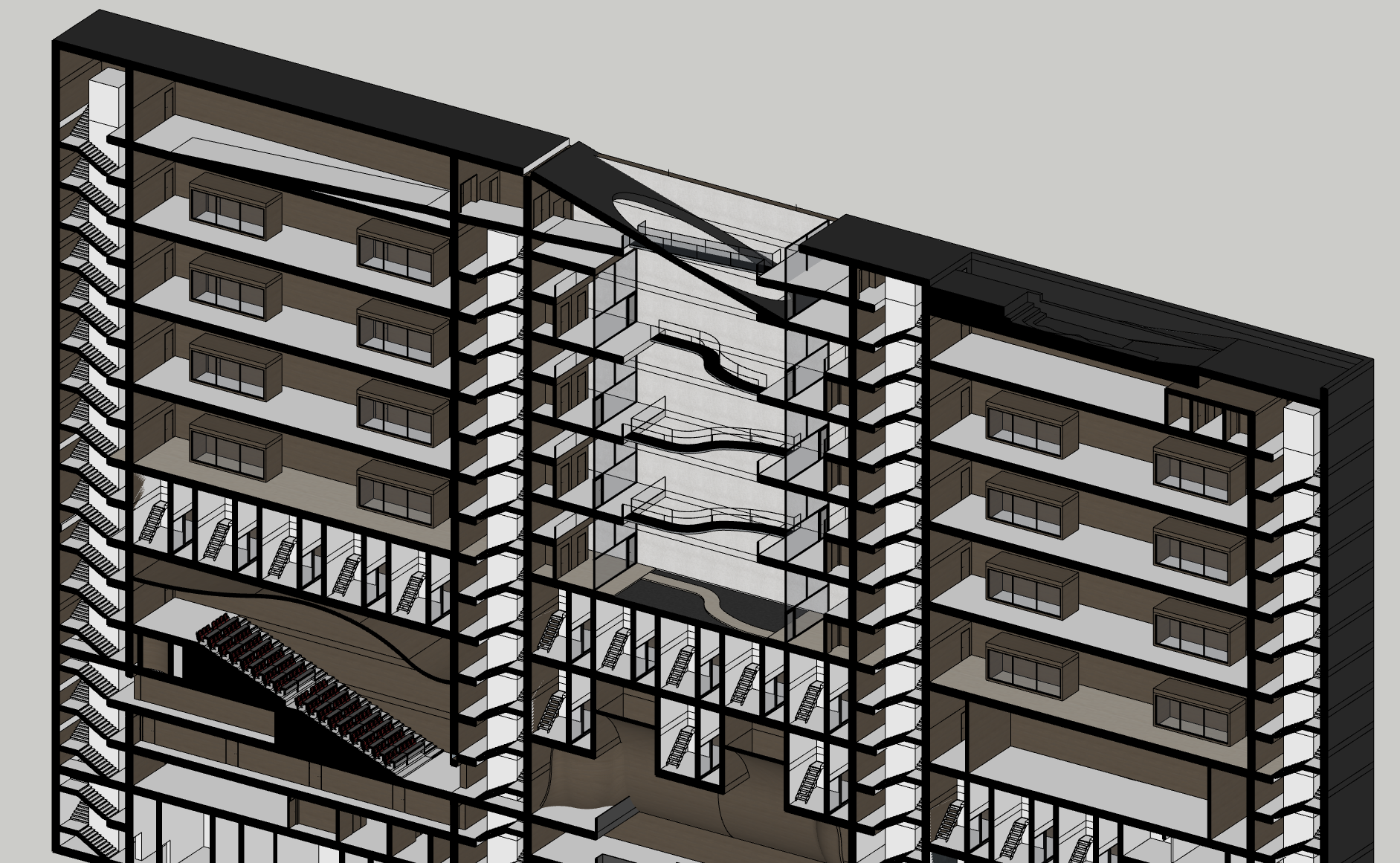
At this stage, I began to think more critically about the building in section. I didn’t want a simple, stacked ‘car park’ configuration where each level felt monotonous and disconnected. Instead, I started carving into the form, introducing variation between floors to create moments of spatial and visual connection. The narrow, vertical nature of the design became an opportunity to explore dynamic floor relationships - encouraging interaction, permeability, and a sense of vertical continuity throughout the building.
Following discussions with the environmental engineer, I became more confident in the building’s ability to harness natural light. Its slender footprint allows daylight to penetrate deep into the plan, meaning that I needed to consider how light wells and other features could be altered and directed. With AI this is simple, install mechanical systems which react such as louvres. Narrow glazing helps minimise glare while maintaining sufficient illumination - supporting both the building’s environmental performance and its internal atmosphere.
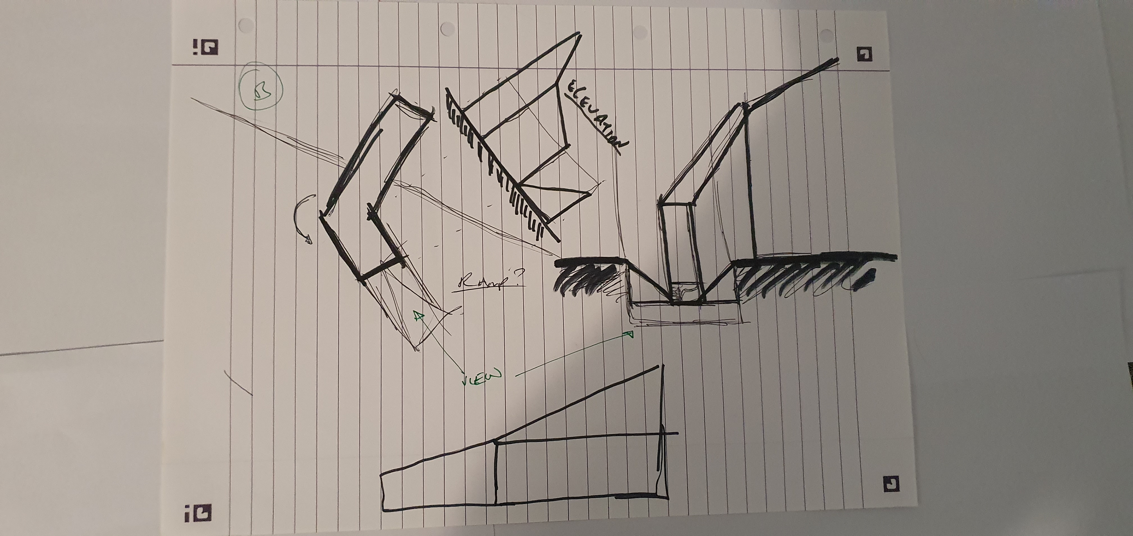
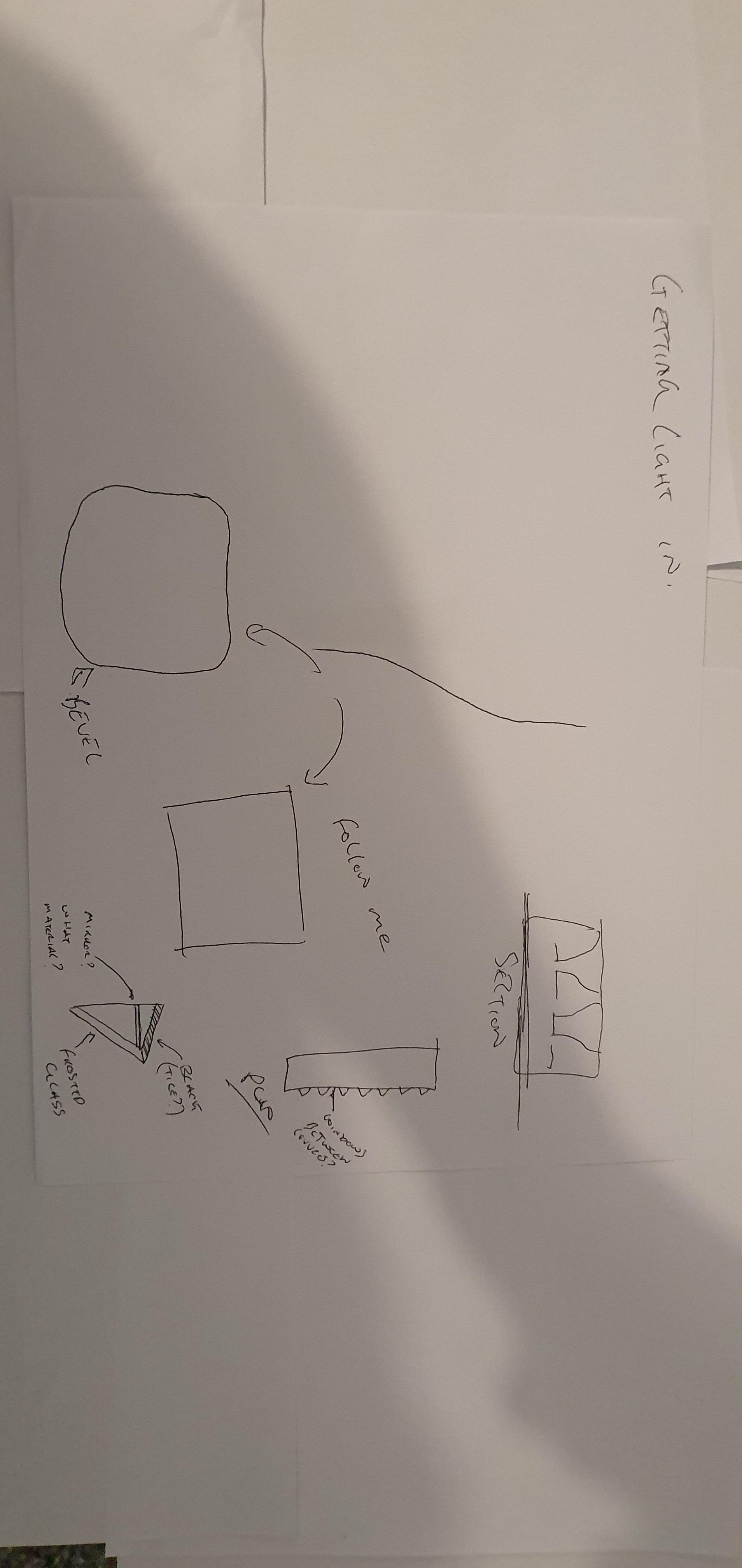
I also began to explore the integration of wellbeing-focused spaces - specifically, a “light spa” designed to combat Seasonal Affective Disorder, which is particularly relevant in Iceland’s extreme lighting conditions. These communal areas would be interspersed among the lab and accommodation floors, offering moments of relief and reflection. I was inspired by James Turrell’s immersive installations, where curved, seamless surfaces gently reflect and diffuse light- removing hard shadows and creating a soft, almost surreal spatial quality. I also really like the ramped section out of the building to the top. It felt like a waste not to allow people up this high and I love spaces that looked "carved out" of masses. Sinking this area down 1m means the buildings mass itself becomes the railing and this space looks seamless, ramping up on top of everything.
John
Fire risers, vertical risers, regs, fire, water tank, suppression, sprinklers, gravity fed maybe?
FD60 doors
Acoustic panels in cafeteria, lecture theatre
Light spa curve the walls and use whole space, no need to decompress etc
Colour cores, make them zonal and more humane
Handicap accommodation, merge a few together, single floor. Number of accommodation is fine, down to 18 odd when you merge
Timber interiors
Coloured floors?
The courtyard area works for him, change the bridges to elefant epoxy transparent, open space up, 150mm thick, grated
Chandelier sort of thing, some crystal or something, play with light coming down into the courtyard
Can have dividers to divide the cafeteria space up, swing out from walls or accordion along, becomes a function space too. Maybe we work with ramps etc to make this an exhibition area, ramp all the way around the room.
Lecture theatre can go further UP and ramp on back. Shift accommodation towards the front and then use extra space for this for more height and seats
Bellows coming down into the spaces, should have taller windows coming into them
Antonino
Ramp the whole thing, would be good, pockets and plugs in, café? Etc
Skin? Idk how it works
Windows, scatter them, make them more irregular, the building is hidden, you don’t want to be able to see in, normal buildings tell you the programme by window placement, this building should obscure it
Good plans
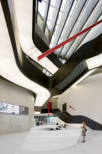
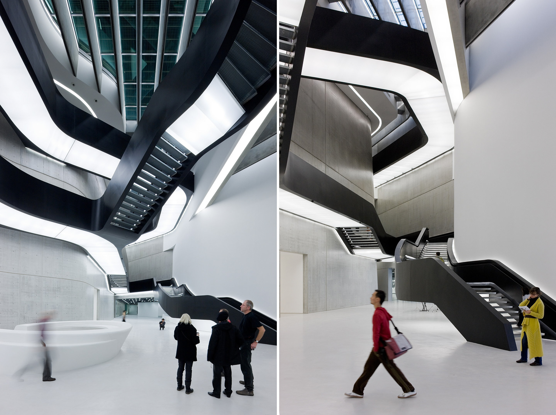
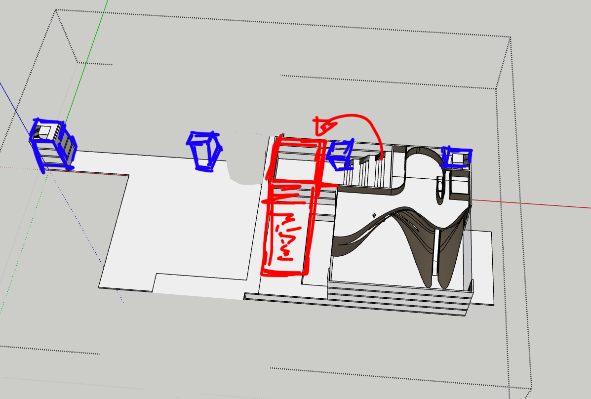
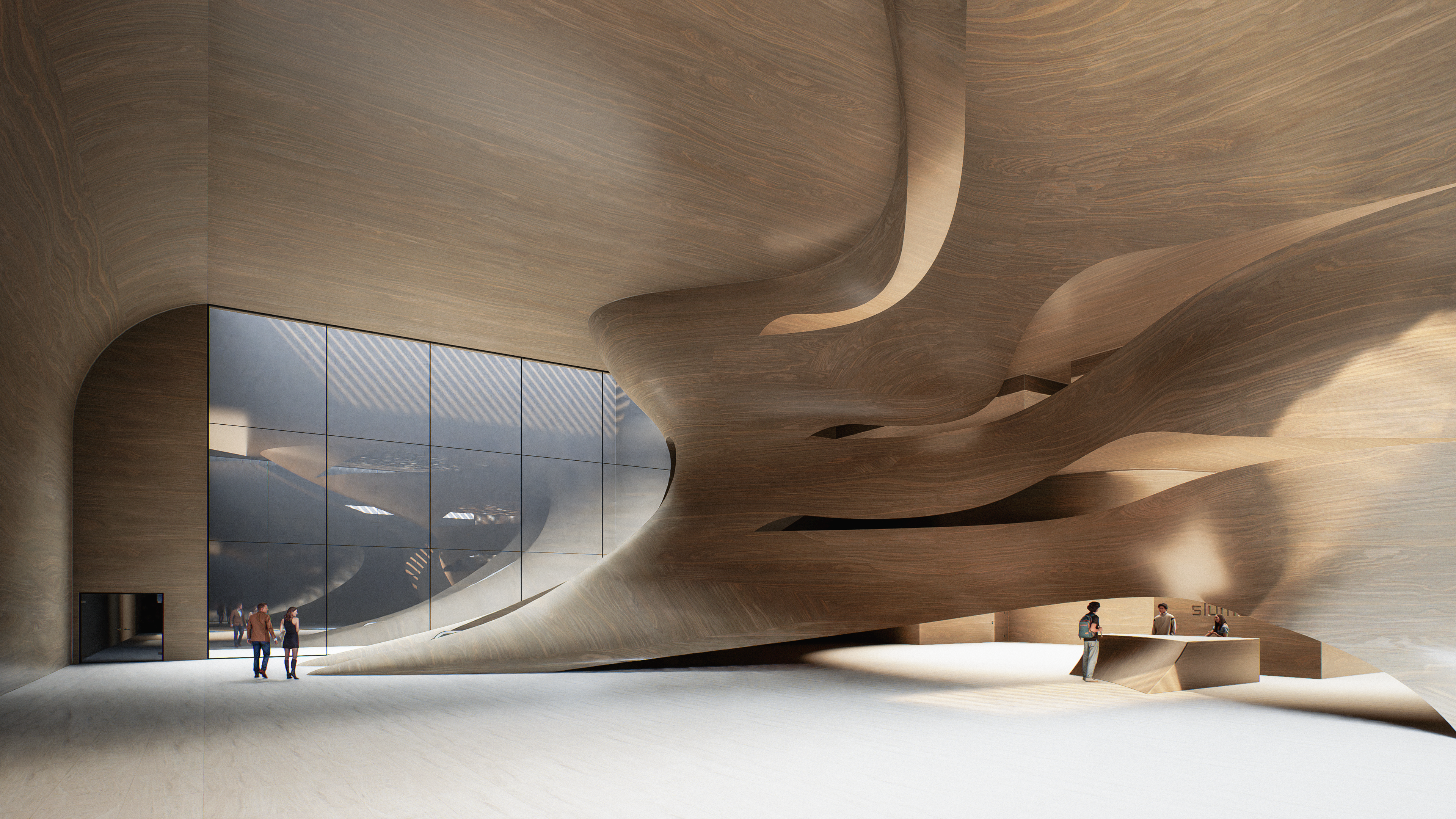
After my final pre-Easter studio, I revisited how circulation operates in my building, not just in terms of access, but as a core part of the architecture’s spatial language. My design already worked heavily in section, with multiple levels cutting through the form, but I wanted to enhance the experience further. I had recently introduced a large ramp leading up to the roof, and an escalator system inspired by the Perot Museum of Nature and Science, where vertical movement plays a key narrative role.
At this point, I came across a video by Architectural Digest that explores Zaha Hadid’s approach to design. The whole video was insightful, but one moment stood out, specifically the discussion around the MAXXI Museum. It described how Zaha viewed movement through a building as an unfolding experience shaped by perspective, elevation, and choice. Her use of stairs and ramps wasn't just about access, they were compositional tools that added complexity, allowing people to move in unexpected ways and choose their own path through a space.
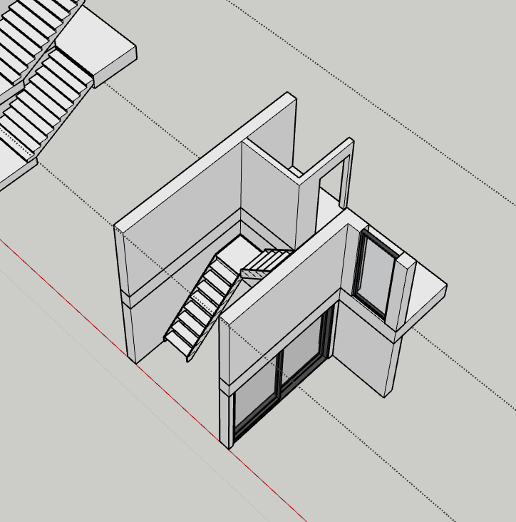
This resonated with me. My project was already fluid in both plan and section, but the idea of allowing users to circulate through elevation more freely, not just via main cores, but within and between rooms themselves, offered a new way to think about layering and spatial rhythm. I began experimenting with internal staircases that pass through double- and triple-height volumes, letting people move more organically between levels without returning to central hubs.
Visually, this also opened new possibilities. I started to think of staircases as architectural gestures, elements that interrupt, define, or enhance the surrounding volumes. My references shifted from static circulation cores to more performative, expressive pathways. I wasn't trying to replicate Zaha’s style, but to absorb the thinking behind it, using circulation as a way to choreograph time, space, and perception.
This design moment helped reinforce that section is not just about levels, it's about narrative. Movement, when treated as an architectural language, becomes a way to tie together experience, function, and form.
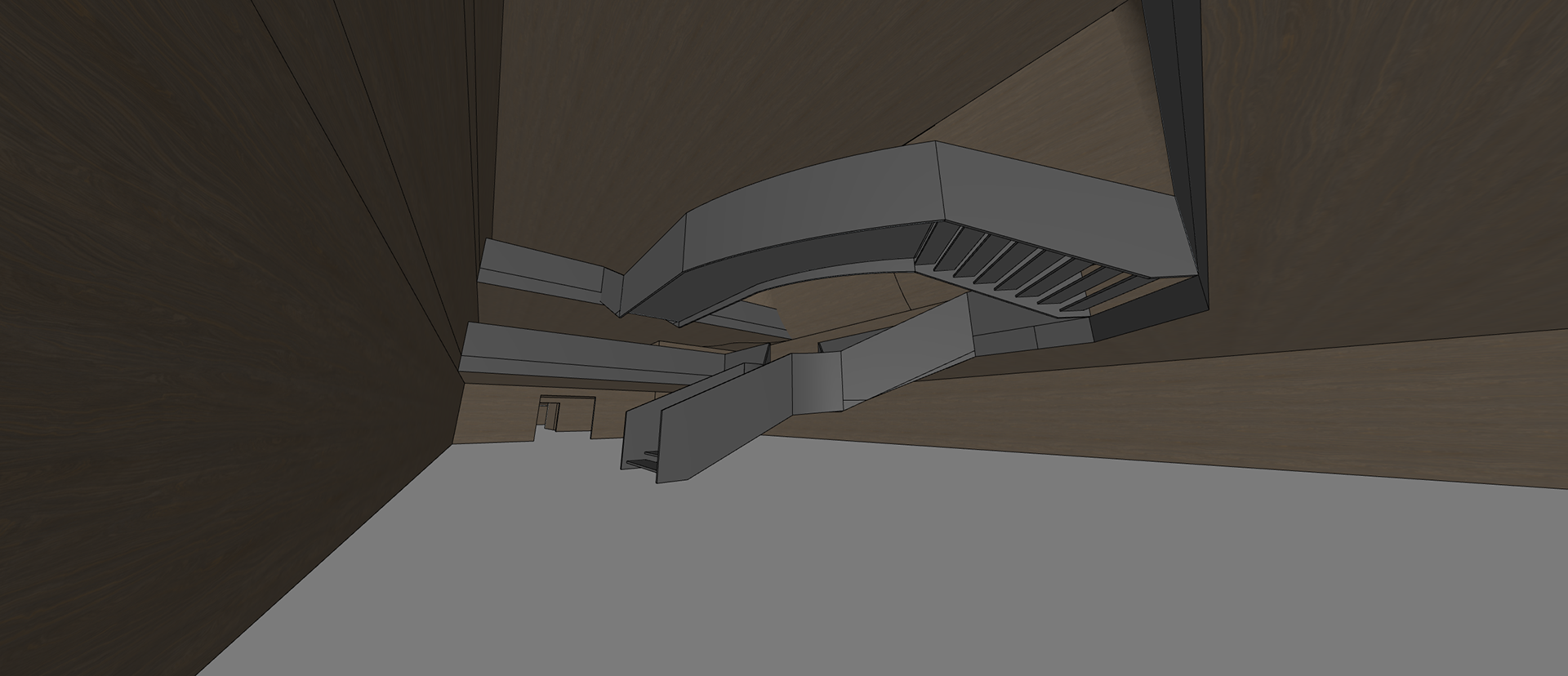
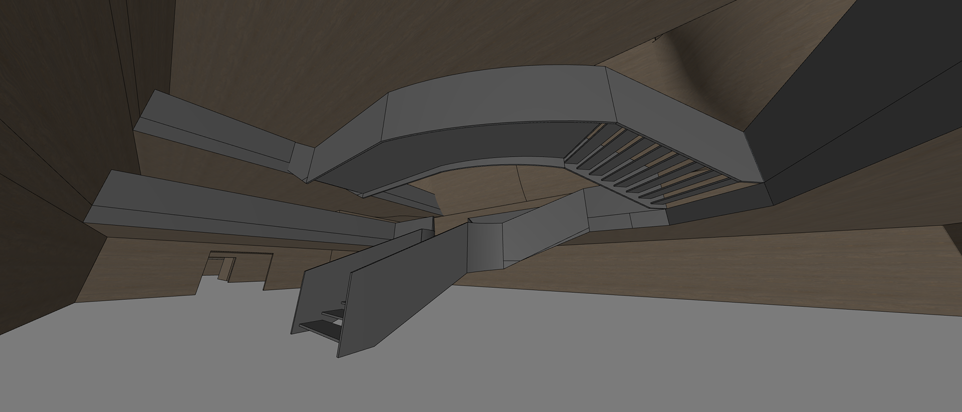
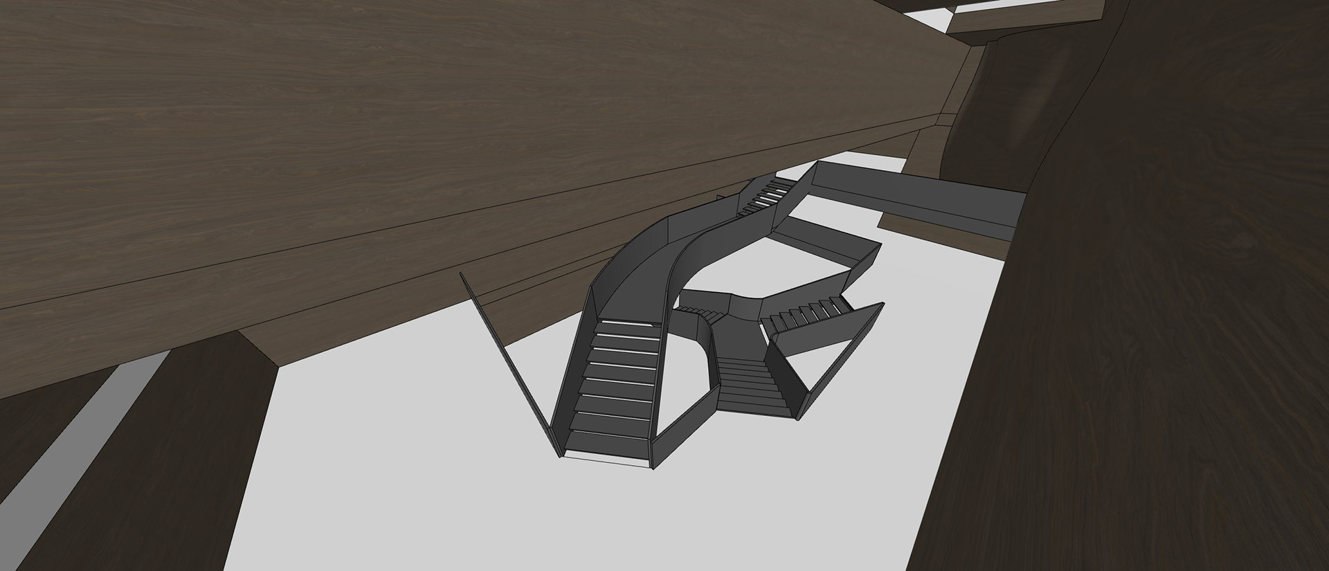
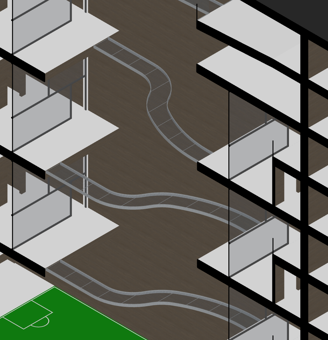
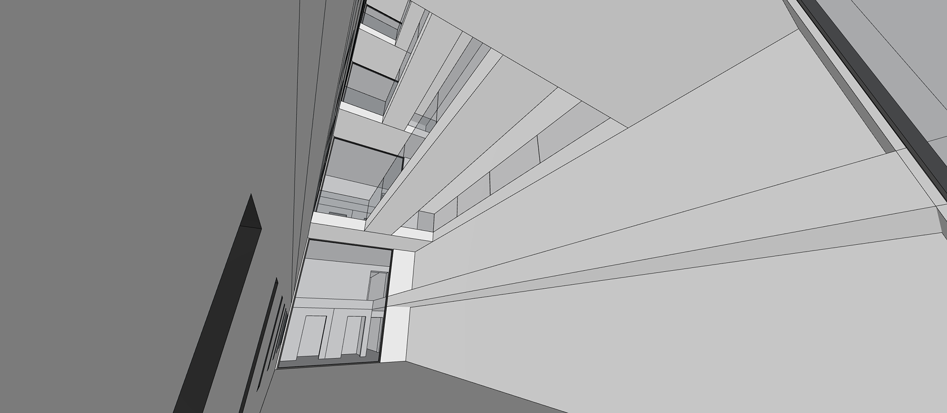
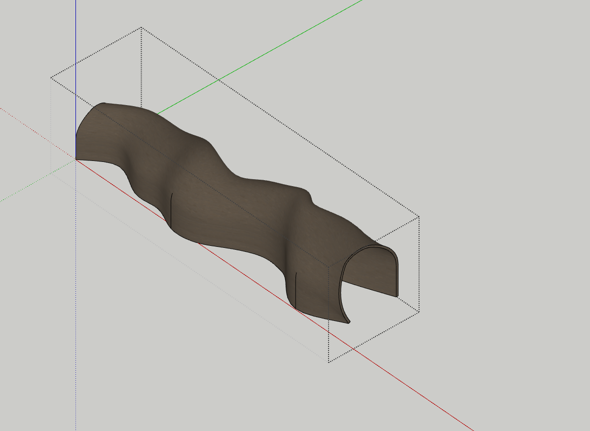
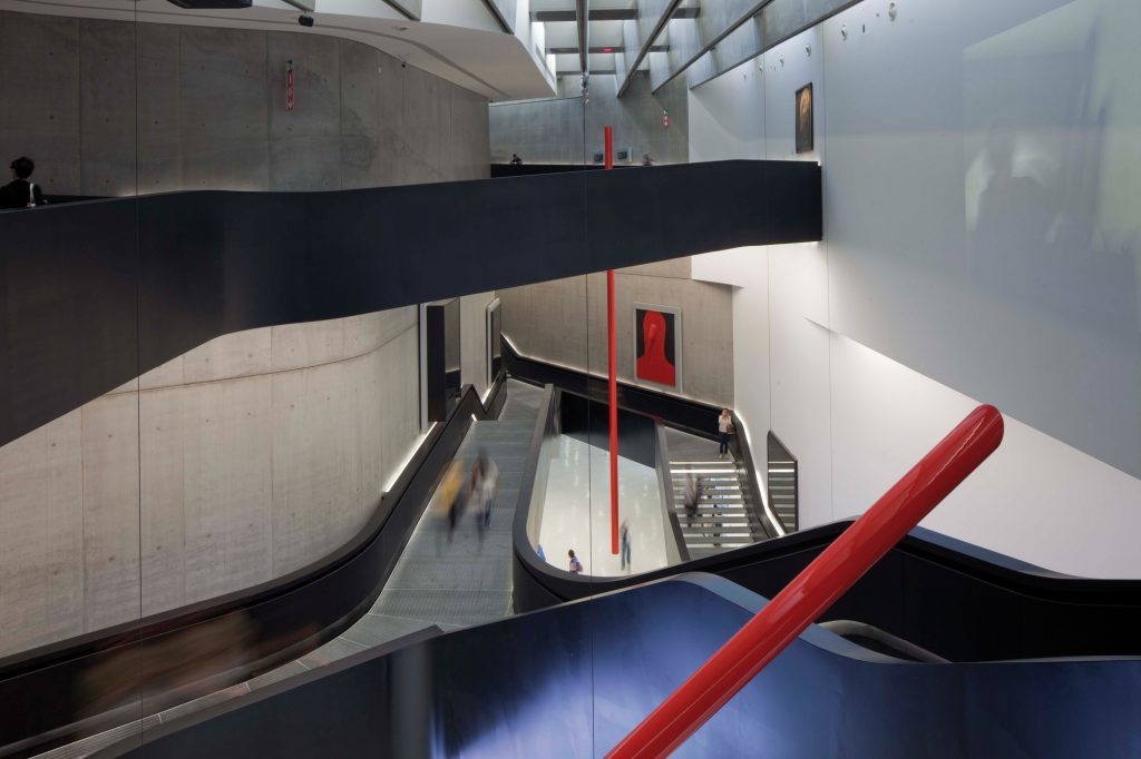
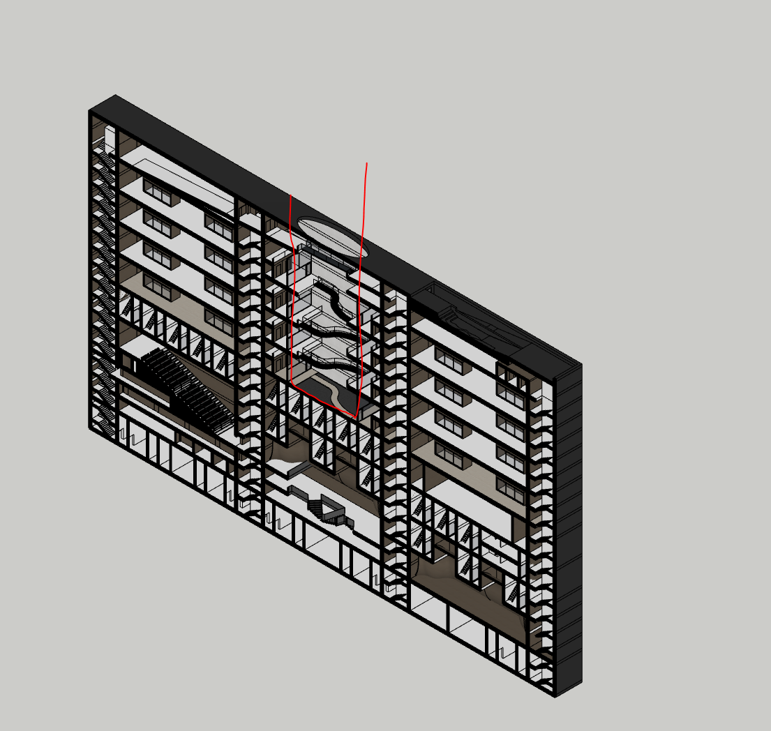
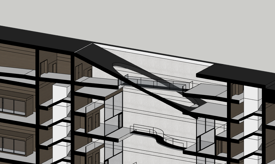
After exploring Zaha Hadid’s approach to circulation, especially how she uses movement to shape space and experience, I revisited the bridges in my own project. Originally, they were simple, straight connections between the two cores, purely functional and visually quite static.
Inspired by Zaha’s use of fluid forms and dynamic circulation, I redesigned the bridges to curve and twist. They now flow between the two sides, making the section feel more alive and intentional. This shift helped transform them from background elements into key spatial features that contribute to the identity of the building.
There’s also an added layer to the design that came out of the process. With their curved paths and stretched spans, the bridges now resemble wires or data cables, which unintentionally reinforces the computational theme of the project. They start to feel like literal and symbolic links between different zones of knowledge and activity.
Rather than just getting people from A to B, the bridges now guide movement in a way that adds rhythm, tension, and character to the core of the building.
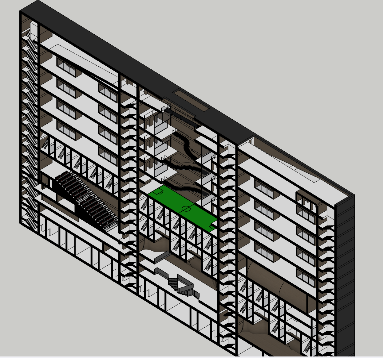
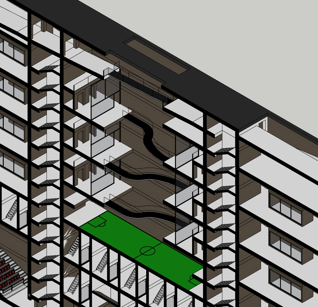
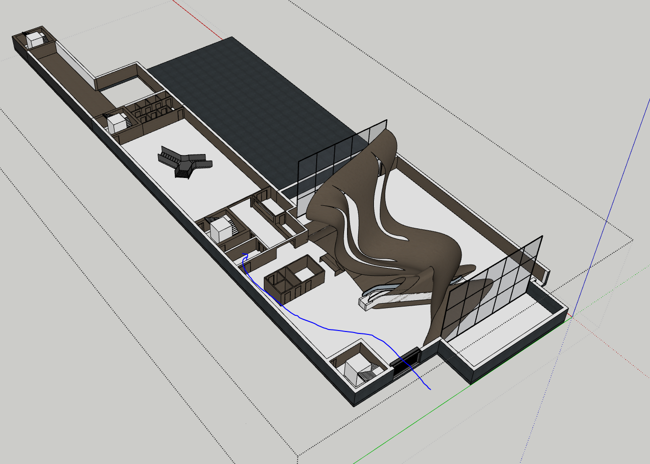
In the centre of the building, I explored the idea of activating the courtyard void with a small 3v3 football pitch. Iceland’s strong football culture inspired this, it's the country’s most popular sport, and the idea was to give researchers and staff a communal, active space within the project. With the lava-covered surroundings offering a dramatic but barren landscape, the pitch felt like a chance to introduce some greenery and life into the heart of the scheme.
The space is overlooked by balconies and circulation bridges, so there’s a natural sense of enclosure and visual connection from the surrounding floors. It could become a kind of social core, where people watch, play, or take a break from the lab or research environments.
That said, I’m torn. While the football pitch injects energy and activity, it might not be the most universally useful or low-maintenance option. An alternative could be a more passive landscape intervention, a garden or planted courtyard that still adds life, but with less noise and upkeep. This would also tie into ideas of wellbeing and recovery, especially for a research-focused building where moments of pause are valuable.
I’m still deciding whether the space should be playful or contemplative, but either way, the goal remains: it shouldn’t be a dead zone. It needs to serve the people in the building, and become a green counterpoint to the harsher terrain outside.
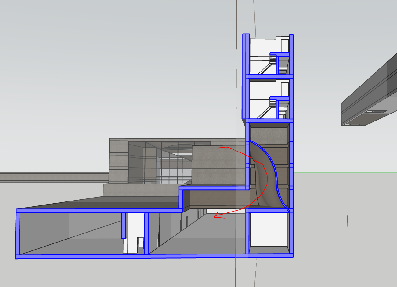
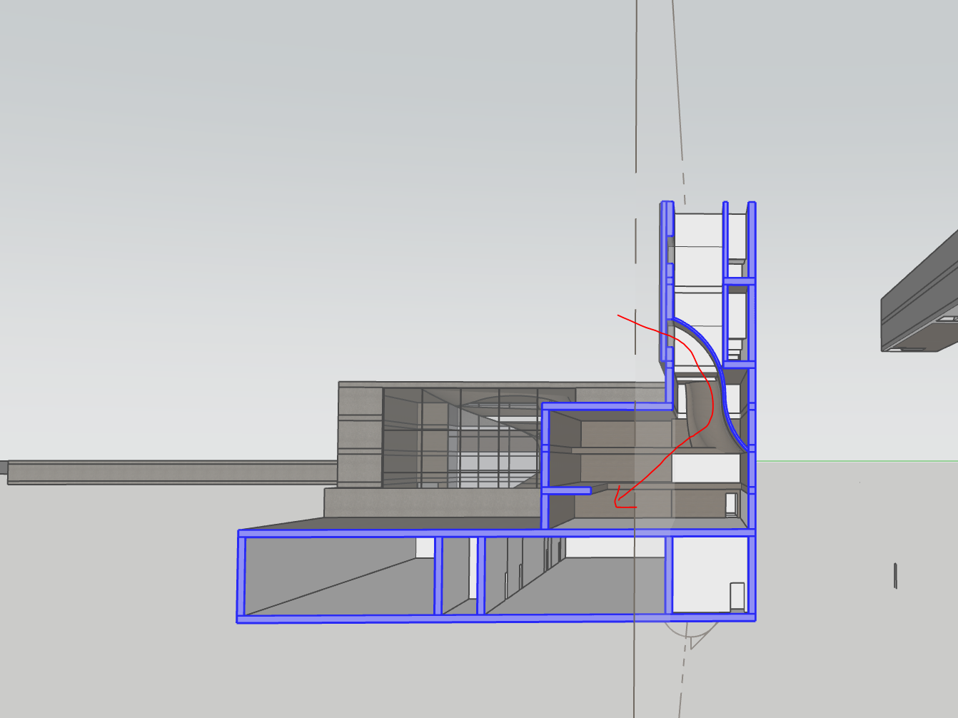
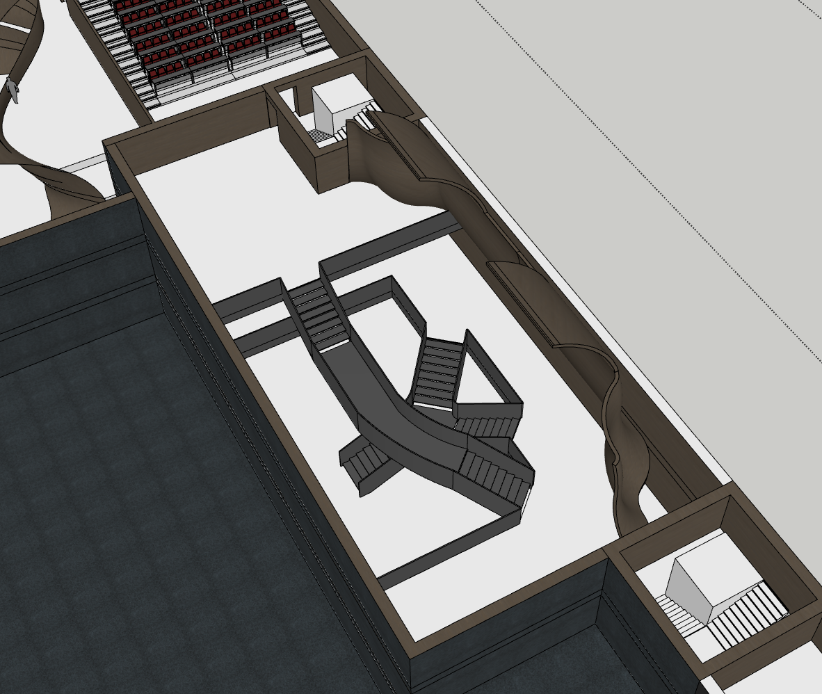
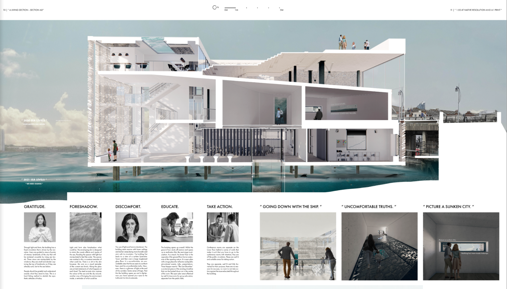
After reworking the roof circulation with a ramp, I refined the top of the building to make the experience more dynamic and spatially rich, while still maintaining clear fire core separation and safety standards.
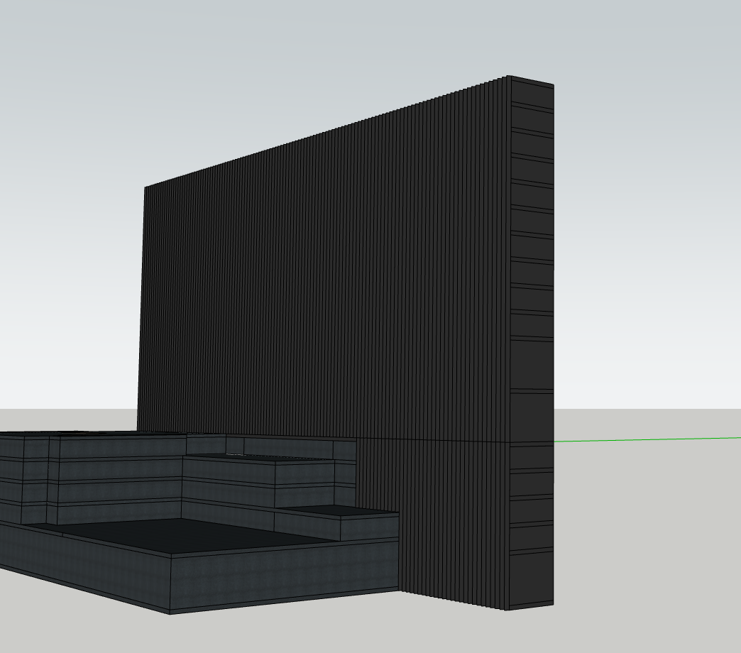
This new configuration introduces sunken seating, carved viewing platforms, and layered levels that guide users across the roof. The spaces flow seamlessly from the building’s mass, shaped rather than constructed, meaning no added railings or bolted-on elements. Everything is carved out as one continuous gesture.
The seating and stepped forms are inspired by Zaha Hadid’s approach to circulation, particularly how stairs and levels in her work act as both movement and experience. Here, the surfaces shift and cascade like cooled lava, echoing the Icelandic terrain and reinforcing the building’s relationship to the surrounding landscape. Movement is not just about getting from A to B, but about exploring perspectives, pausing, and occupying space along the way.
Following the reworking of the upper circulation and seating, I began to reconsider the idea of the small 3v3 football pitch in the courtyard. While it initially felt like a playful addition, it now seems too constrained and slightly forced within the broader design language.
Instead, a more open, low-maintenance garden feels like a better fit, providing a shared green space for researchers, office staff and visitors to step "outside" the monolith and experience a sense of lightness and calm. Surrounded by the volcanic landscape, this courtyard becomes a counterpoint to the intensity of the architecture, a soft, human-scaled communal zone within the larger form.
Rather than defining it too rigidly, this garden space can remain adaptable, somewhere to relax, take calls, gather informally, or simply enjoy fresh air. The balconies above overlook it, further connecting the interior life of the building with this exterior, social void.
I’ve now developed the cafeteria layout in more detail. This includes the kitchen, storage areas, and a service route that allows goods and produce to be brought in without interfering with the main circulation paths.
To achieve this, I introduced a more industrial-style back-of-house route, accessed via a roller shutter entrance. This allows service vehicles or staff to load and unload supplies efficiently, keeping operations discreet and separate from public or staff-facing spaces. It also brings in a layer of architectural realism and functionality, acknowledging that this is a working, lived-in building, not just a gallery of AI and research.
The kitchen and storage areas are placed directly adjacent to the cafeteria for easy access and workflow, while still remaining out of sight from the dining space. This ensures the communal eating area retains its atmosphere and can be zoned as a social, open environment, while the logistics remain hidden behind the scenes.
This move also supports ideas of flow and separation within the building, such as public versus private, or social versus operational, which ties back to earlier design strategies around thresholds and layered transparency.
Mechanical brise soleil, ai controlled and north, south facing, responds to the solar positioning.
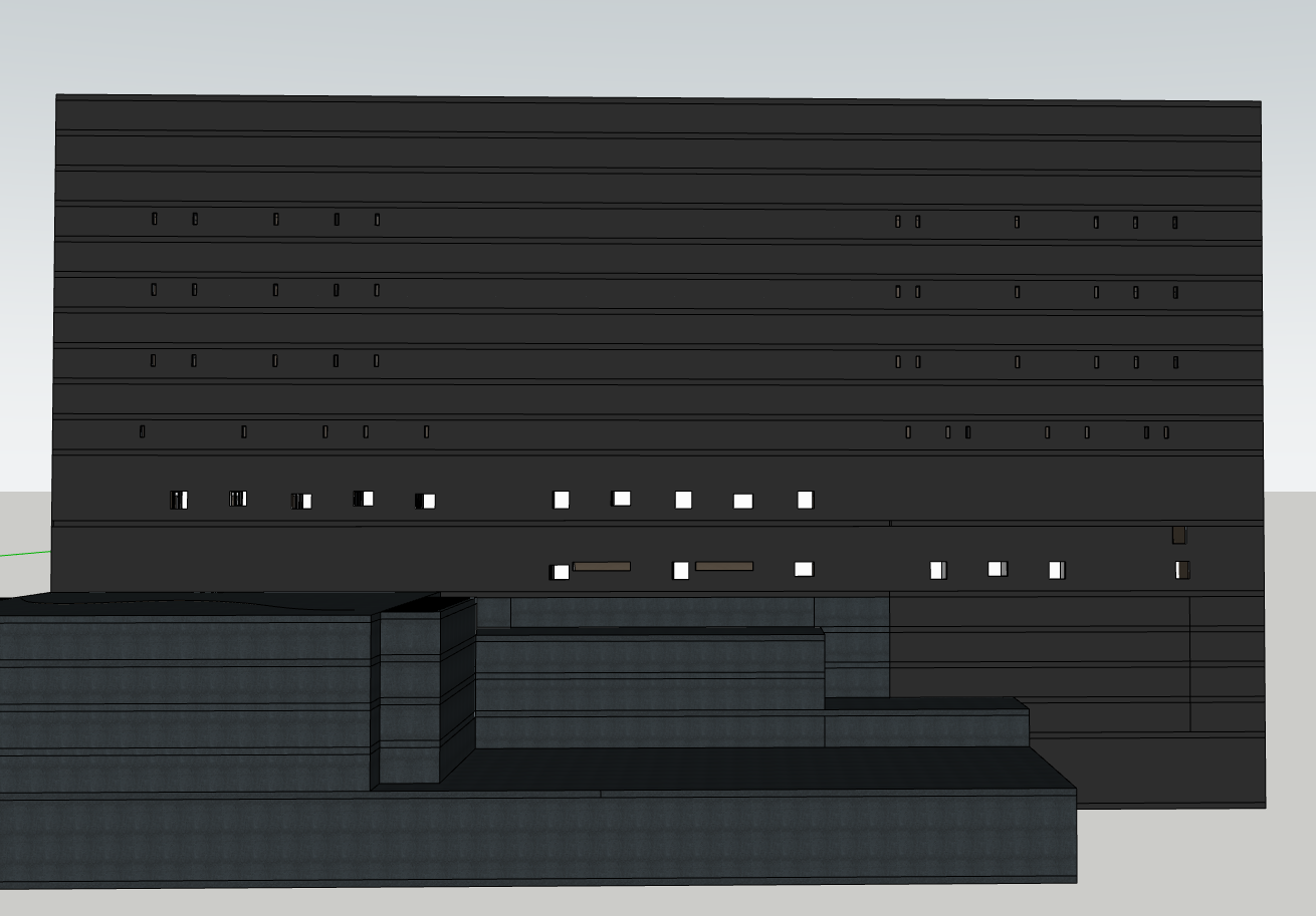
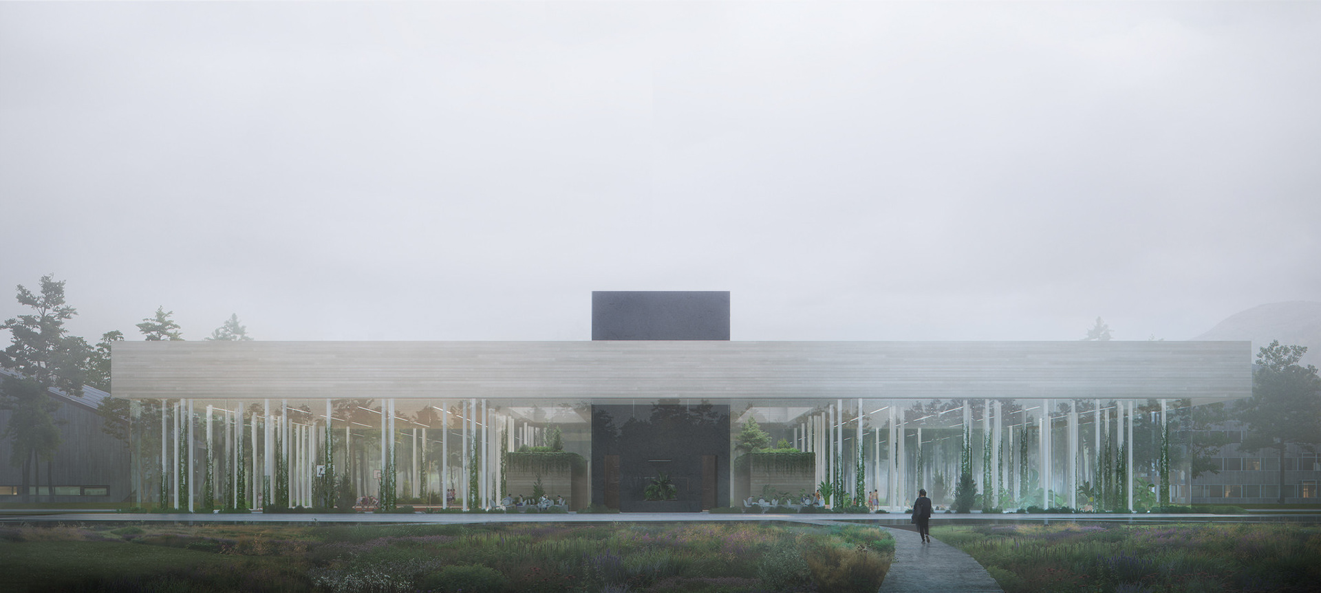
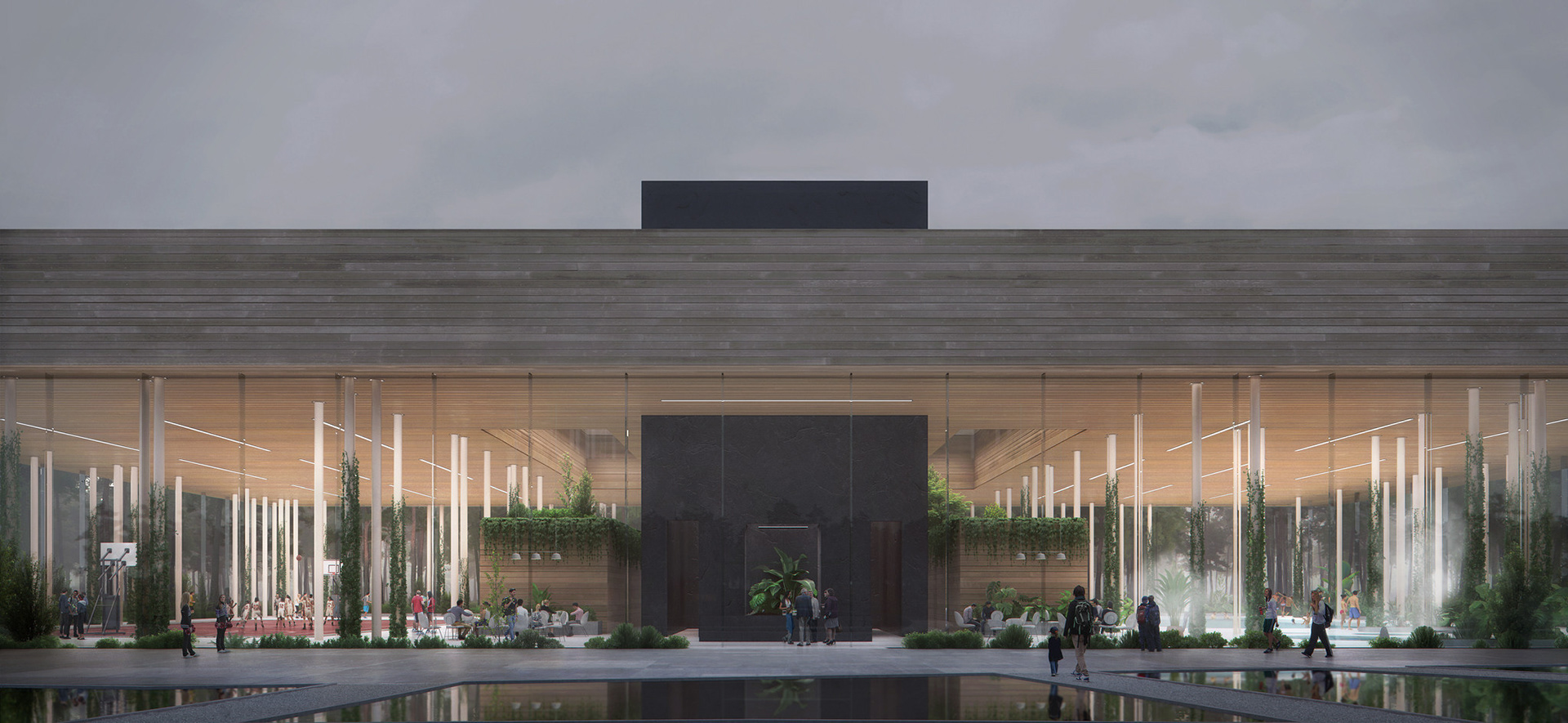
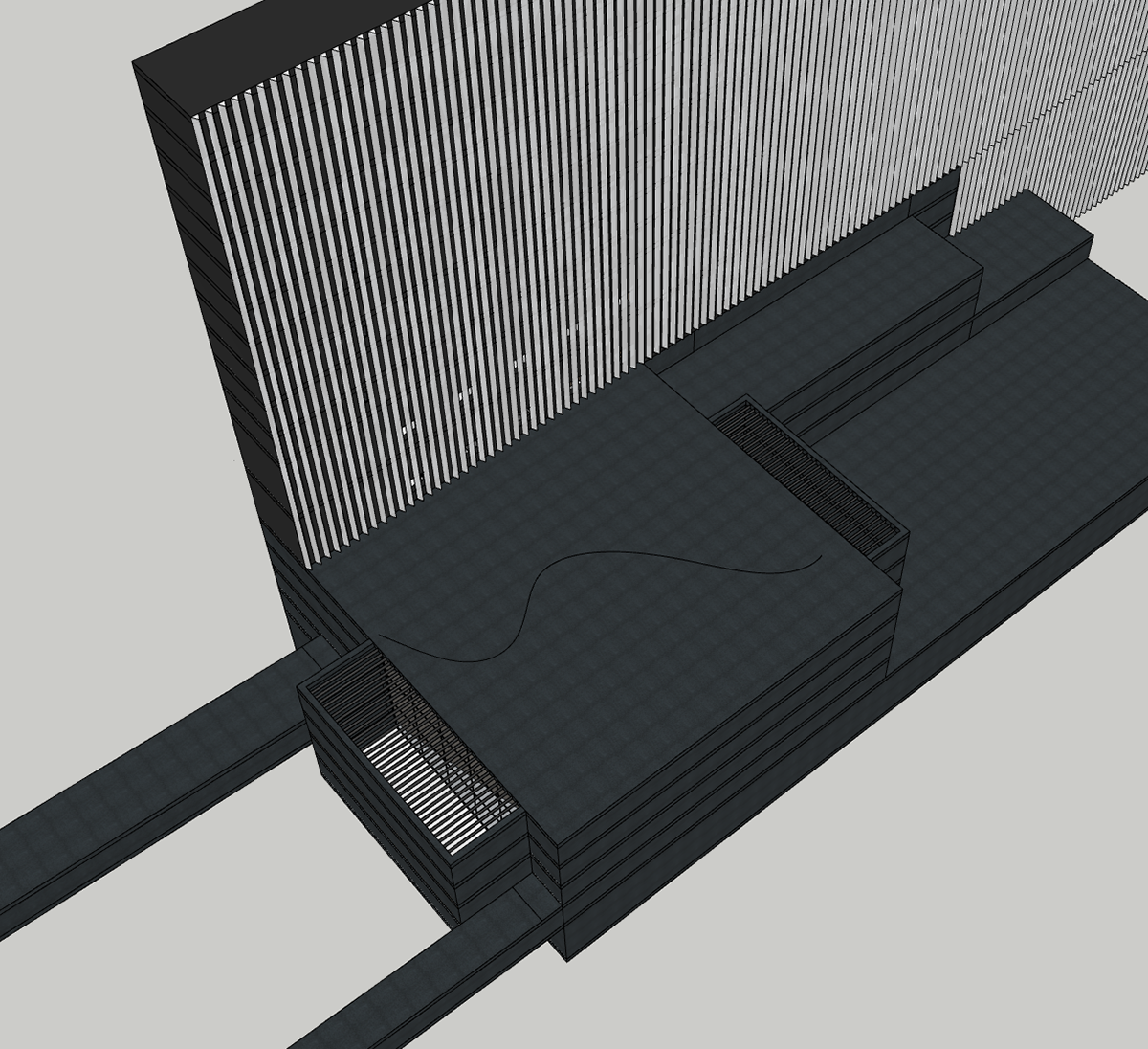
I wanted to challenge the way openings are typically used to reveal a building’s programme. Often, window placement gives away what’s happening inside, where the kitchens, desks, or corridors are. In my scheme, especially with the office areas, I deliberately reduced the number of windows. This had two effects: it helped with glare reduction, and it supported the idea of the building as a secure, enclosed system. Since the building is narrow, tall and slim windows were still effective at bringing in natural light, but I placed them irregularly, only where needed, so they didn’t form predictable patterns.
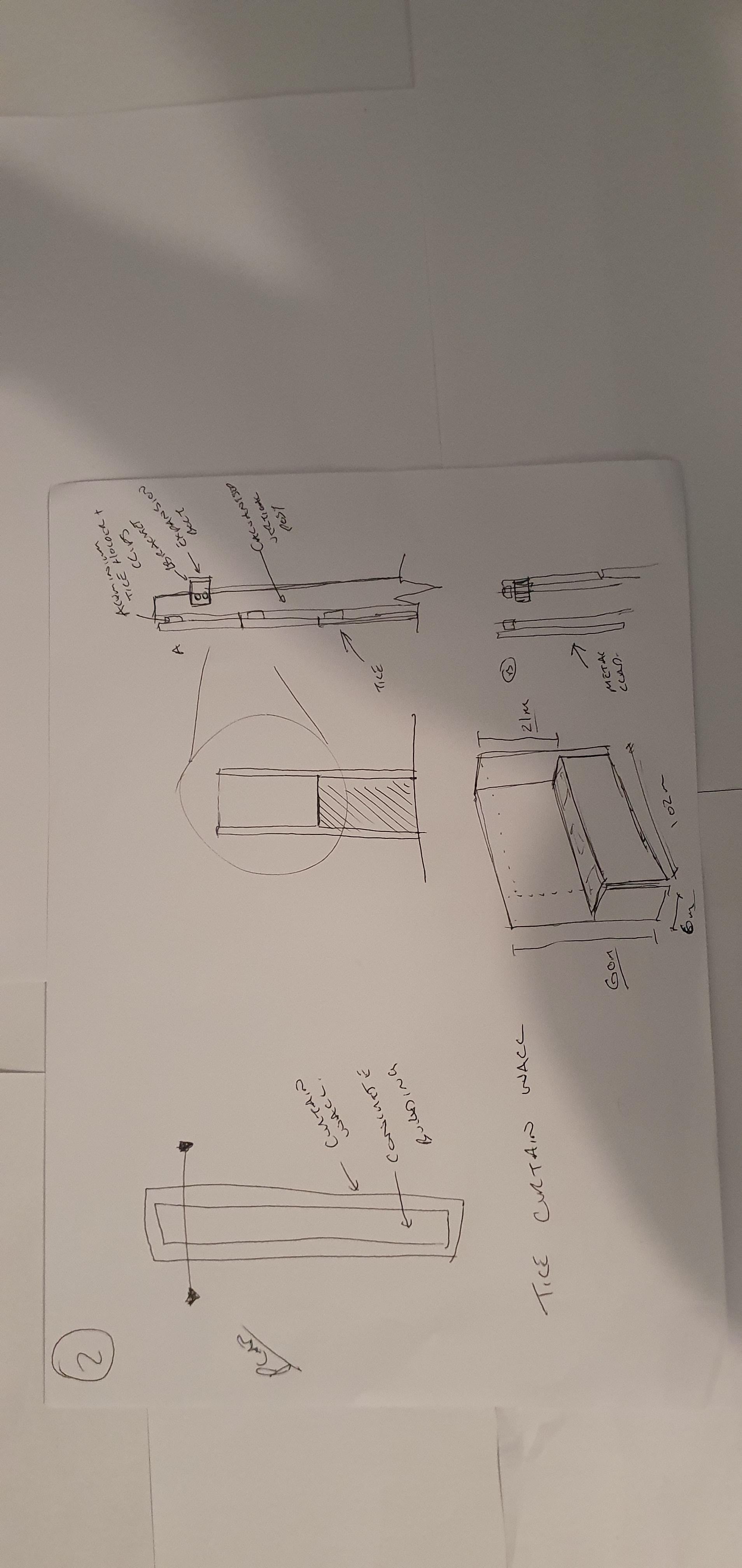
This strategy, however, became more difficult when dealing with the accommodation units. The exterior cut-outs for these spaces were more rigid, as they could only occur in specific locations due to the internal layout. To overcome this, I offset each opening by 250mm from one of the four sides of the façade cut out. This subtle manipulation allowed for a sense of randomness and fragmentation, softening the regularity. It reinforces the idea that the building is secretive, its external skin gives away very little about what’s going on inside. Along with the way I have set the fins up to be on their own consistent offset means that the gaps that pass through the fins are unique. They are on their own grid to allow for window placement, this makes a shift in grids whereby these don't always align.
This balance between functional requirements and an intentionally obscured exterior adds to the narrative of the building as a secure, intelligent entity. The architecture resists legibility, just as the systems within may resist human comprehension.
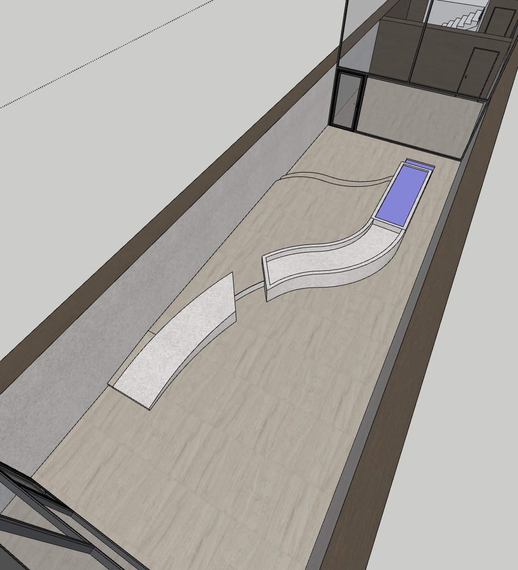
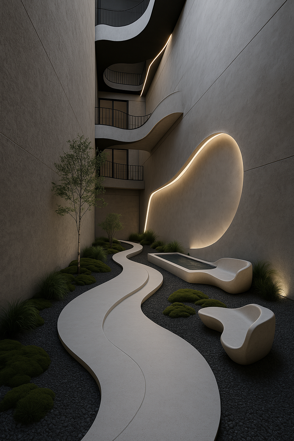
As I began designing the courtyard, I was interested in continuing the visual and conceptual language established by the fluid, wire-like bridges overhead. My first attempt was to create a central spine running through the courtyard, something that would physically reflect the bridges above and reinforce that sense of a continuous, connected system. However, once placed in the model, it began to feel too rigid and clunky. The gesture lacked the softness and calm I wanted from this space, which is intended as a communal retreat for researchers and staff.
To explore alternatives, I turned to AI image generation to test options. One particular image stood out, a calm, grounded arrangement featuring curved seating, gravel, and planting, with a soft lighting feature on the wall. The layout felt more like a place to pause, to step outside the intensity of the building and reset. The gravel and soft planting brought a meditative quality, while the sunken seating created a more intimate and tactile space.
I still like the idea of incorporating a water feature, something subtle that enhances the sensory experience, but I now realise that the success of this space lies less in mirroring the digital systems of the building and more in providing a contrast. It needs to be something grounded, textural, and slow, a moment of human scale within the monolith.
I then returned to the light spa, re-evaluating its role as a permanent wellness space rather than something that felt like a temporary installation or pavilion. While the original concept held potential, its execution, full of angular sunken seating and competing ramps, felt overly complex and visually busy. It lacked the serenity I was aiming for.
Taking on board feedback from my tutorial, I stripped it back and allowed the architecture to breathe. I softened the walls, opened the space up, and focused on gentle curves to shape a more immersive and calming environment. The result is a quieter, more meditative space, akin to the courtyard in spirit, but more pared-back. Soft lighting and smoother transitions define the atmosphere, creating a true retreat for reflection and decompression.
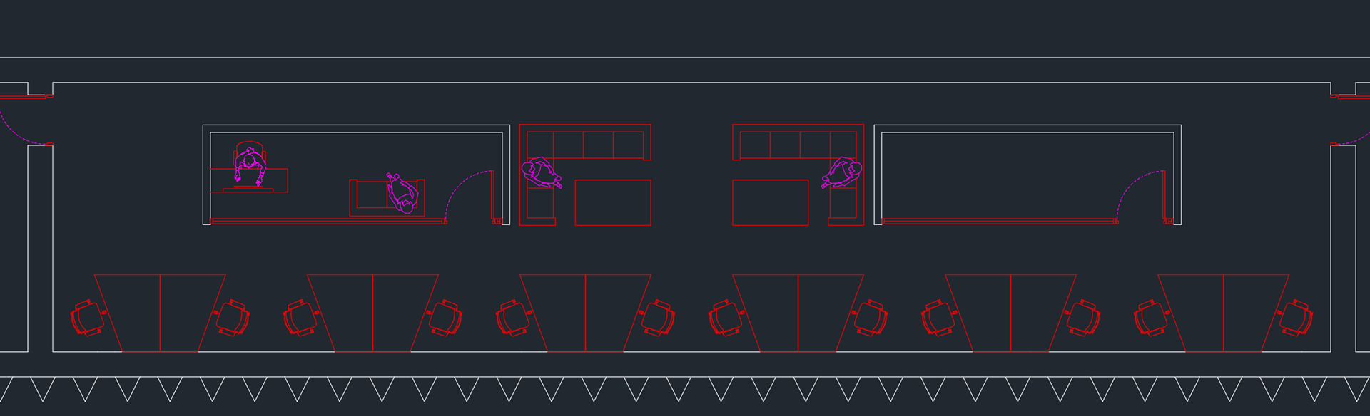
Each AI software lab is conceived as a secure, collaborative cell, home to a focused team of twelve researchers. The desk layout avoids the rigidity of a corporate plan, using angled workstations arranged in mirrored pairs. This enhances privacy and reflects the fragmented, decentralised nature of AI development. No screen is easily visible from the outside, or even from within, supporting the narrative of layered thresholds and concealed logic.
At the centre of the room, a breakout space provides an informal area for discussion, model reviews, and downtime. Two low sofas and tables offer a relaxed setting, forming a communal core that balances the surrounding desk clusters and creates a rhythm between focus and collaboration.
A private office for the project lead sits slightly removed from the main space, maintaining a connection while allowing for more focused or sensitive work. On the opposite side, a spare room allows for future adaptability. This could serve as a space for VR setups, secure file storage, or other experimental tools as the needs of the lab evolve.
The overall layout supports the core themes of the project: distributed systems, privacy, and architectural expressions of secure, intelligent infrastructure.
The courtyard functions as an outdoor microclimate, a softened landscape carved into the monolith. It acts as a gentle echo to the lava field beyond, drawing from its moss-covered terrain while deliberately contrasting its darkness and unpredictability. Where the lava field is vast, black and harsh, the courtyard introduces lightness, softness and calm. Curved concrete paths wind through gravel, and native mosses and grasses are reinterpreted in a more curated, inhabitable form. Seating rises organically from the ground, offering moments of quiet relief.
Reflecting on my earlier work, particularly the MArch 1 project that explored notions of portals, and my BA2 scheme, I returned to the idea of diagonals as tools for both movement and spatial carving. These previous projects showed me how sectional diagonals could act as narrative devices, guiding users through buildings in unexpected, engaging ways. In my BA2 project, I began exploring the use of diagonal circulation and carved spatial thresholds. Revisiting that strategy here allowed me to evolve it within the context of a far more monolithic and bold, highly regulated building, where sectional transitions become performative and symbolic.
Inspired by that lineage, I began to explore a new ramp condition in this scheme, one that crosses diagonally across the upper portion of the monolith. What emerged was more than a circulation device, it became a spatial incision that allowed me to extend the idea of the “outside” deeper into the heart of the building. The courtyard now serves as the point of transition, framed by a circular void that has been rotated and stretched to act as a portal, simultaneously grounding and dislocating the space around it.
The intersecting diagonals across the top levels create an ascending sequence of platforms, ramps and landings that feel choreographed and fluid. These moves transform what could have been a typical stacked section into something more continuous and dynamic, while still maintaining the monolithic fin identity of the exterior. From the outside, the structure remains quiet and unreadable, yet internally it is full of complexity, light, and layered transitions.
This strategy ties directly into a broader design language I’ve explored over time, where sectional diagonals are used to manipulate light, programme, and perception. Here, they serve not only to link spaces, but to construct a sense of ascent, legibility and progression, within a building that is intentionally unreadable from the outside.
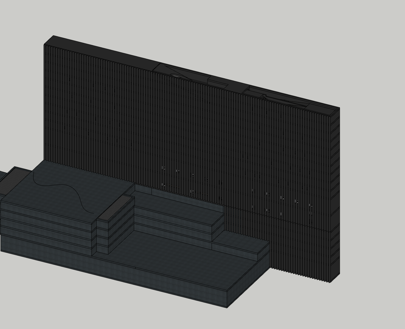
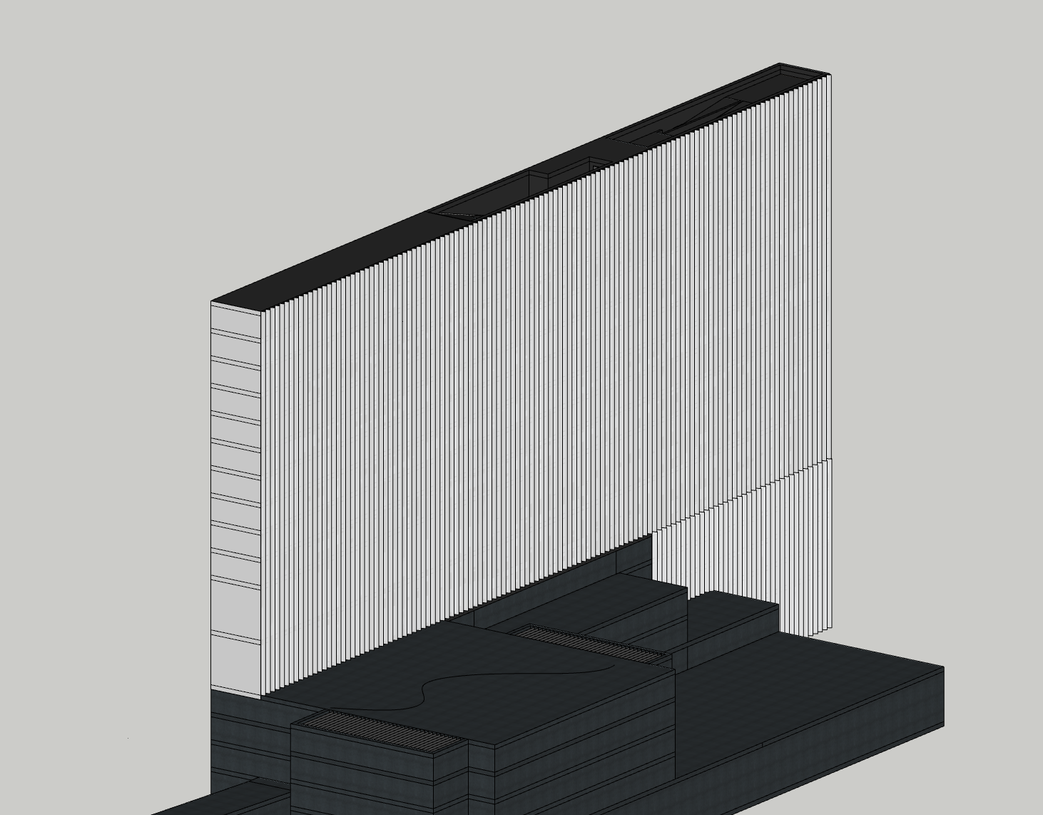
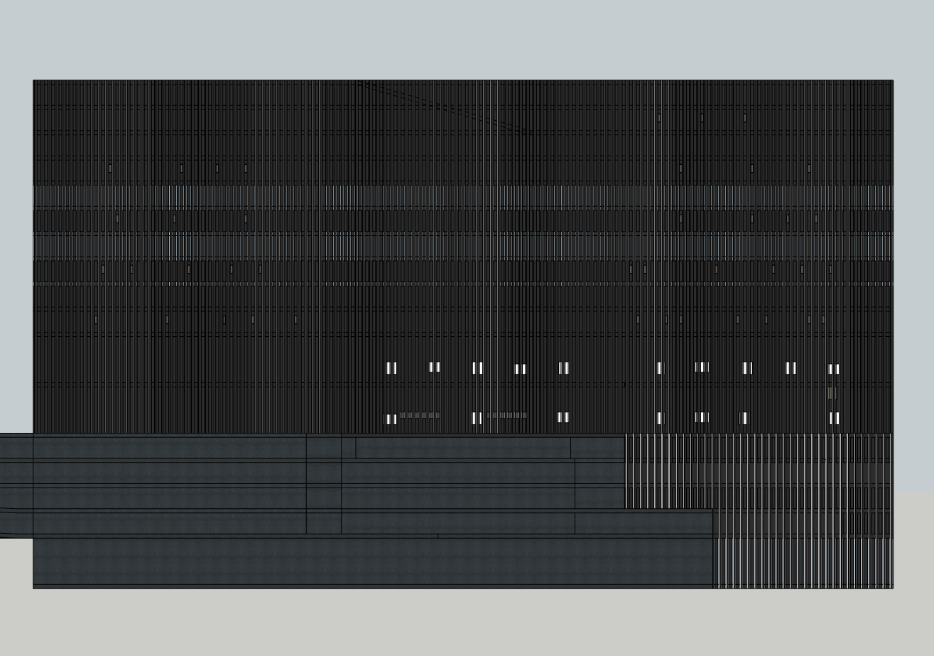
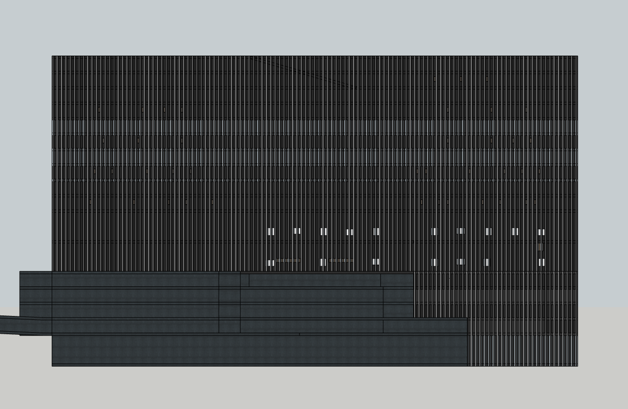
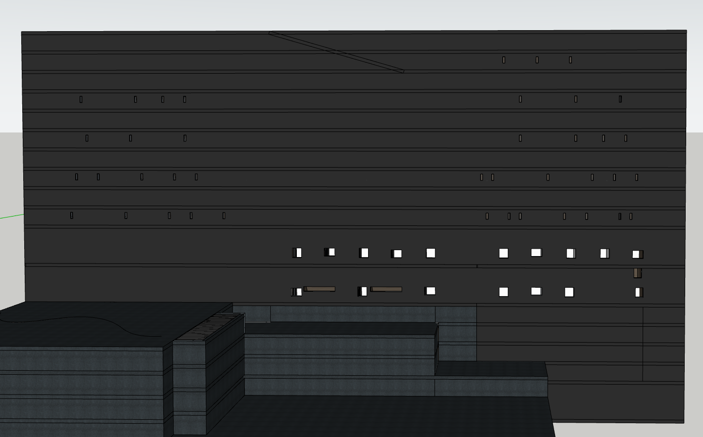
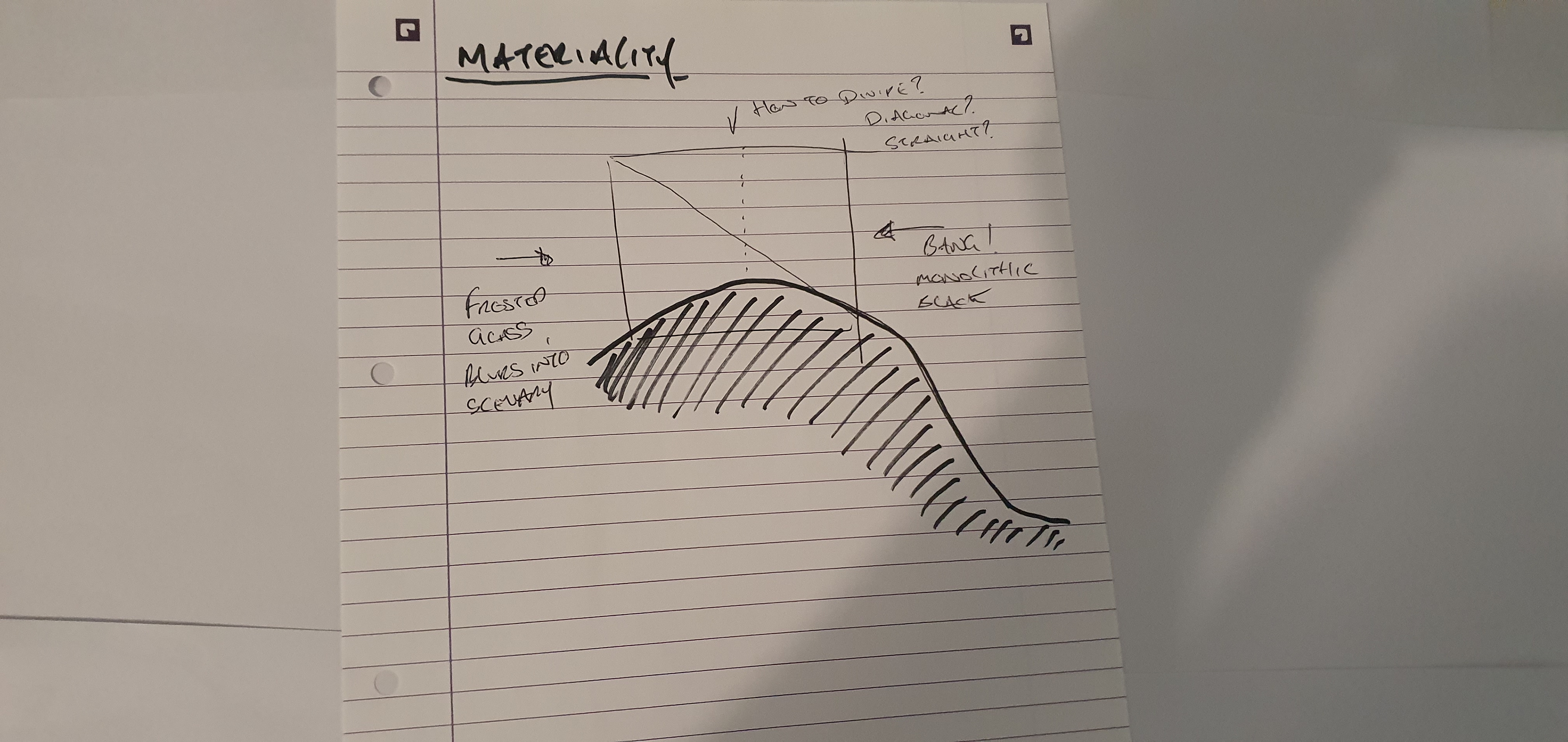
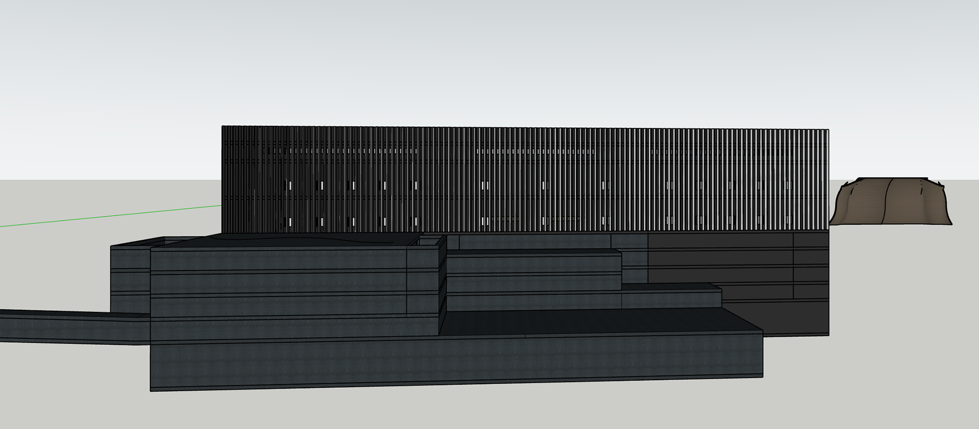
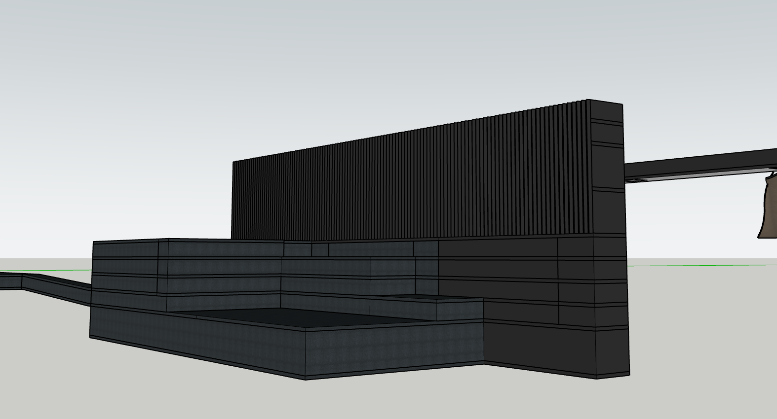
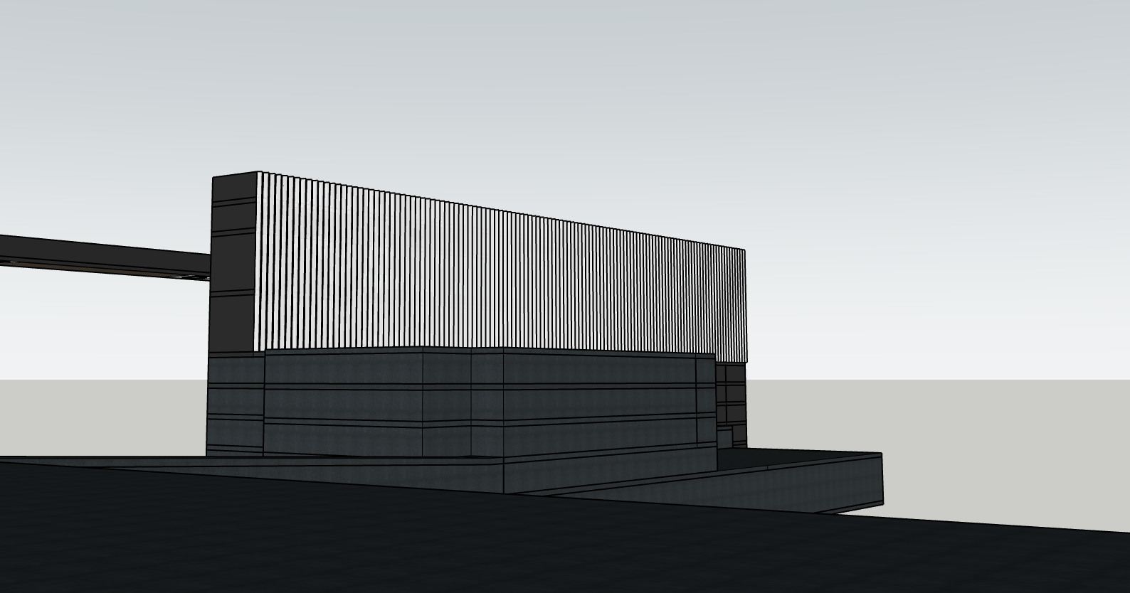
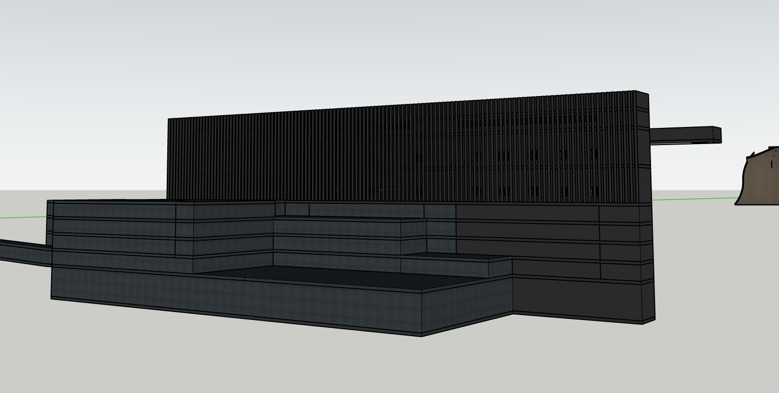
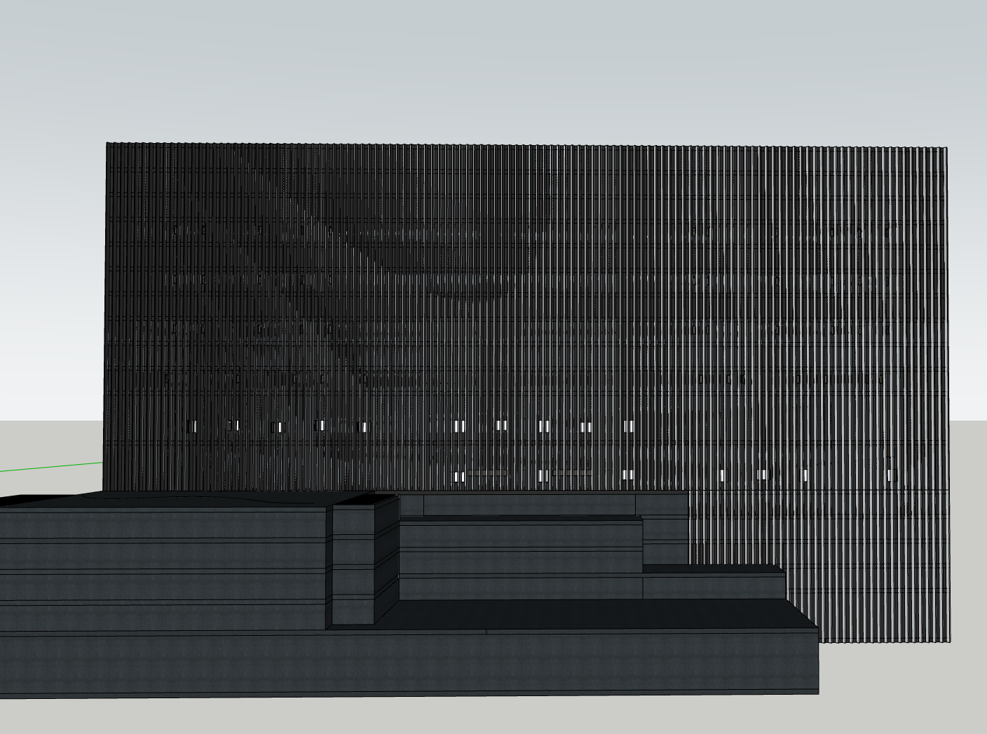
I refined the window placement strategy to further obscure the internal programme, introducing a more randomised arrangement that resists easy legibility from the exterior. Alongside this, I adjusted the fin angles across the façade to intensify the building’s shifting visual effect, a key part of the lenticular strategy. Now, windows are only perceptible when viewed almost directly perpendicular to the façade. At more acute angles, the fins dominate, transitioning the surface into a seamless, monolithic black. This visual shift, from transparency to layered opacity and finally to solid mass, is emphasised through deliberate elevation banding. The rhythm between white (frosted transparency) and black (pure mass) creates a gradient of visibility that supports the narrative of concealment, security, and control.
The lenticular façade is not merely an aesthetic device, but a spatial strategy that amplifies the ethical ambiguity at the heart of AI research. Alongside the ridgeline, already violently sliced open for infrastructure, the angle of approach becomes critical. It is intentionally difficult to view the building front-on. As such, the interplay between the black monolith and the scattered frosted apertures becomes increasingly binary, not gradual. From most vantage points, the building reads as solid and opaque, only revealing slivers of activity under tightly controlled alignments. This sudden perceptual shift, from unreadable surface to fragmented transparency, creates moments where the architecture appears to switch rather than change, disappearing or revealing itself in an almost glitch-like manner.
This instability of appearance mirrors the instability of knowing what is being developed within: research, intelligence, surveillance, and systems whose consequences are still unfolding. The building becomes a physical manifestation of the ethical concerns that surround the AI field, what is visible, what is withheld, and who gets to see in.
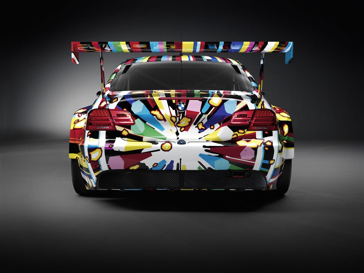
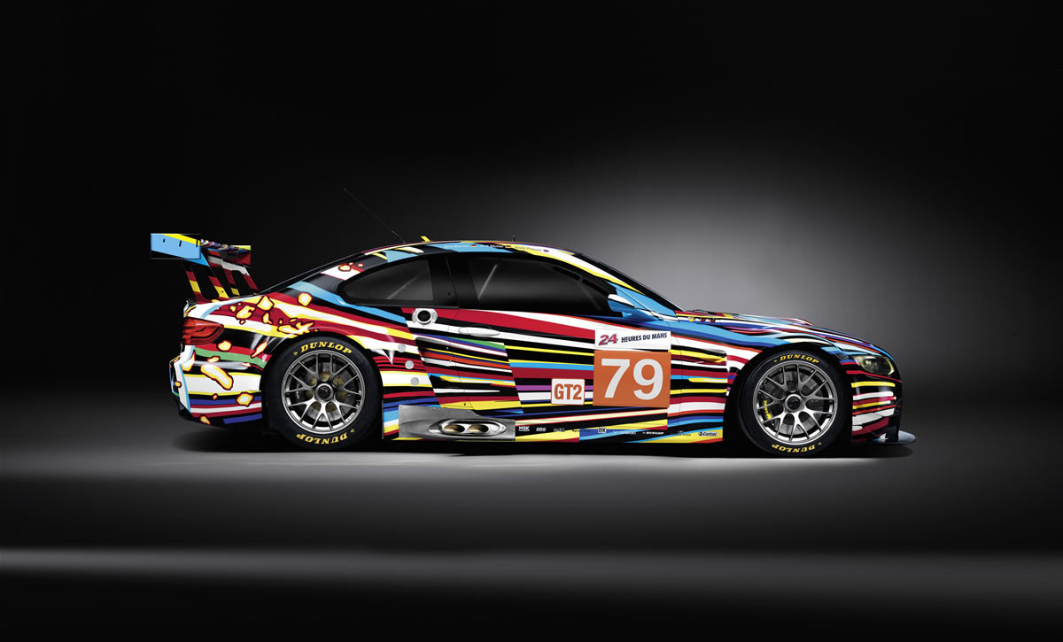
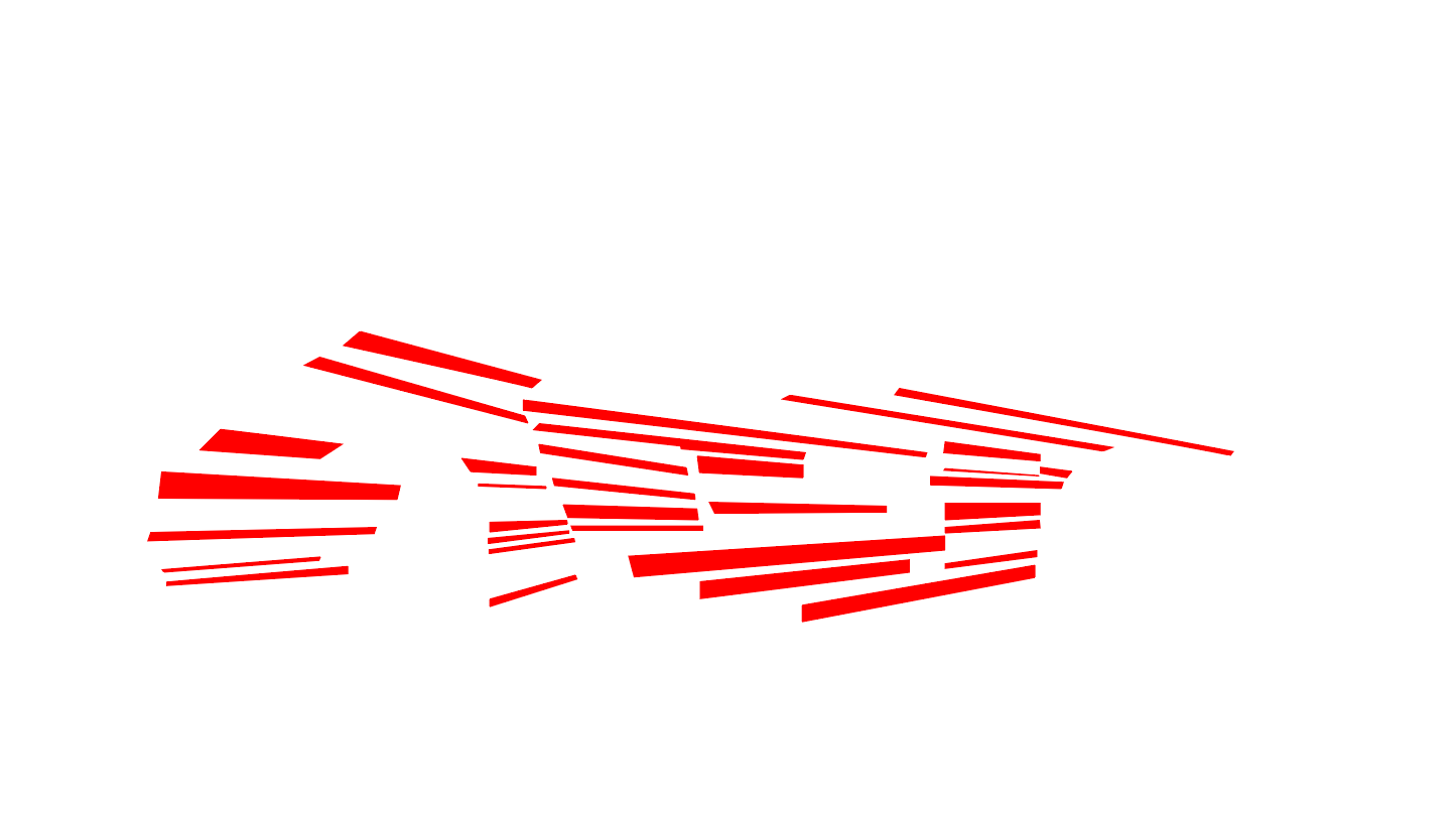
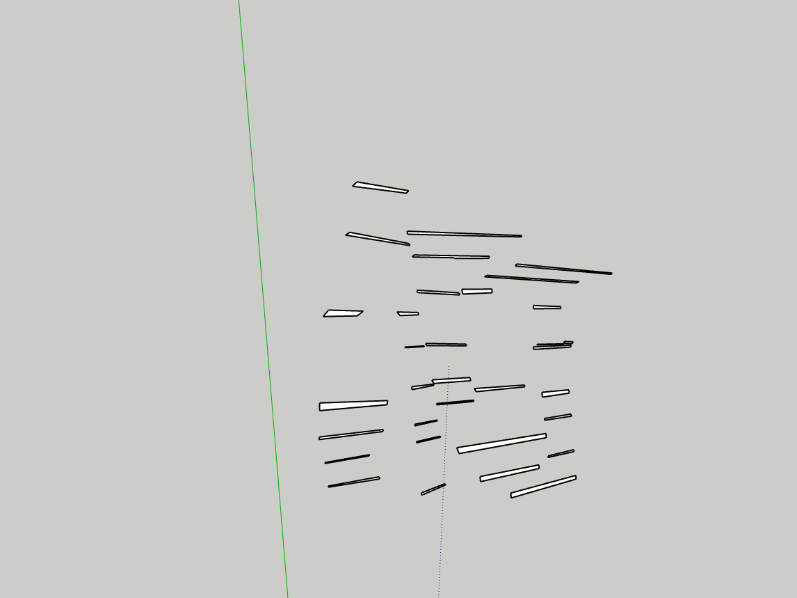
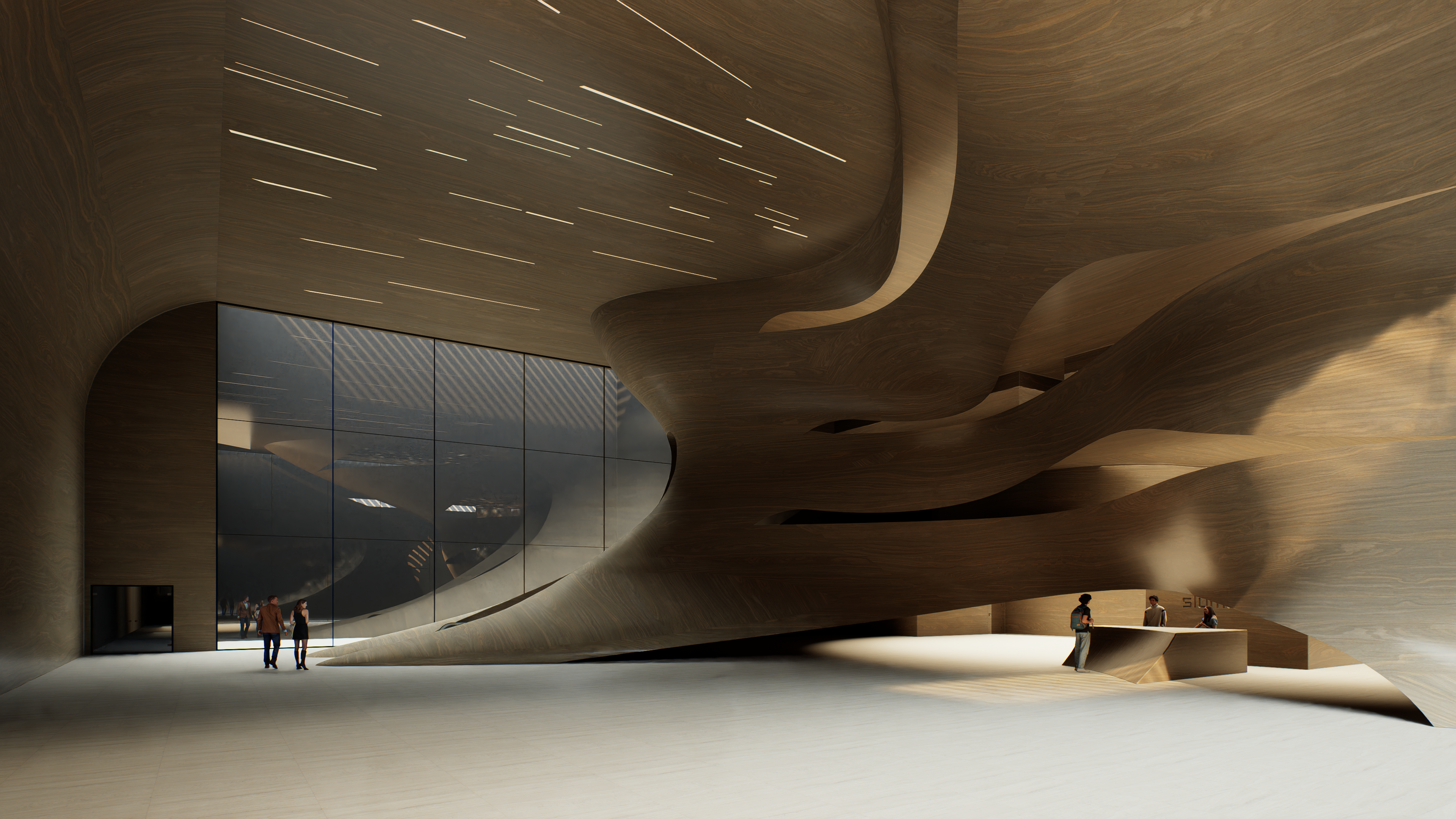
Lighting inspired by Jeff Koons
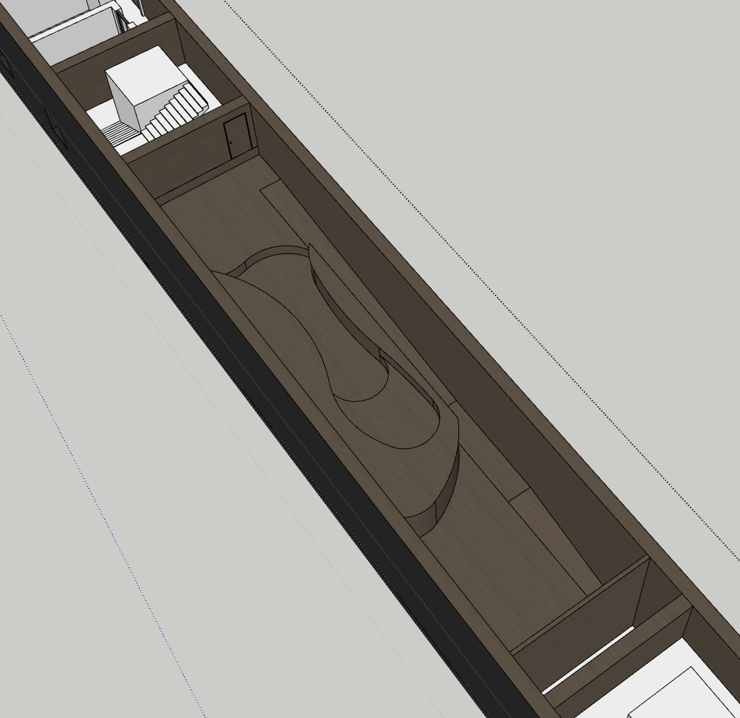
The lighting concept for the entrance was inspired by Jeff Koons' 2010 BMW GT2 Art Car, a piece I have always admired for its sense of motion and explosive colour. When thinking about how light could animate the vast carved ceiling of the entrance space, I returned to the streaking lines of the Koons vehicle. These linear elements felt like a natural fit for the sweeping geometry of the room, enhancing the directionality of the space as they stretch across the ceiling and arc towards the reception wall. The result is a gesture that feels dynamic yet restrained, amplifying the form of the architecture while referencing speed, energy and the idea of movement suspended in time.


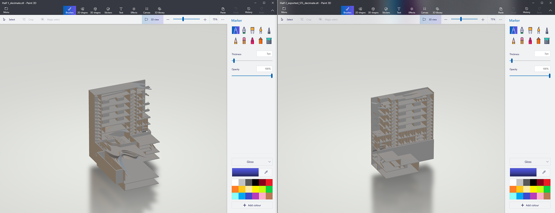
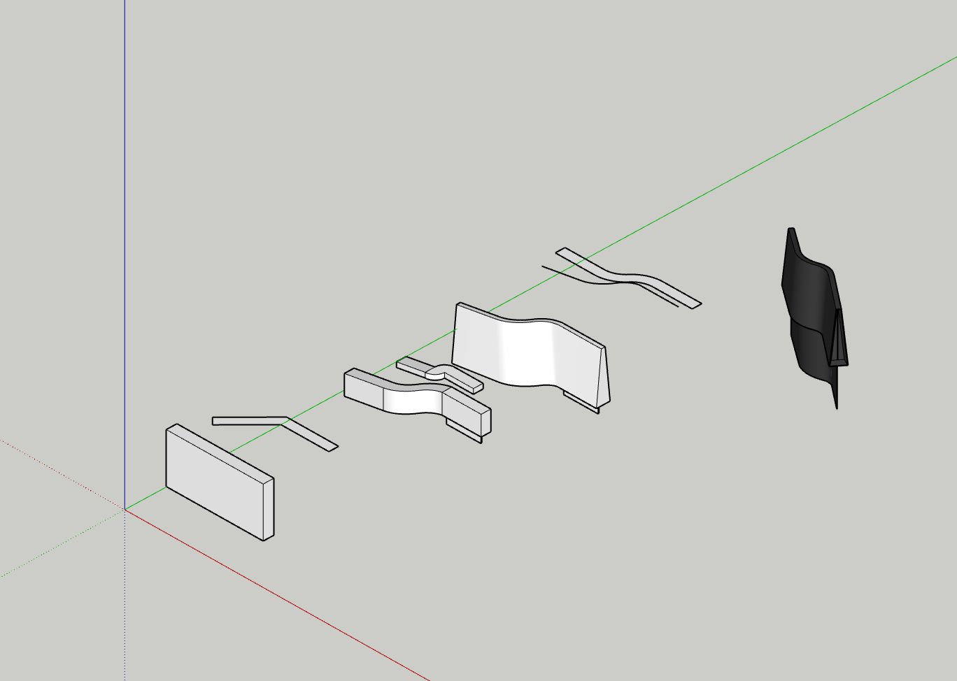
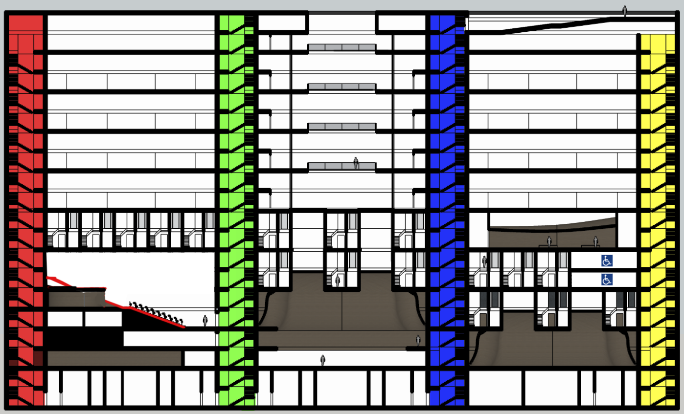
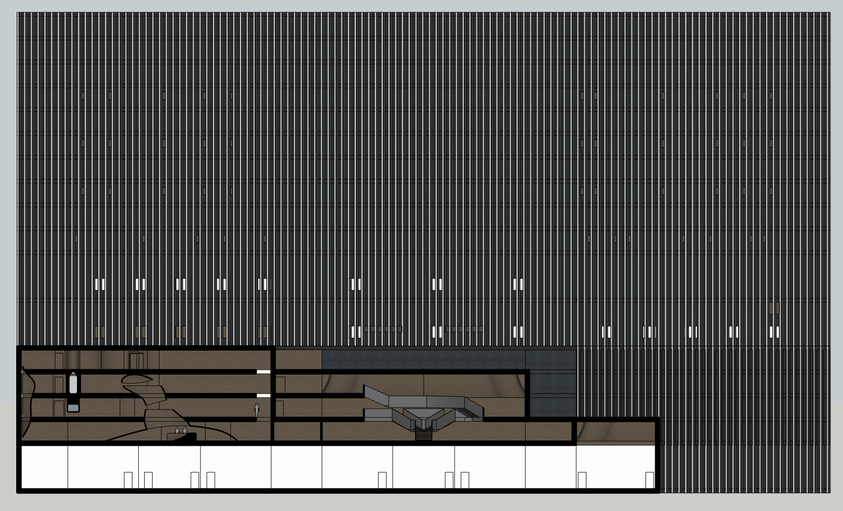
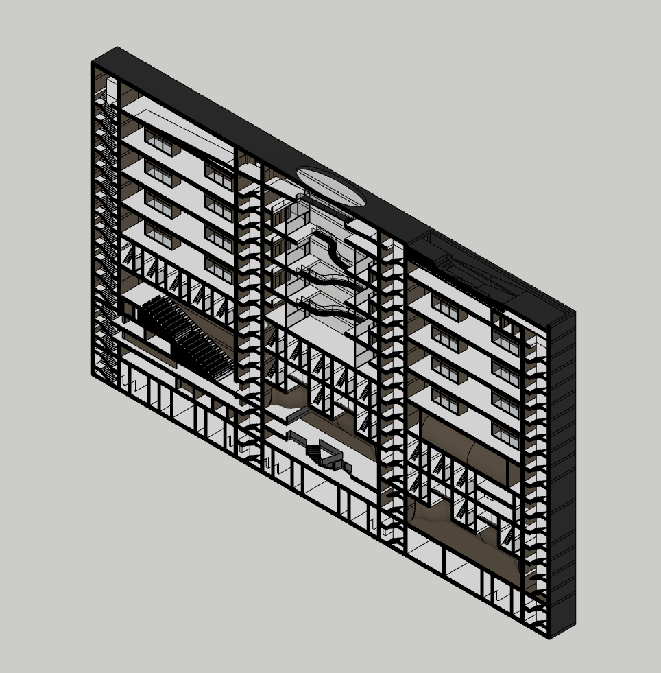
A sectional model (split in half) which has been sent to 3D print. This is 1:200 scale on the x and z axis and then 1:100 on the y due to the building being so thin and this scale.