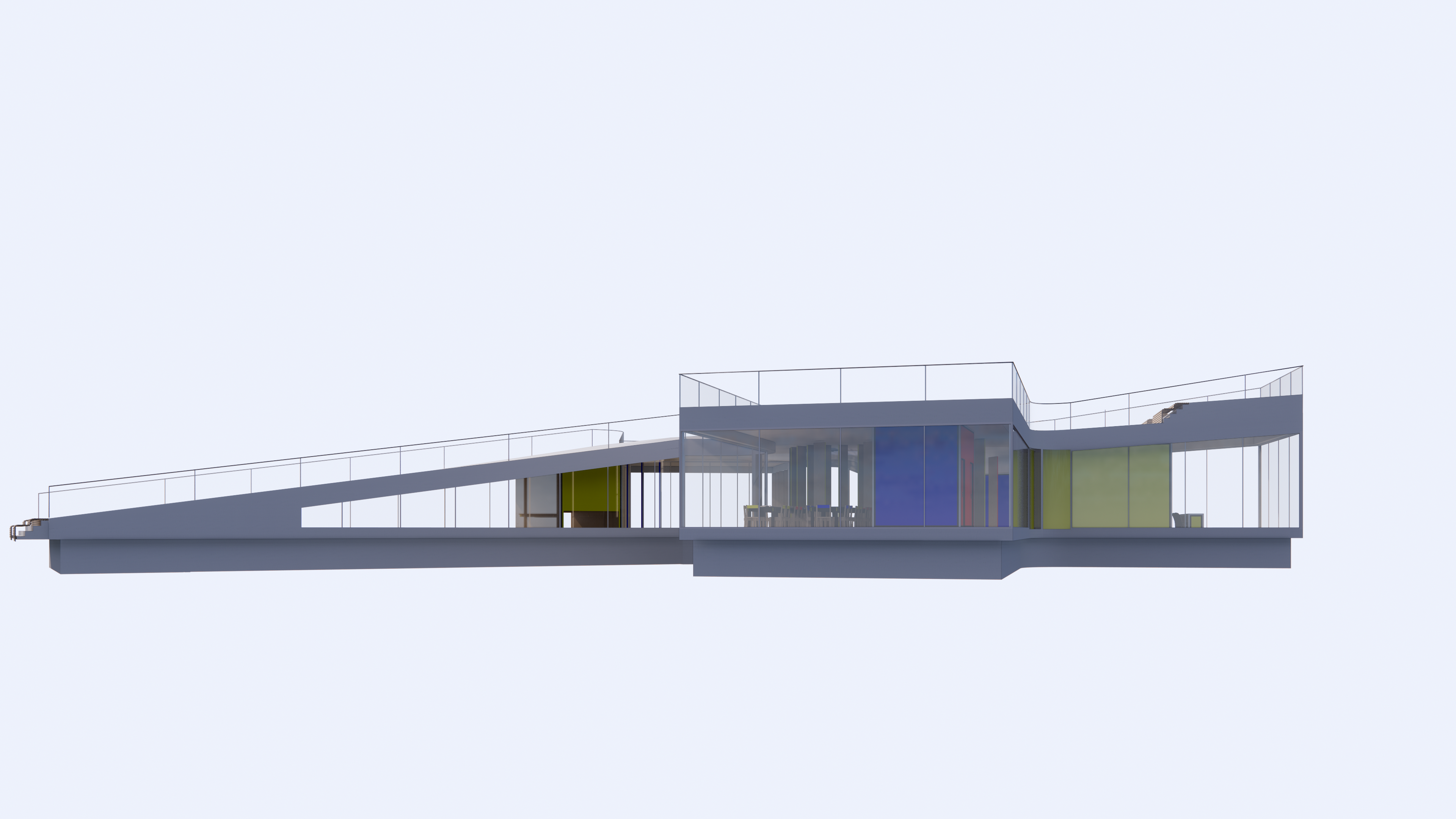
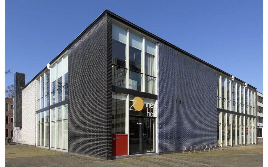
taking inspiration from bauhaus and de stijl classics such as the zonnehof museum by gerritt rietveld, i experimented with the colouration and addition of black to the framing of the glazing and mullions. this is done in an attempt to frame the colours within as the black framing of the colours blocks has been reduced.
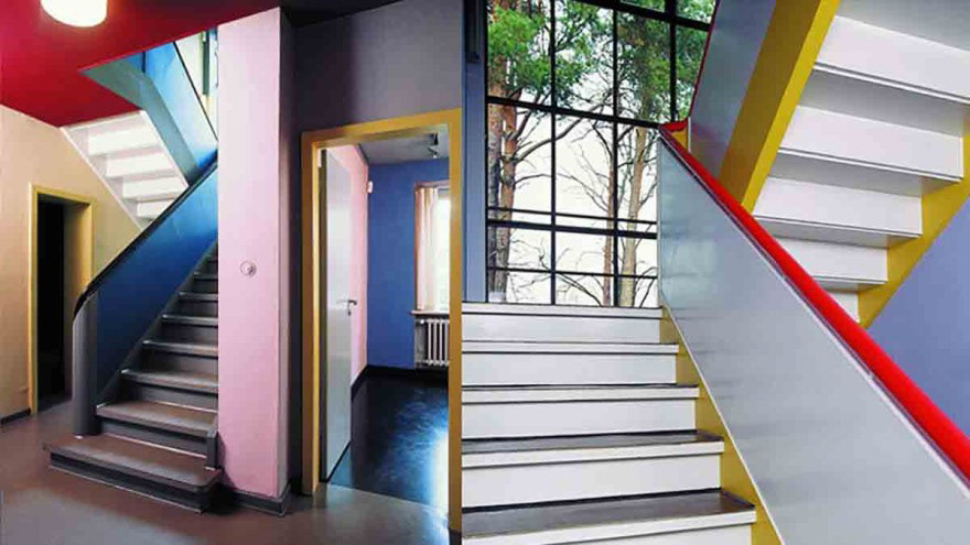
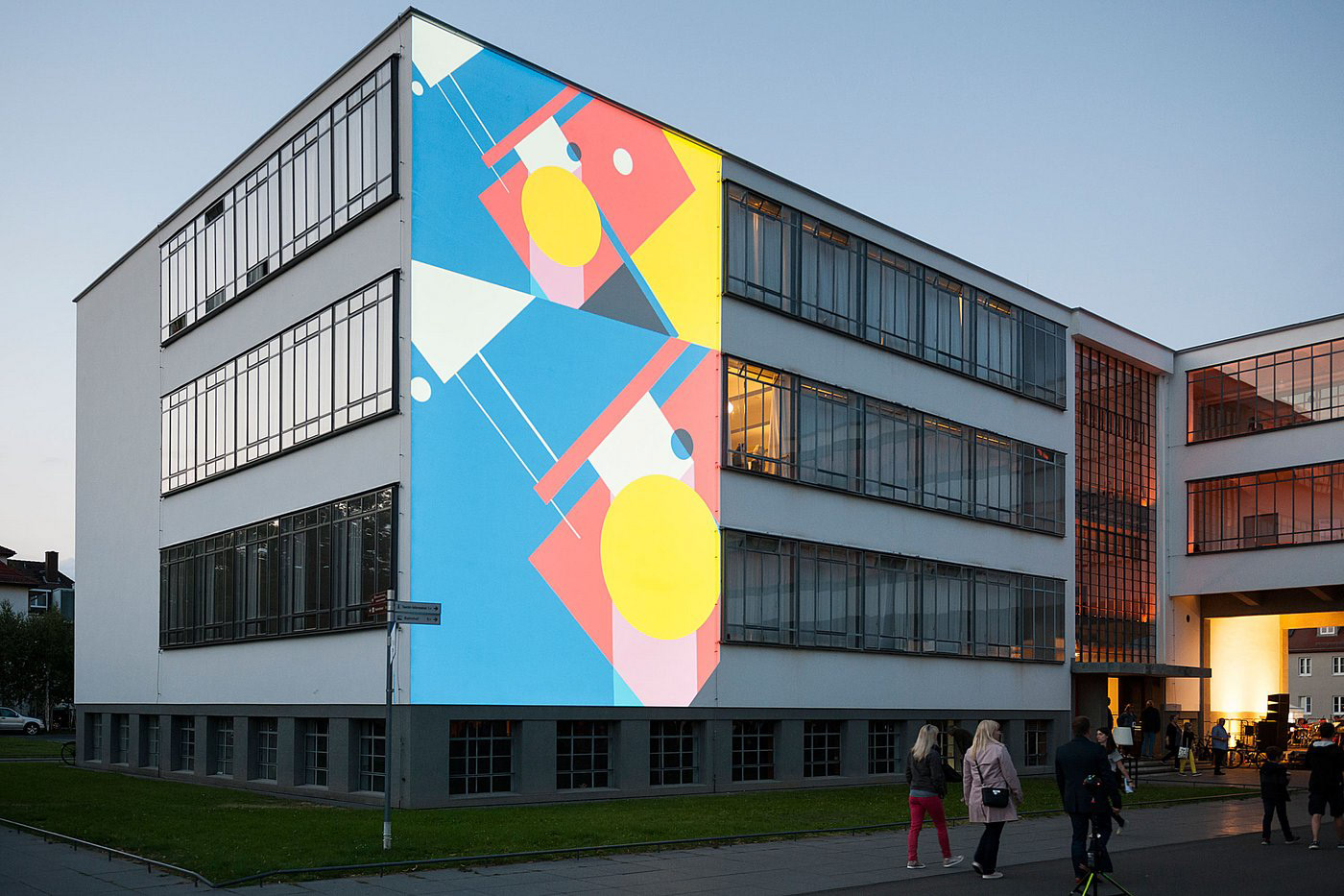
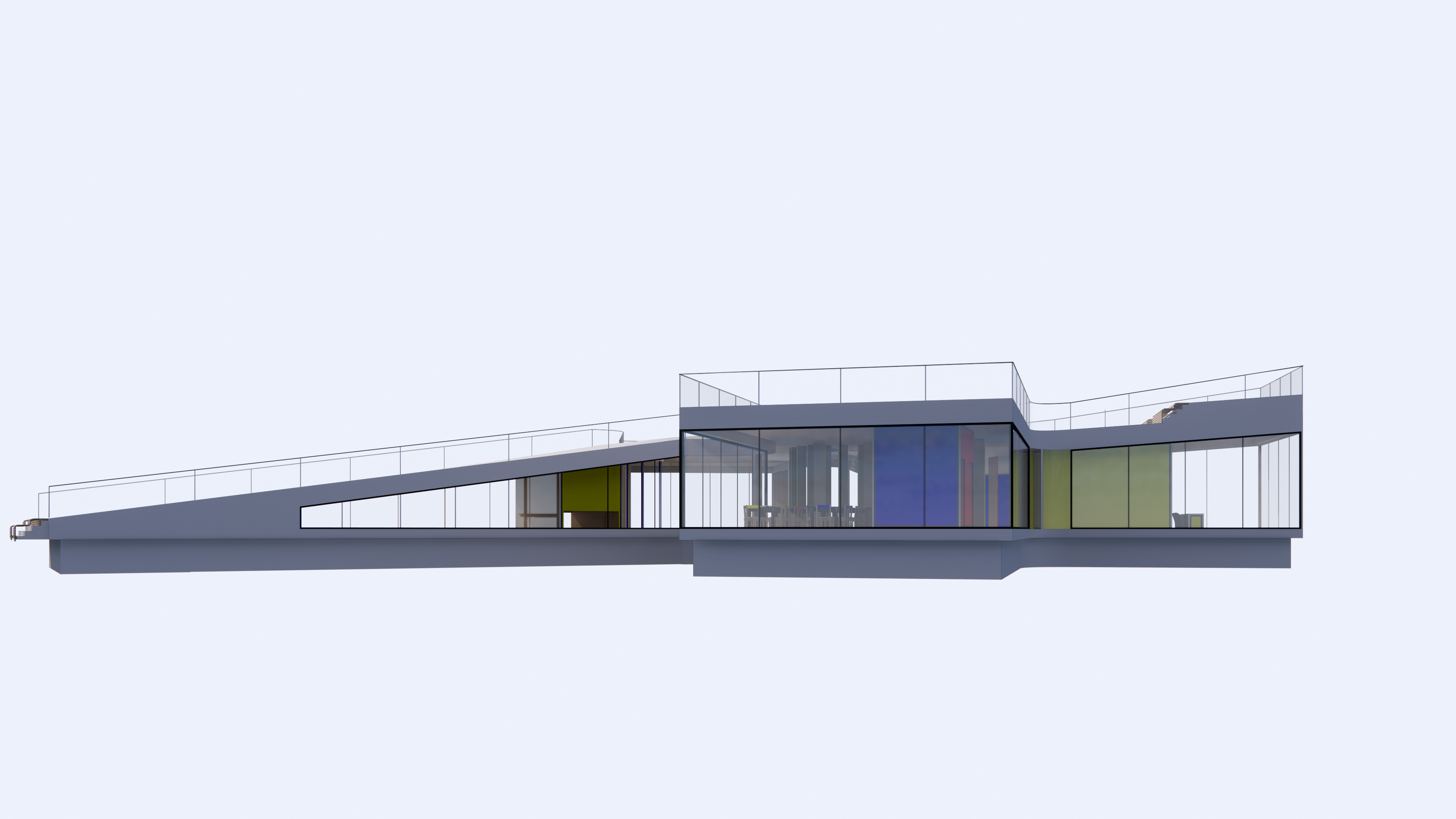
these black lines do draw more attention to the building with vertical lines. i am unsure as to whether this is an improvement or not as i do like how clean the white framing looks when sat in the environment especially along with the white concrete actually cleaning the air. i feel white mullions and framing give a cleaner, more contemporary and airy feel to the building especially in combination with the lighter wood. i feel it looks alot softer and child friendly with respects to materiality as well as how it plays with the light. i think that the black looks good and works but would be more suitable for a museum or more mature audience.