colours affect the moods of people, more so children. colours are important to children, they can enhance and help dictate to some extent how they feel within a space, how comfortable they are. colour psychology and its impact on a child’s learning abilities and behaviour is a much researched subject. one shade of pink can be calming, another one stimulating. violet may be a mystical and spiritual colour, but to some groups of older students, violet induced feelings of fatigue and sadness.
psychology: the scientific study of the human mind and its functions, especially those affecting behaviour in a given context.
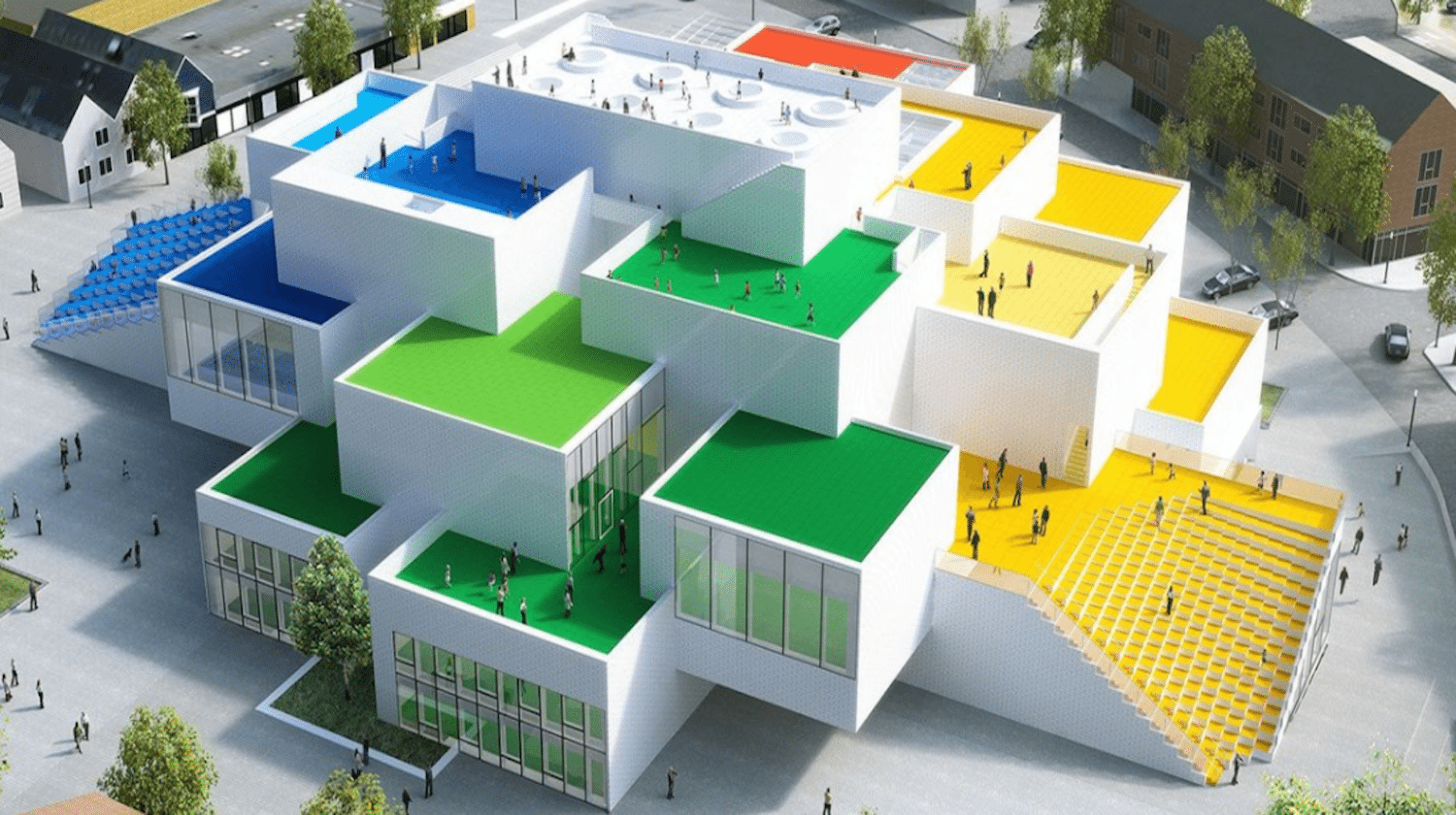
therefore, i think it is important to add colour to my building in a subtle manner, i do not want it to be overbearing or overwhelming. taking inspiration from the bjarke ingles group "lego house", i think that primary colours can be used in a reserved and appropriate manner. i therefore researched into the overlap between typical bauhaus colour schemes and blocks and their affect on a child's psychology.
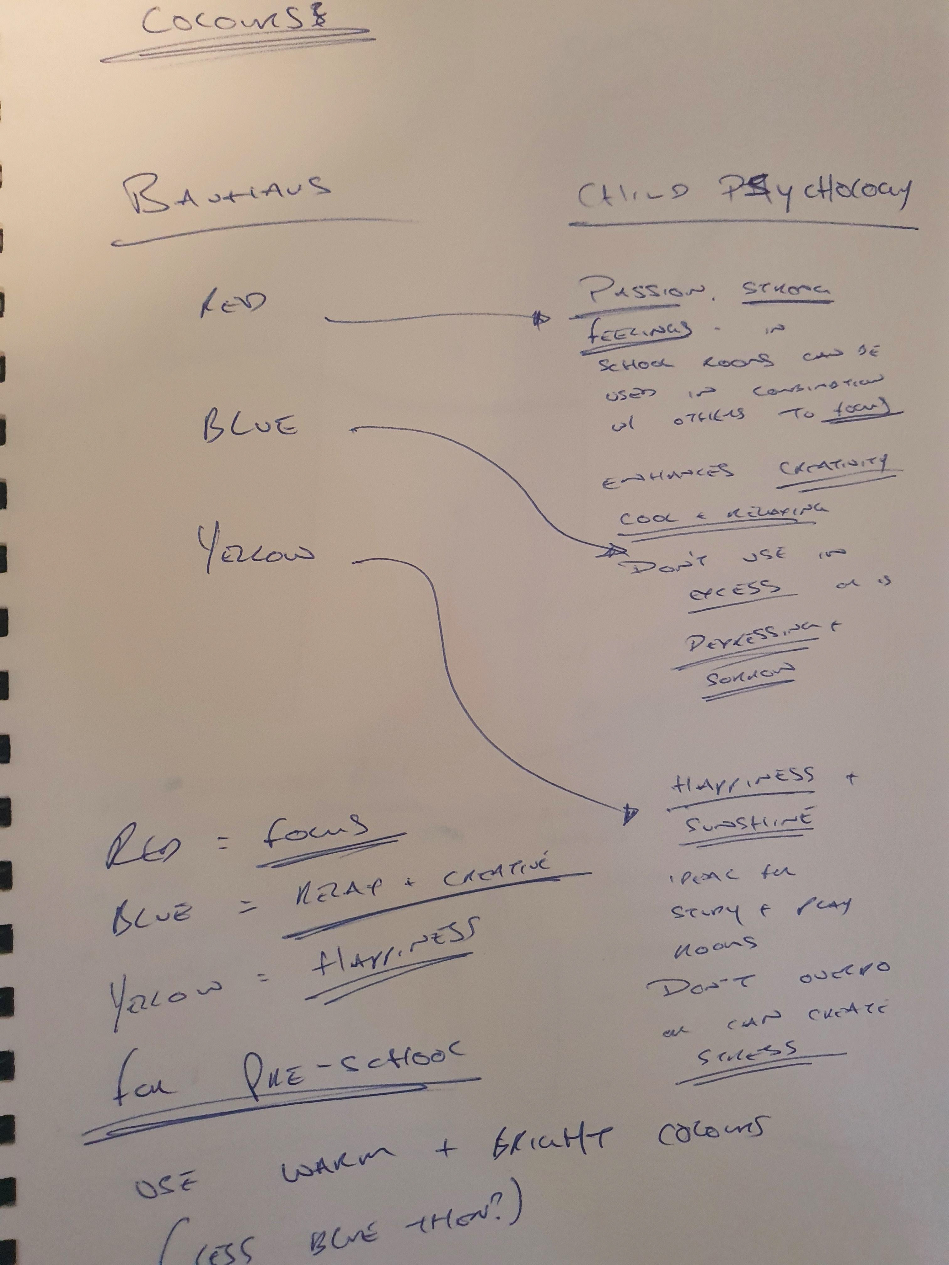
as a result of my research, i plan to add accents of red, yellow and blue within my building. these primary colours not only have significance architecturally but are also heavily contrasting being the three base colours, this makes them easily distinguishable for children.

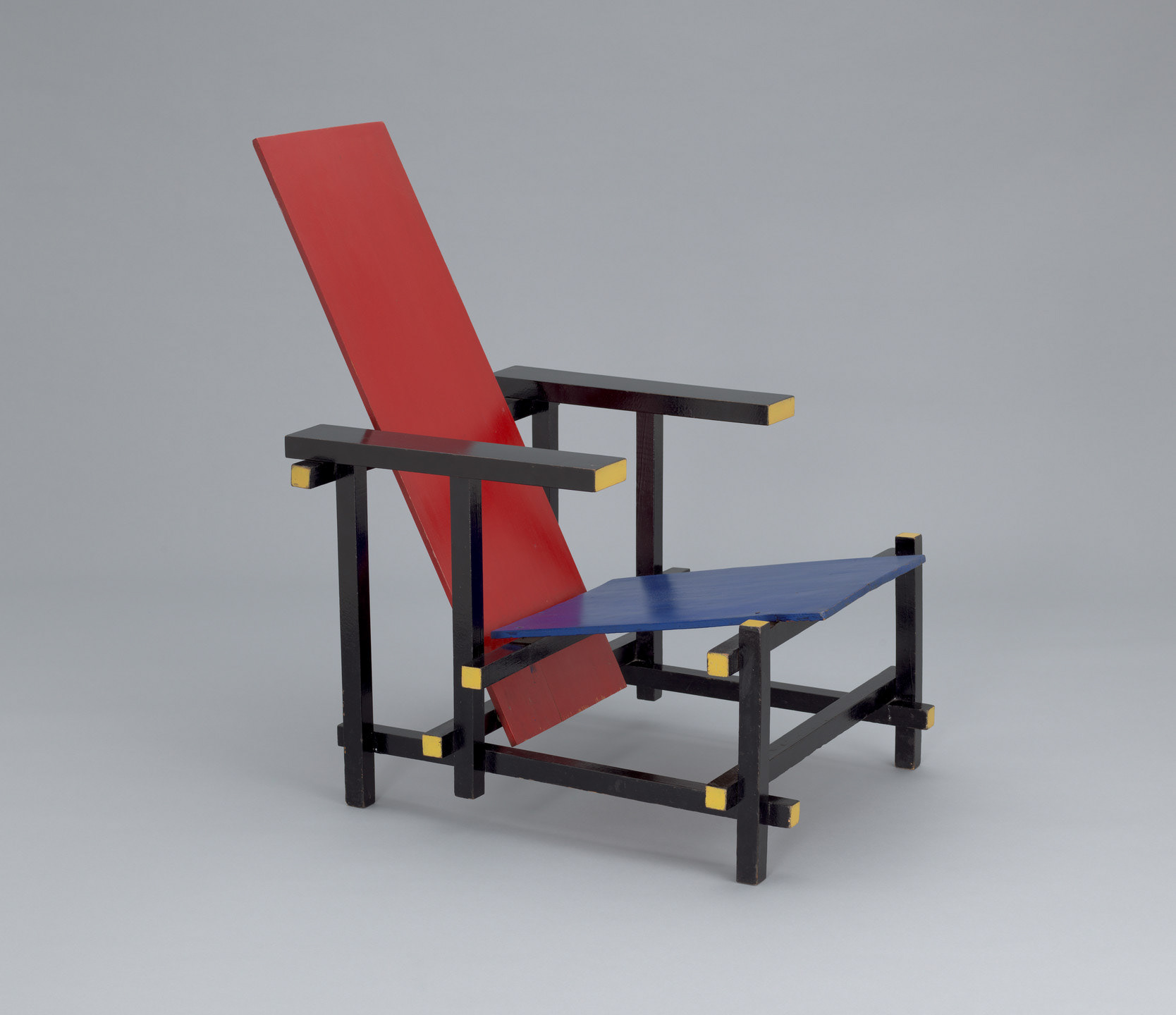
to avoid the colours interfering with the "forest" look of my building from the outside, i plan to use these colours on the "cut sections" of the louvres and wooden aspects, much like the bauhaus inspired chairs of gerrit rietveld.
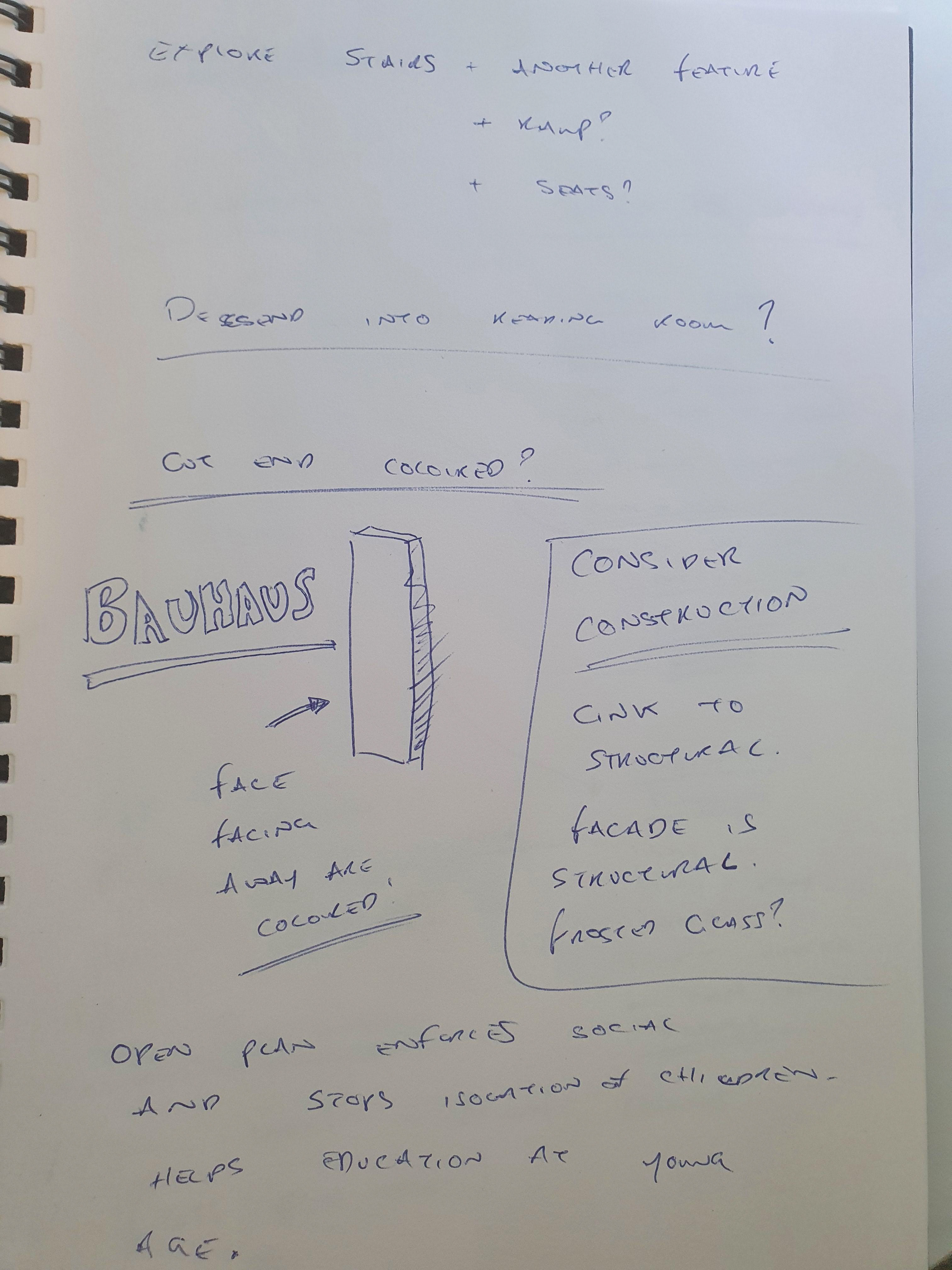
additional things to consider as iterations.